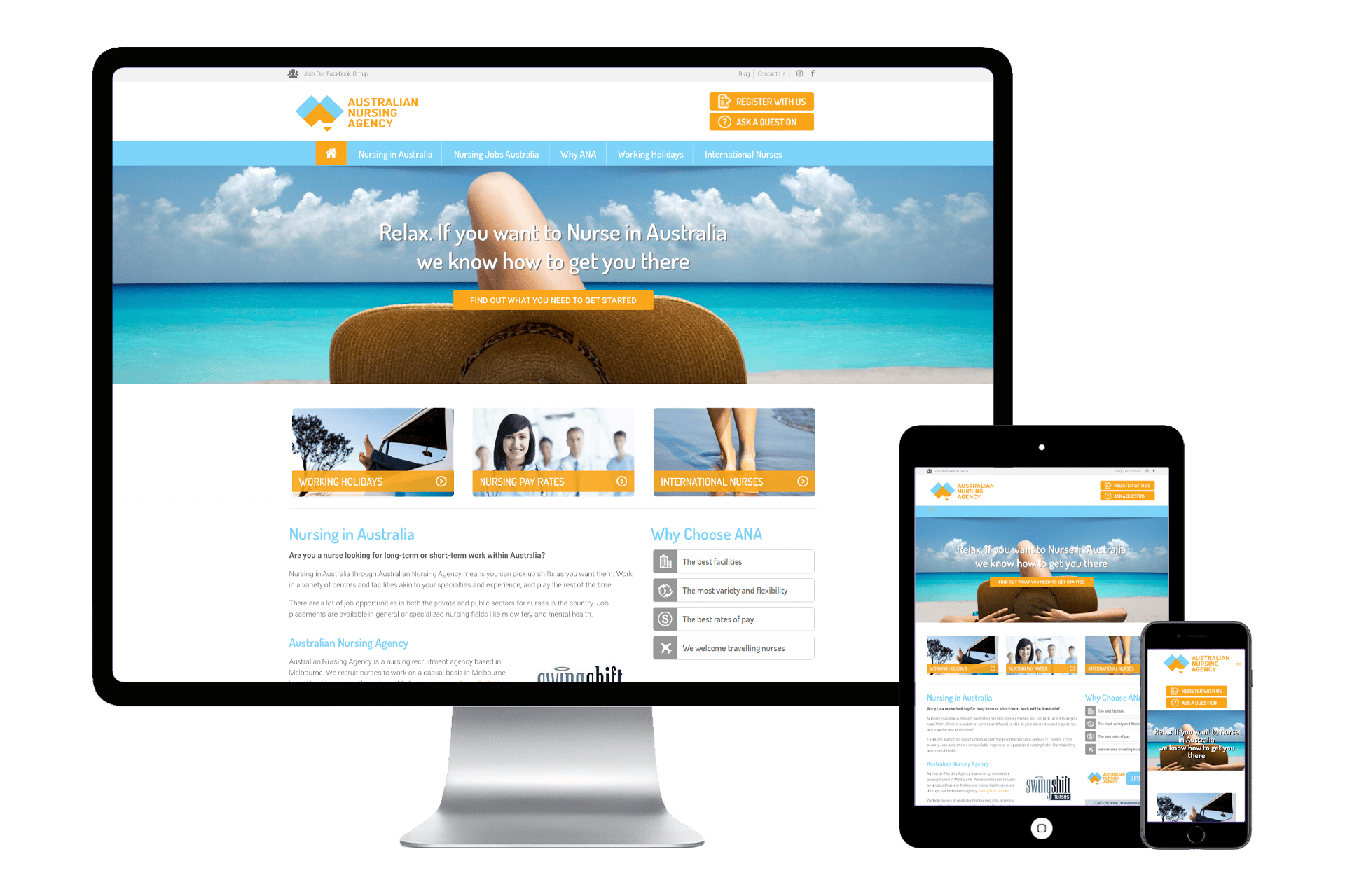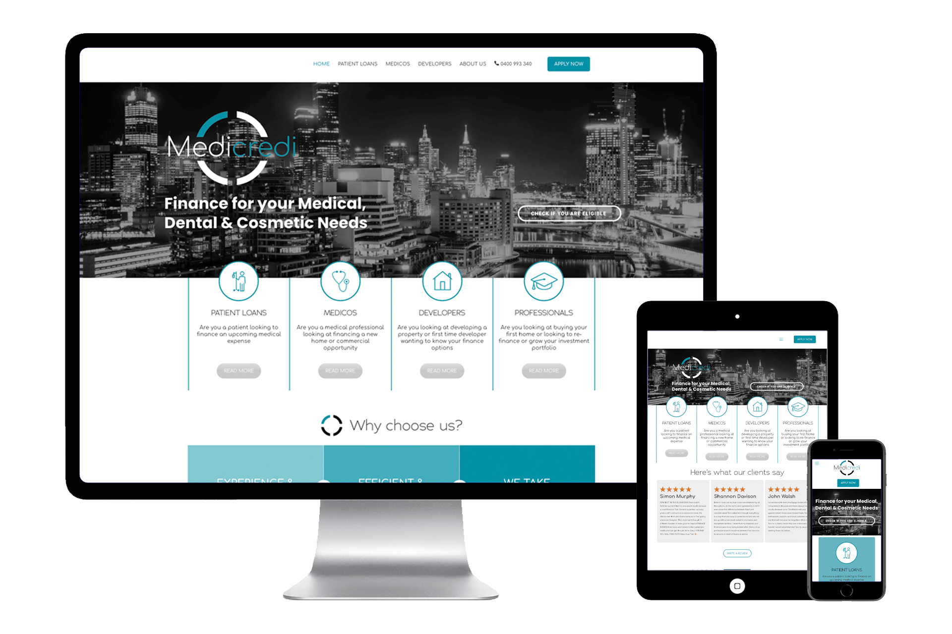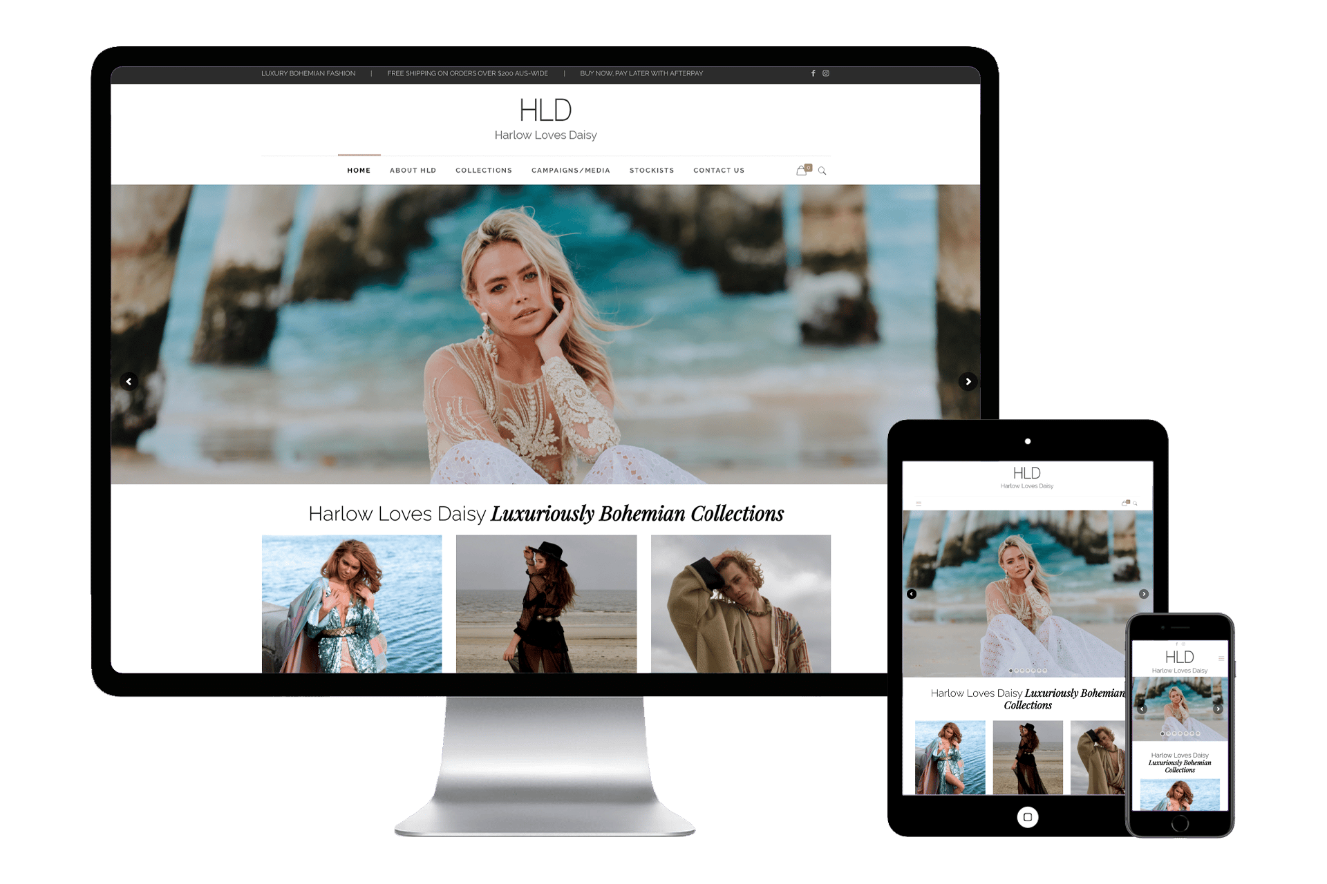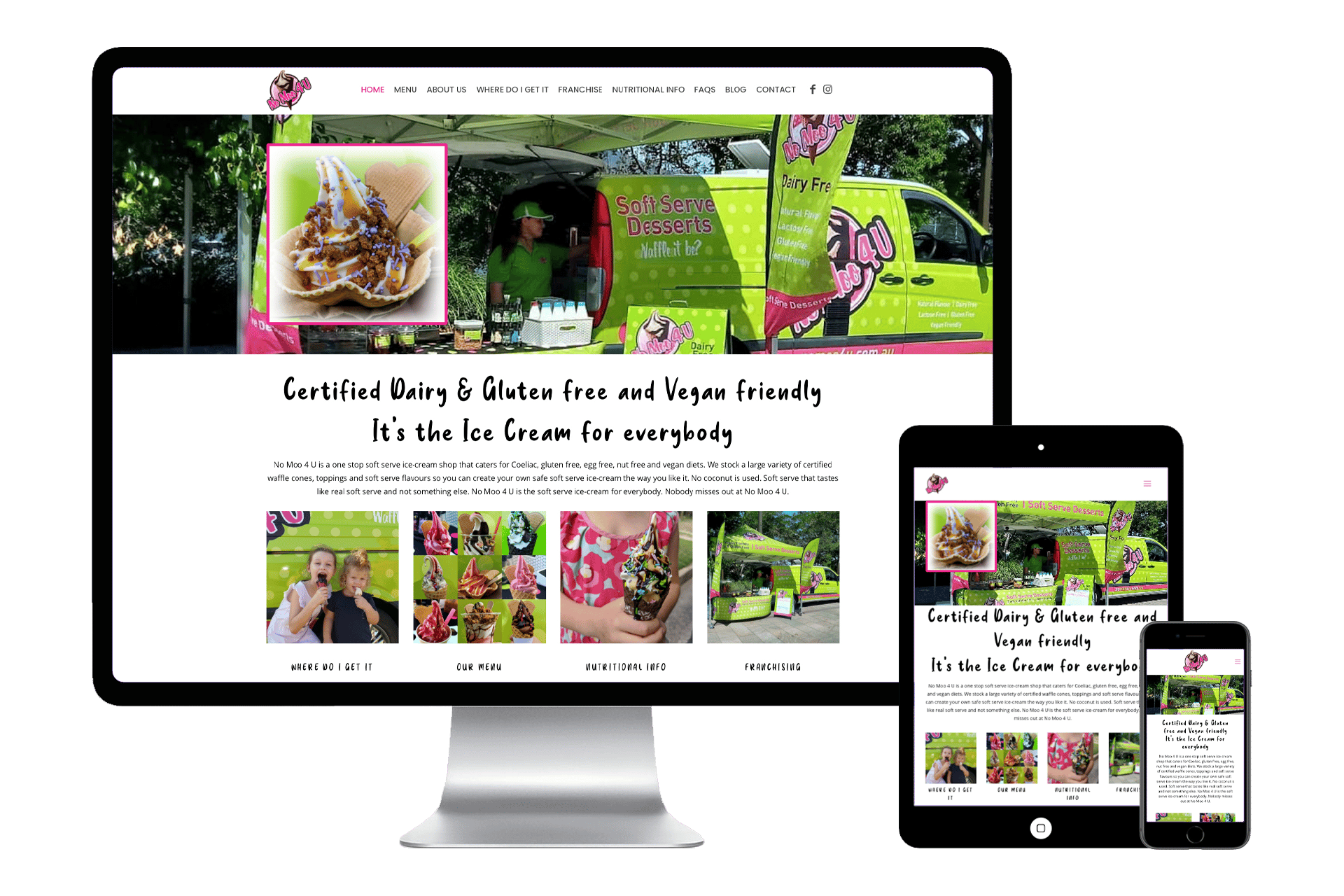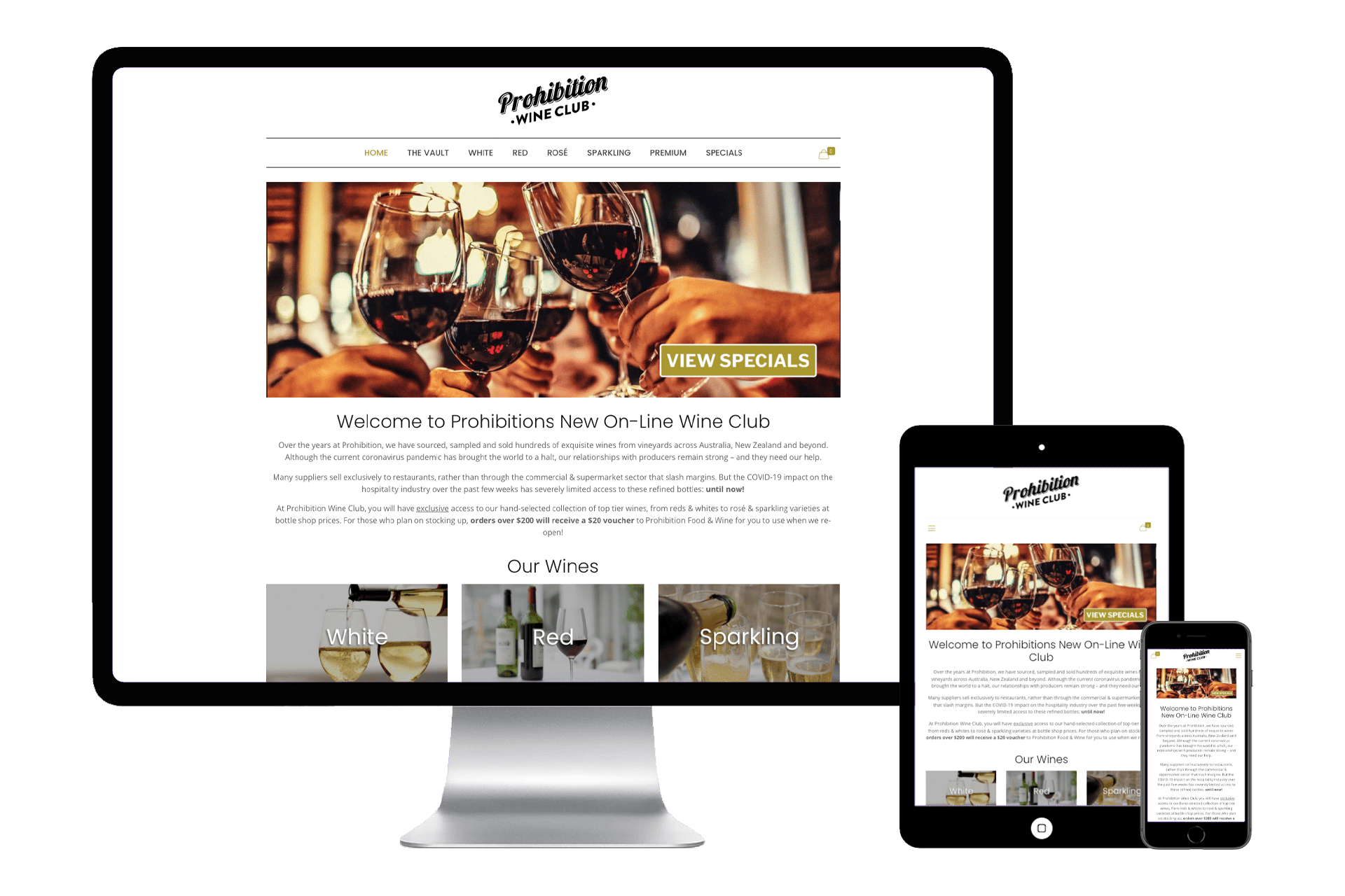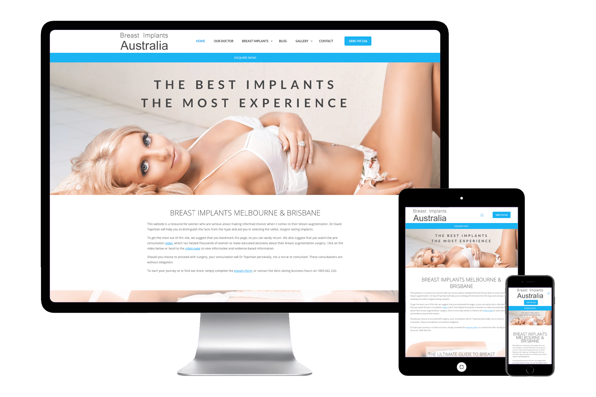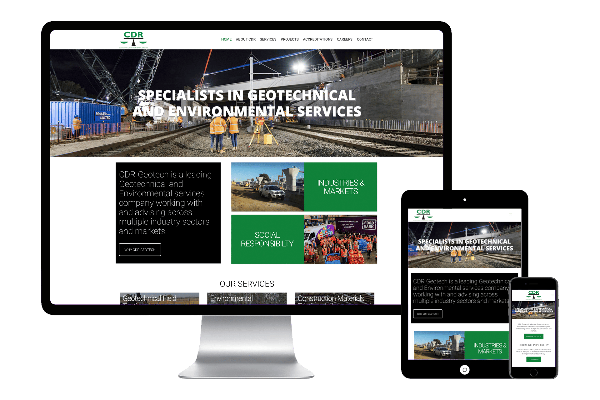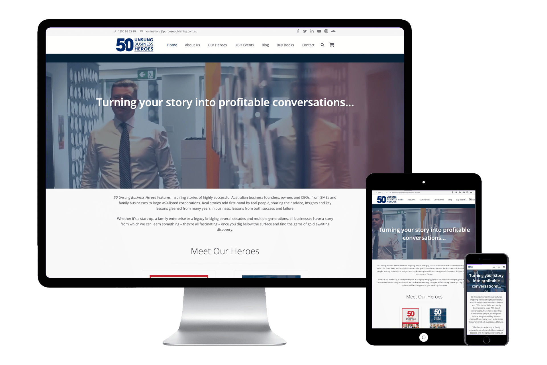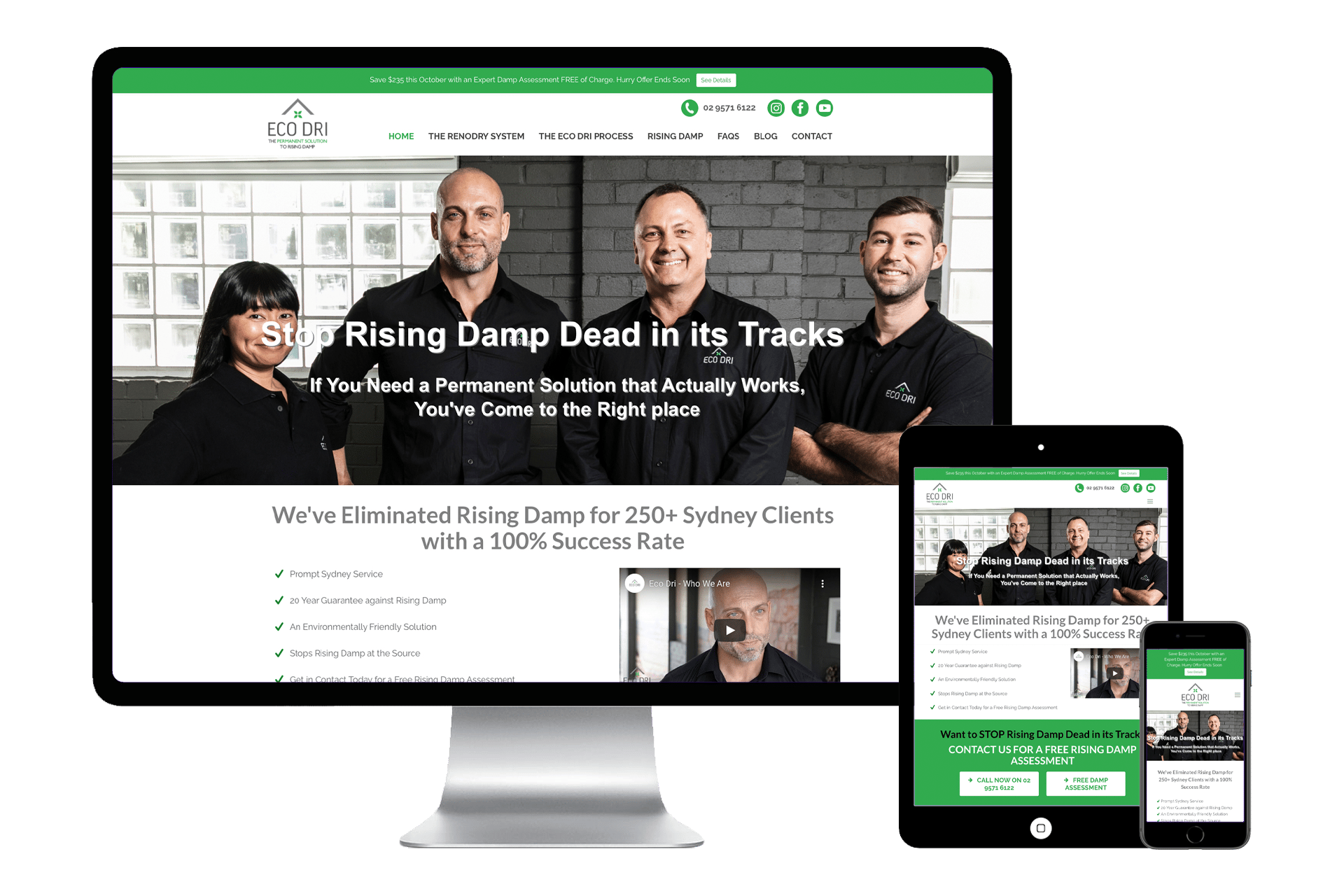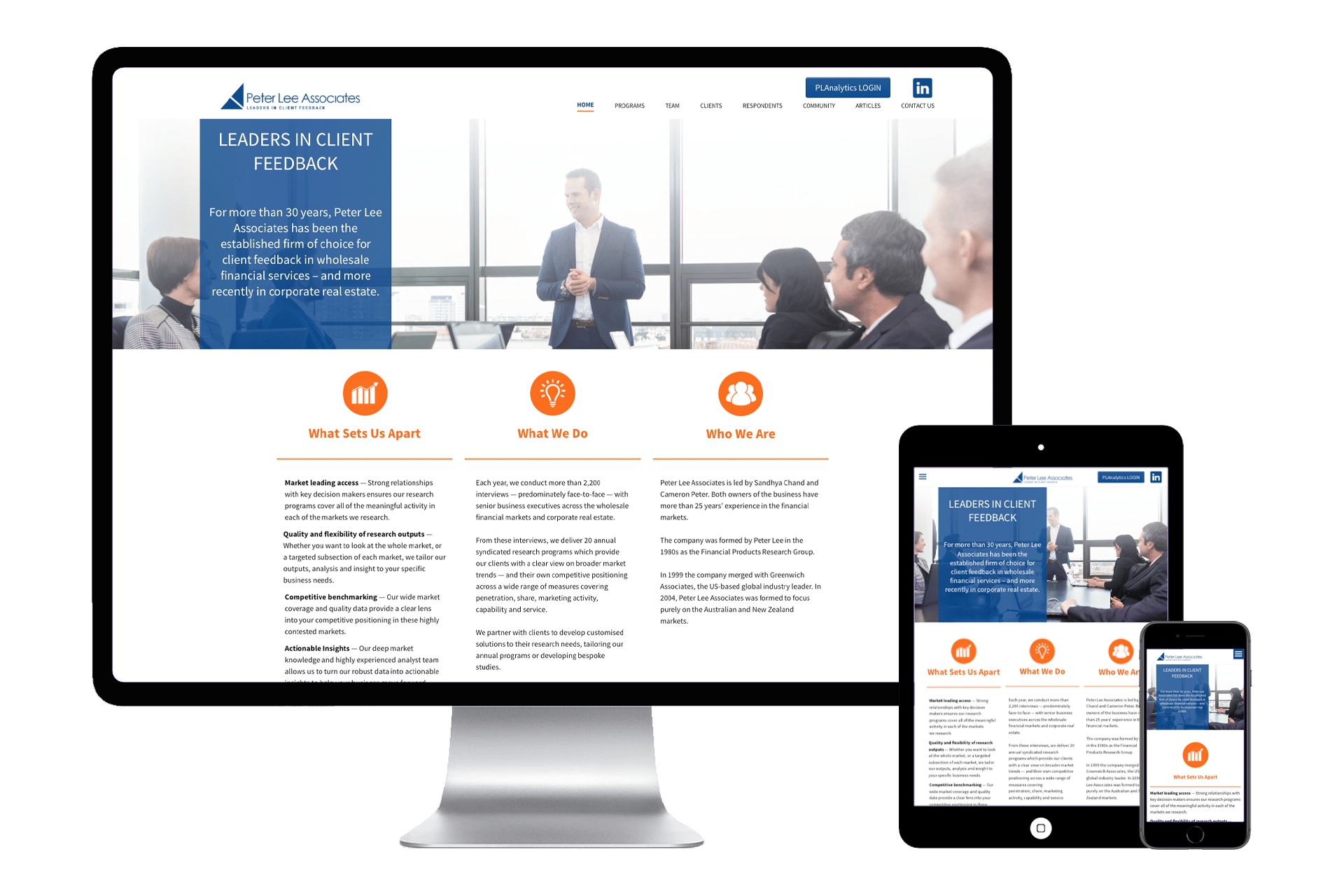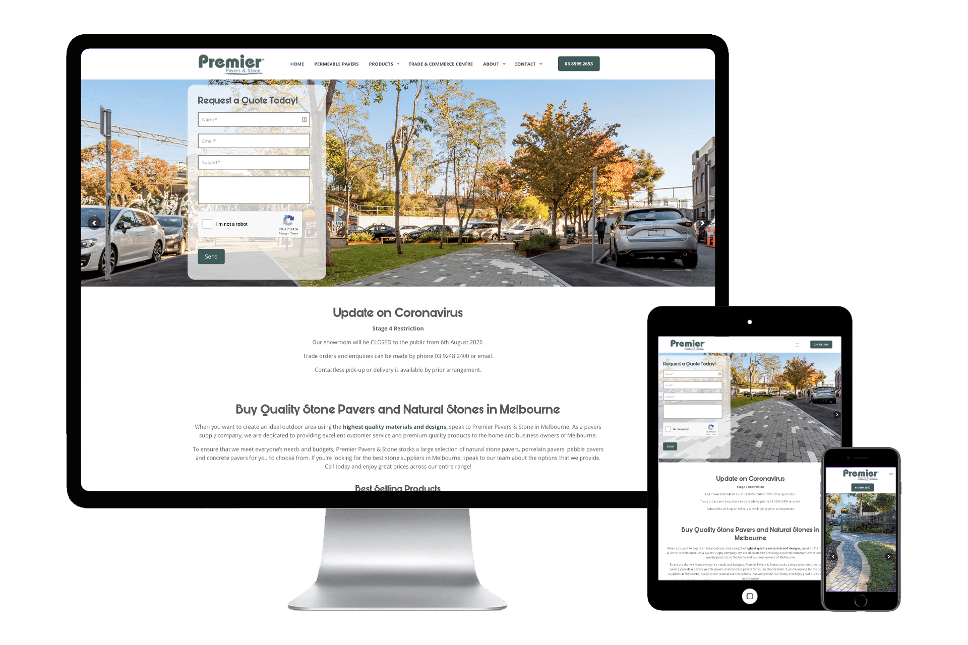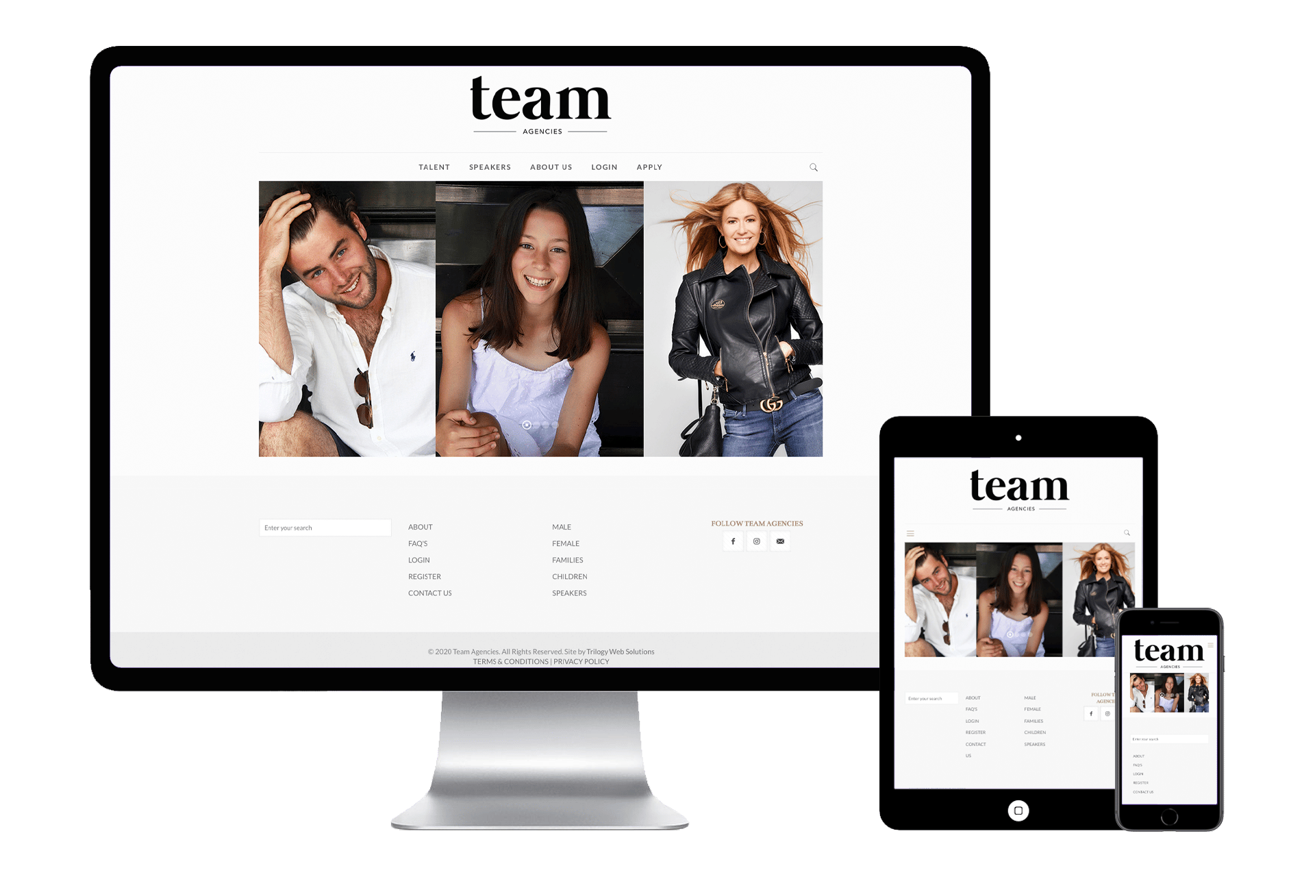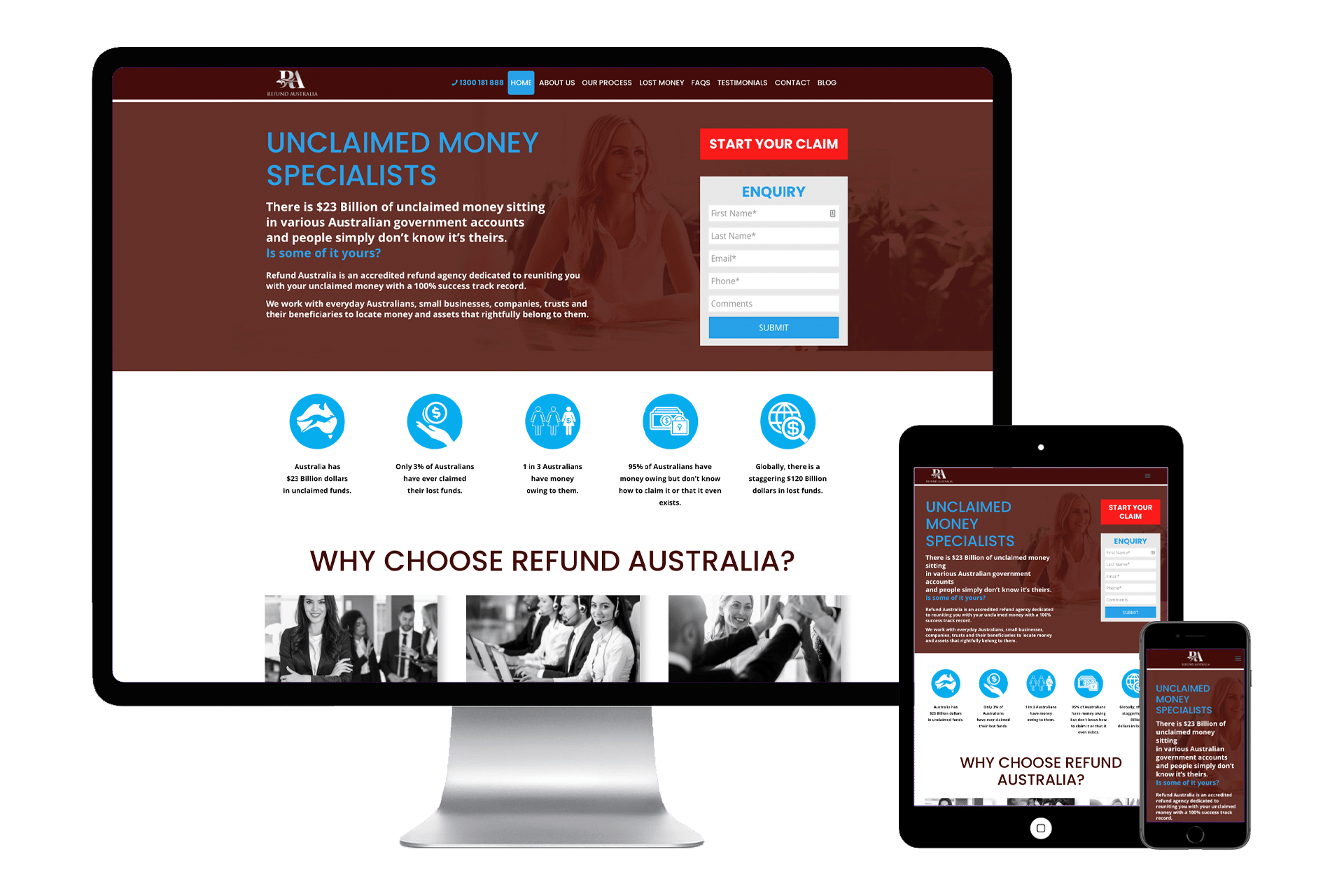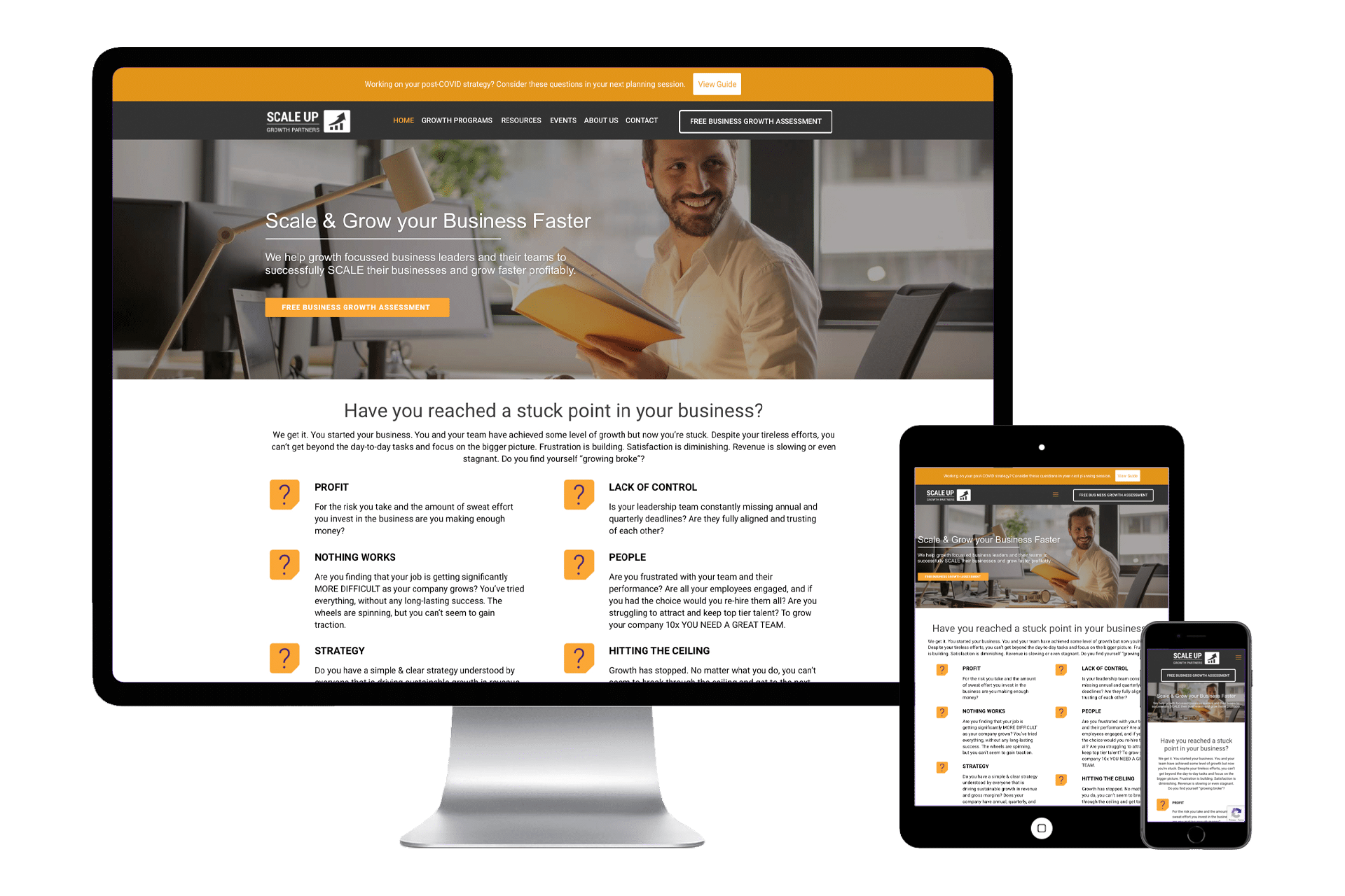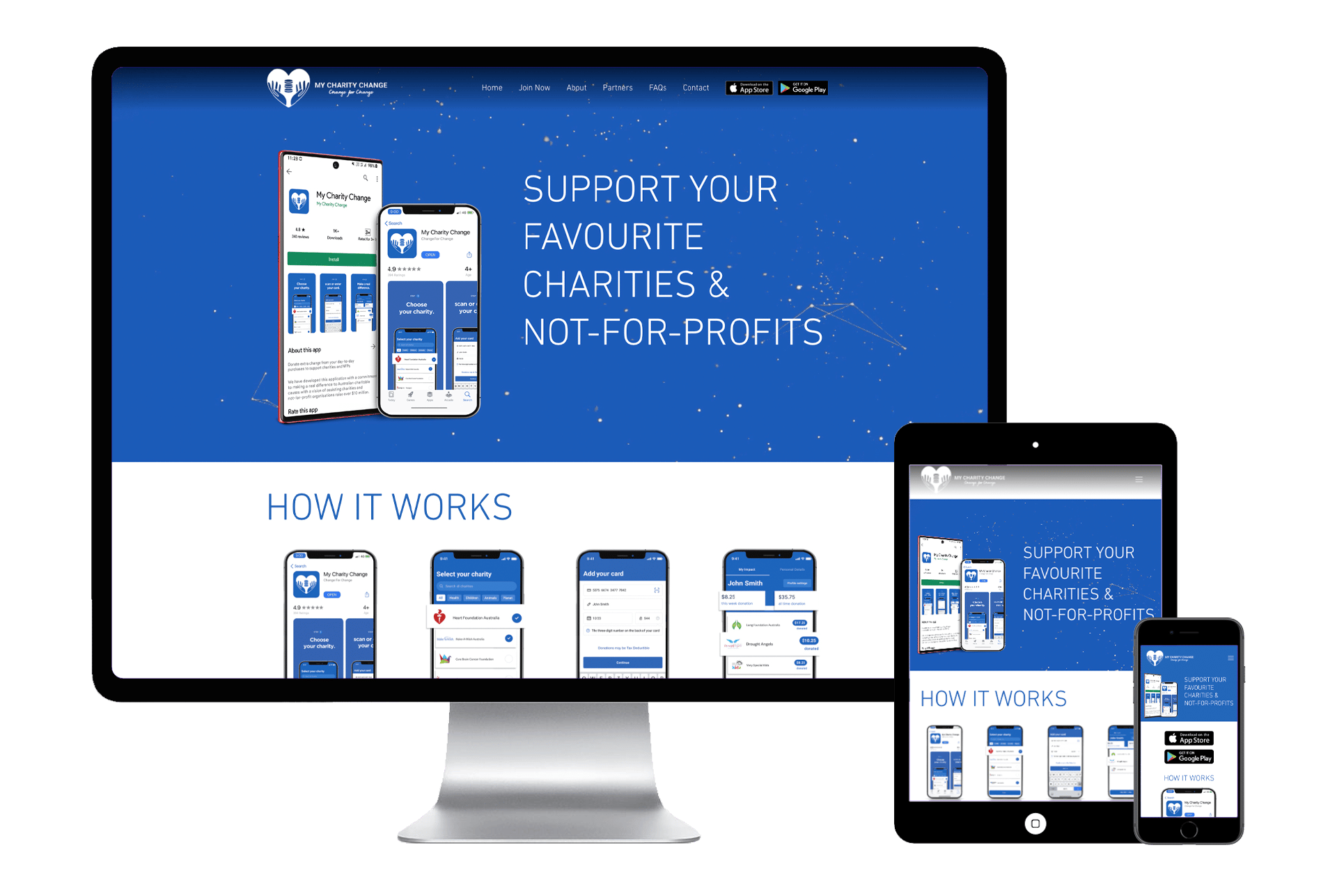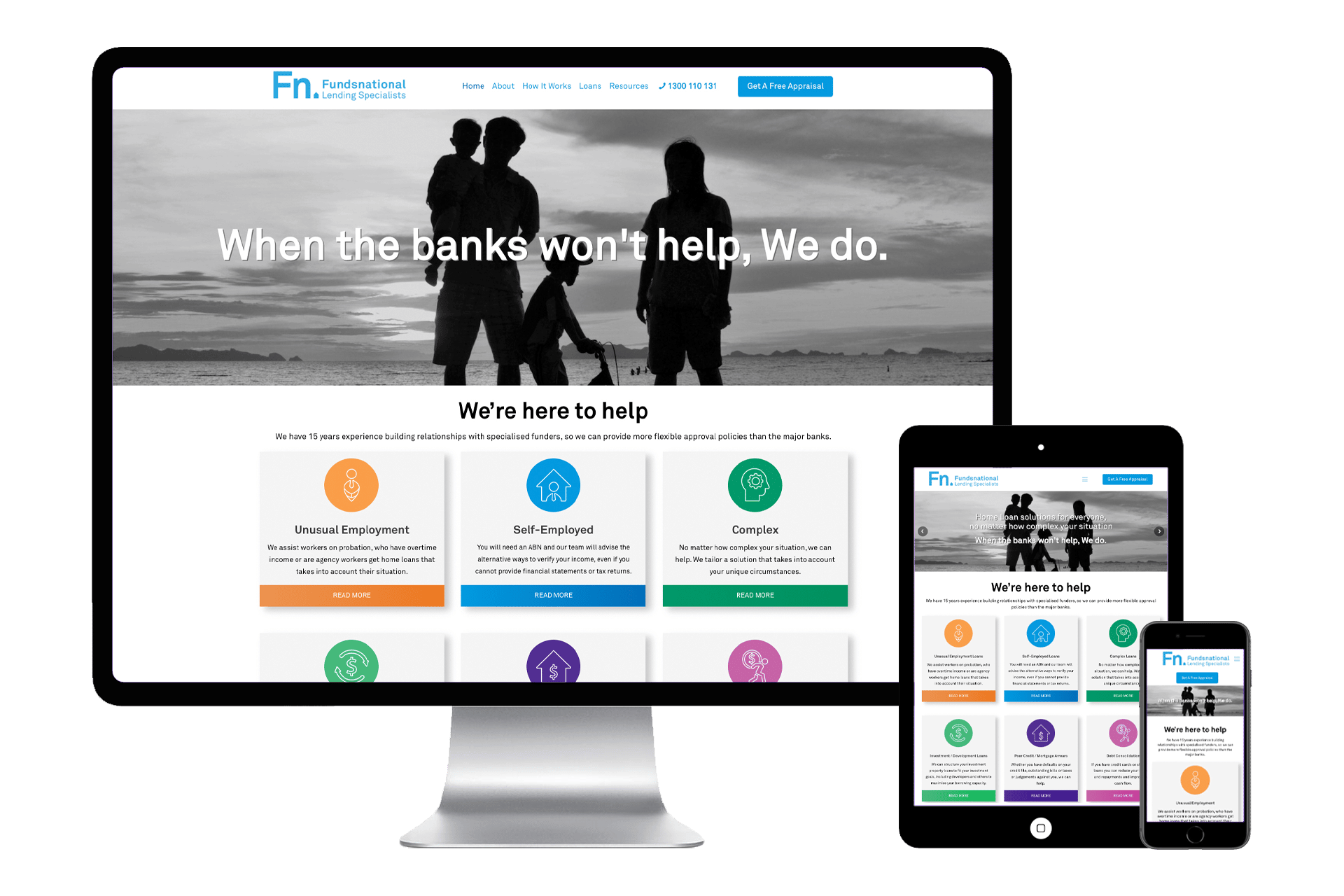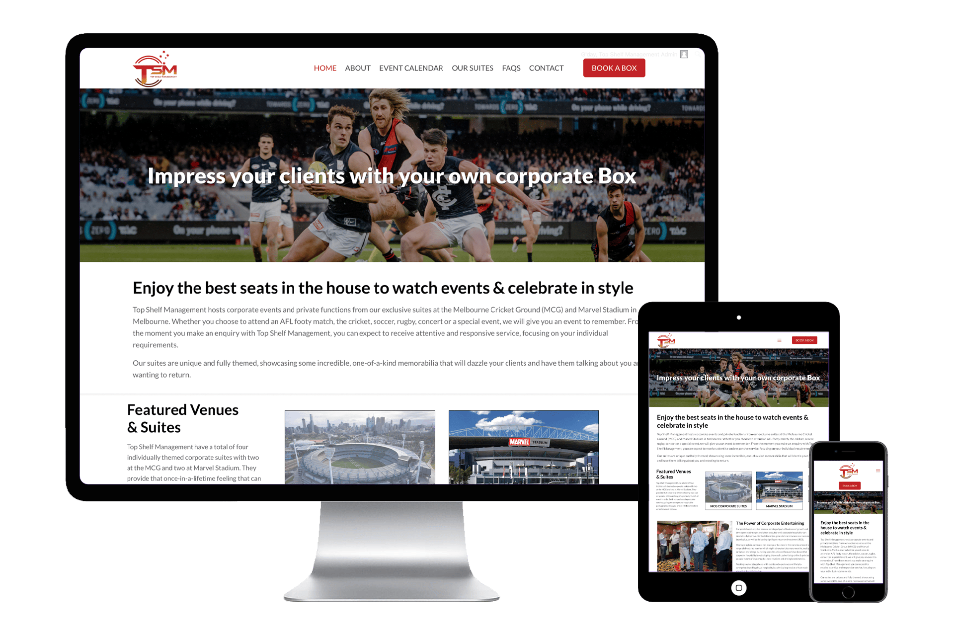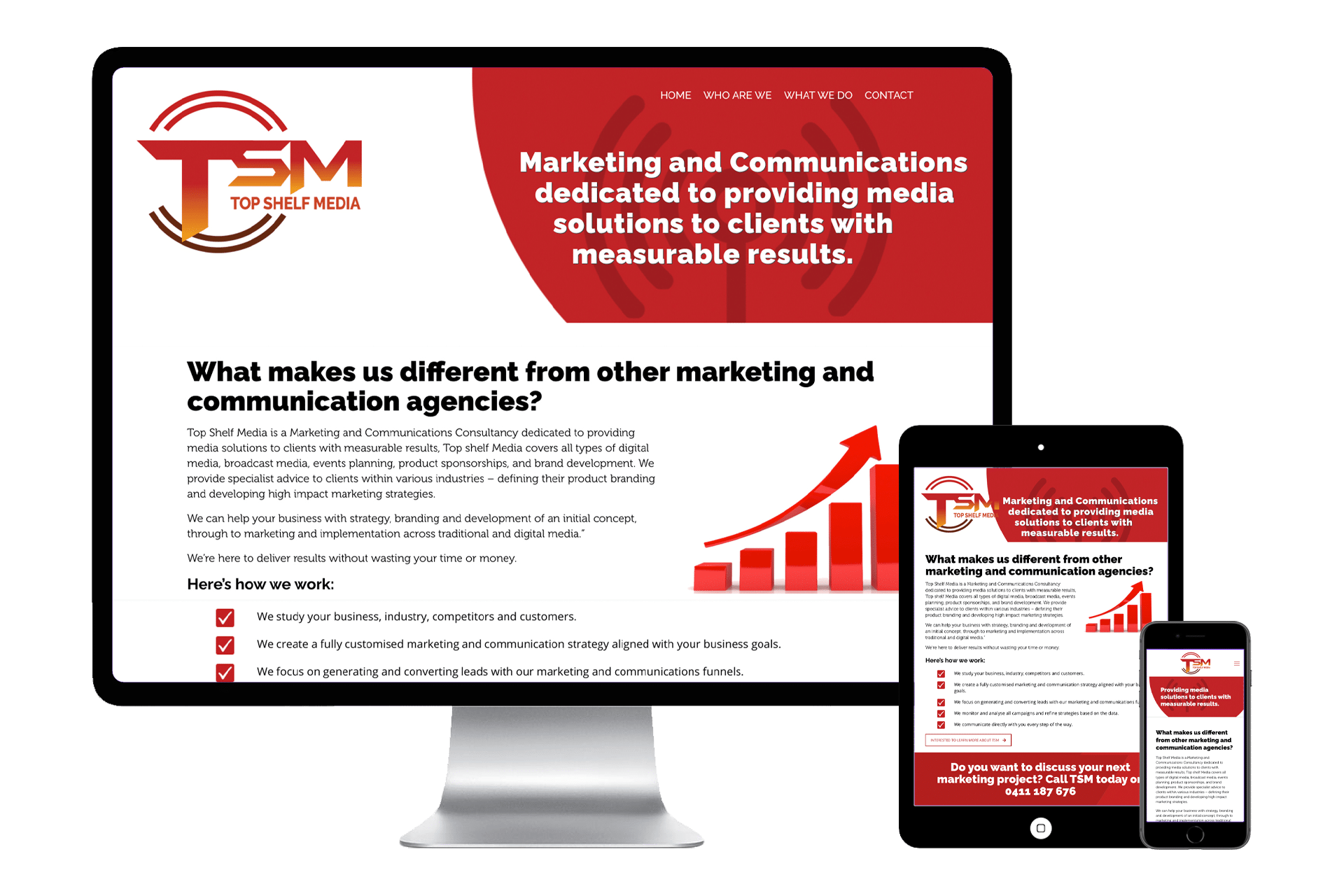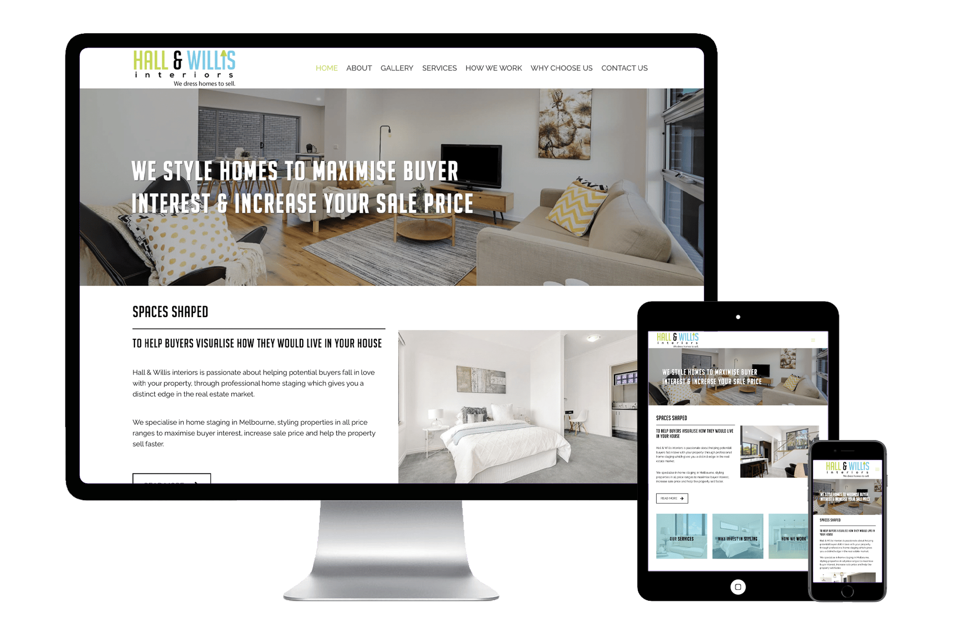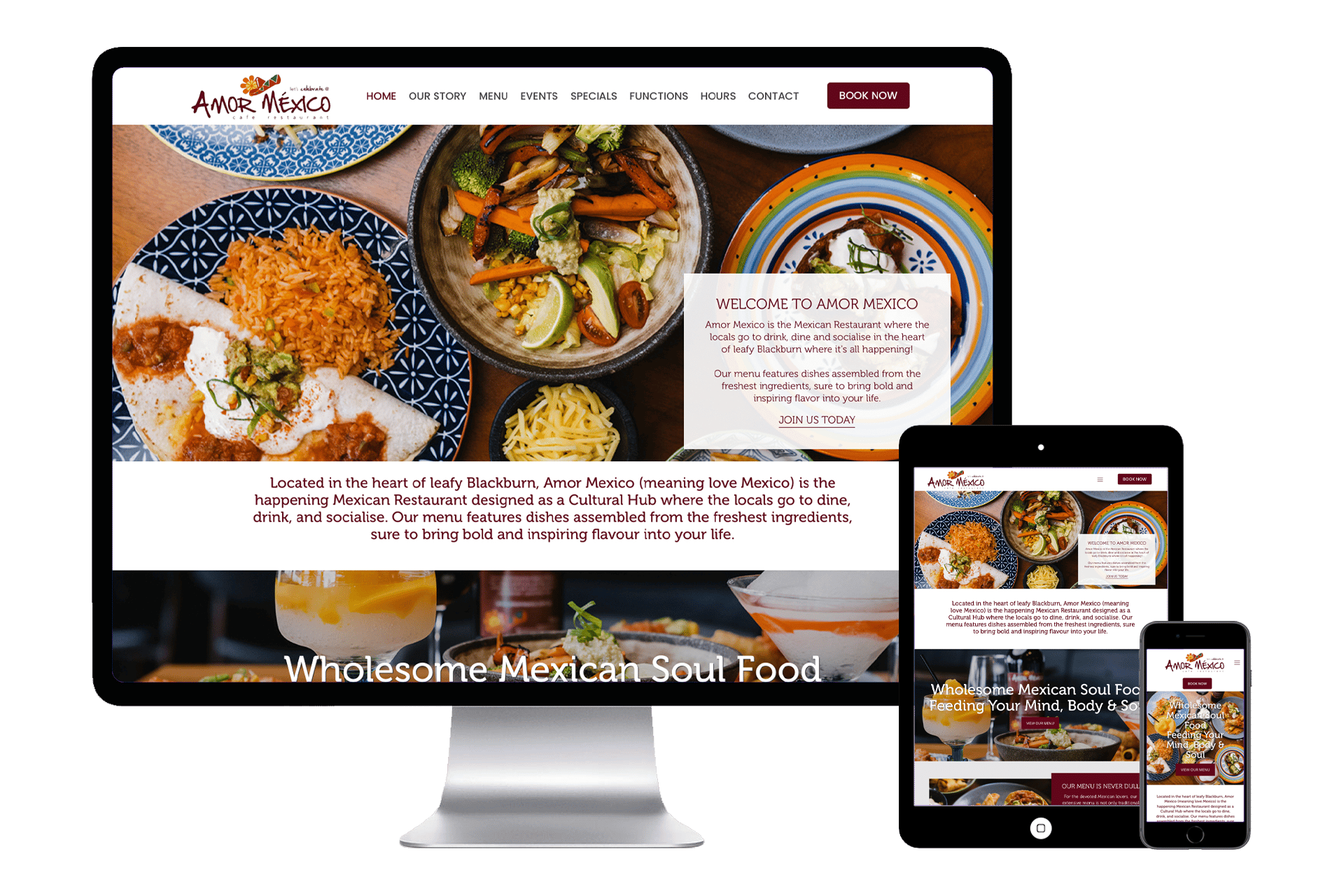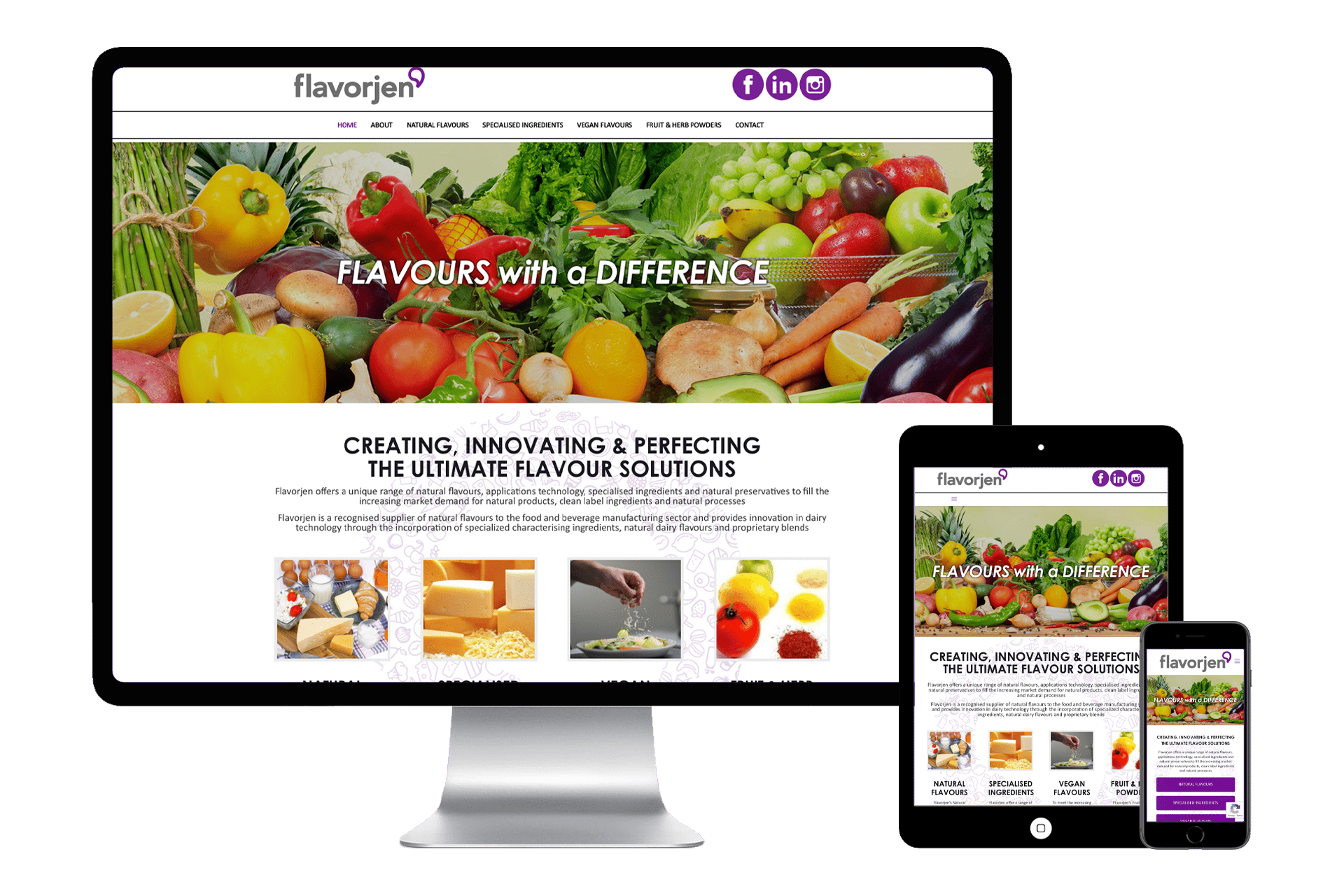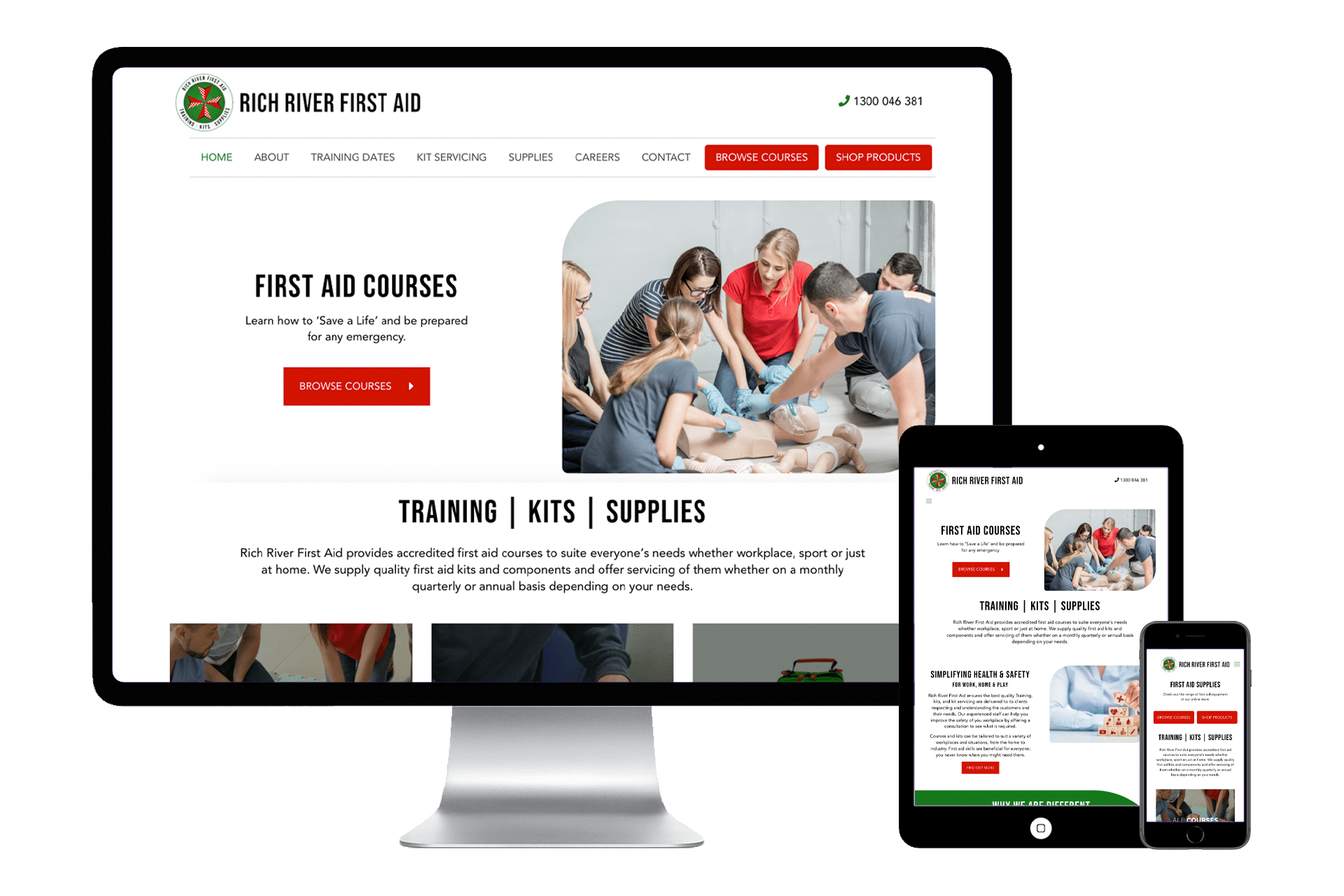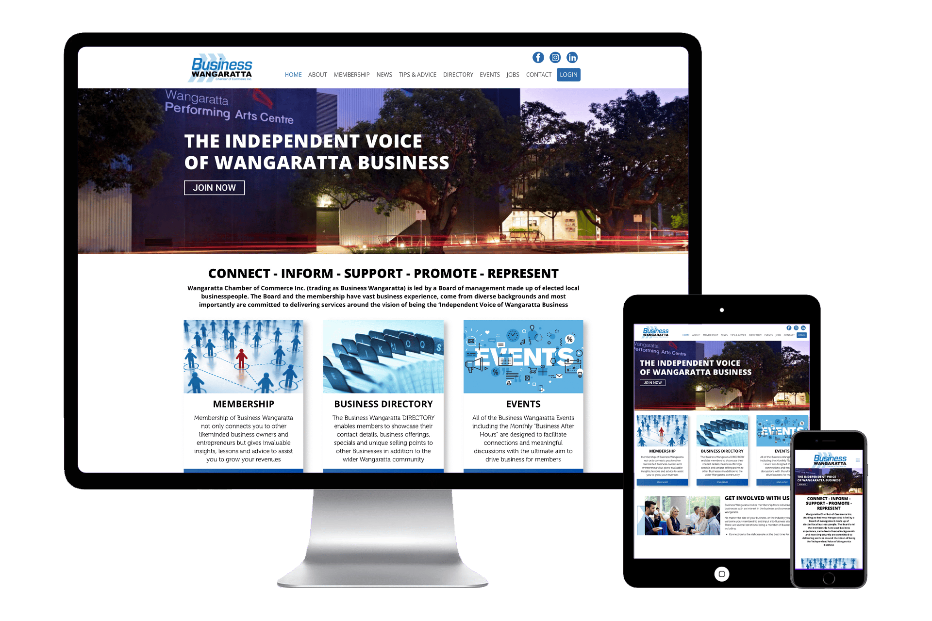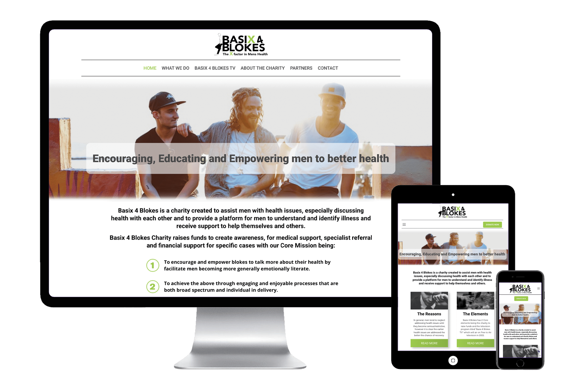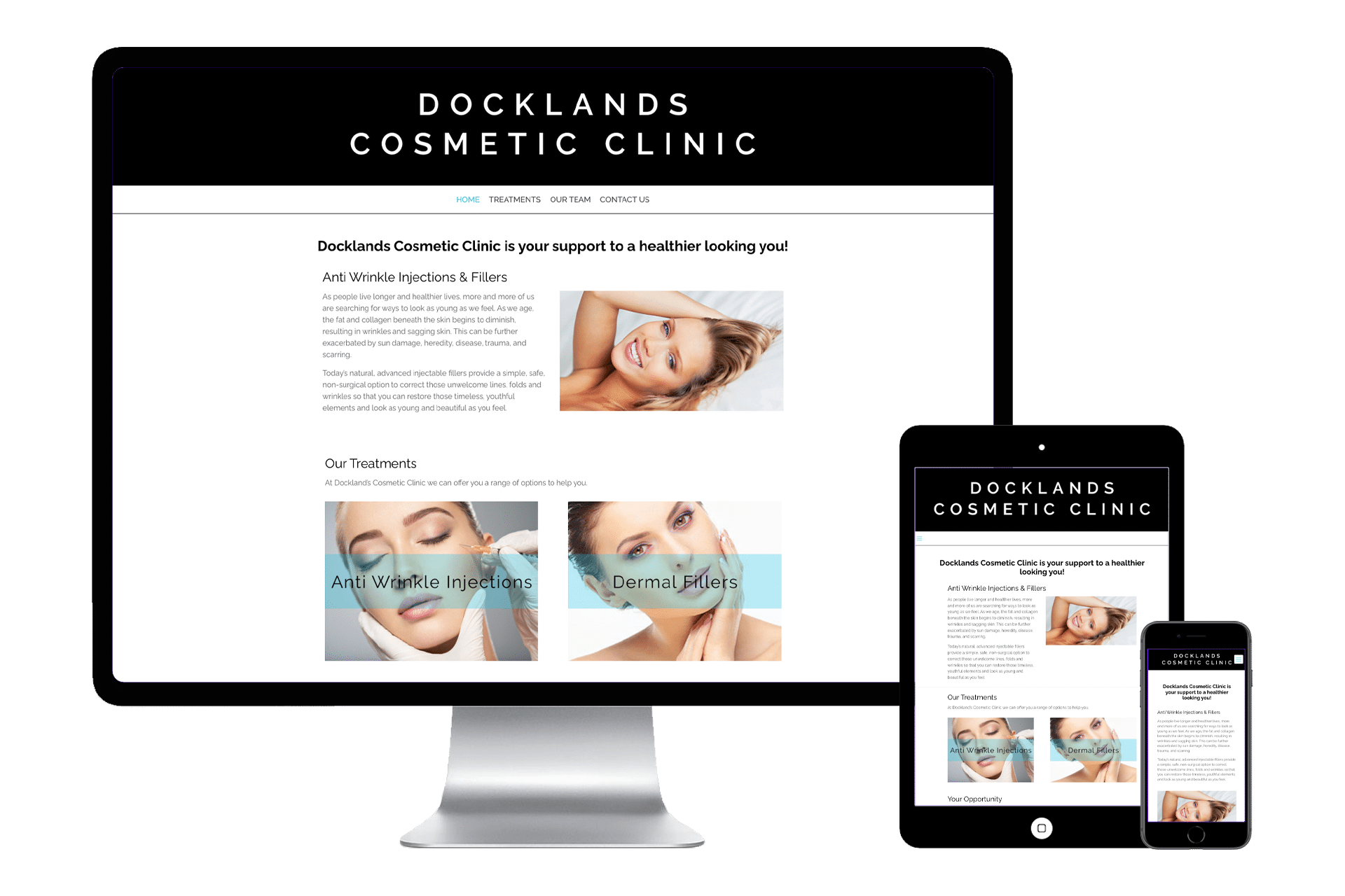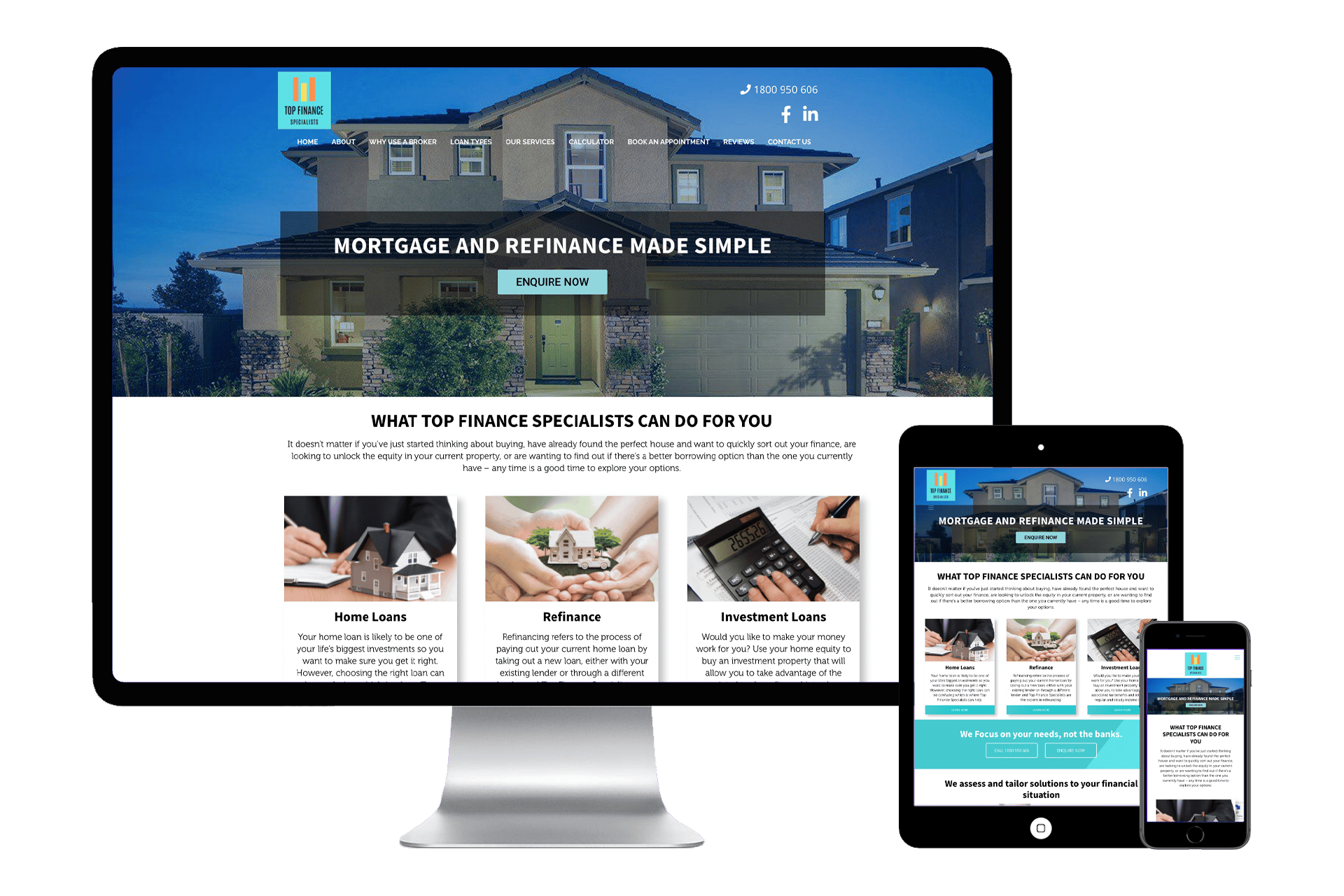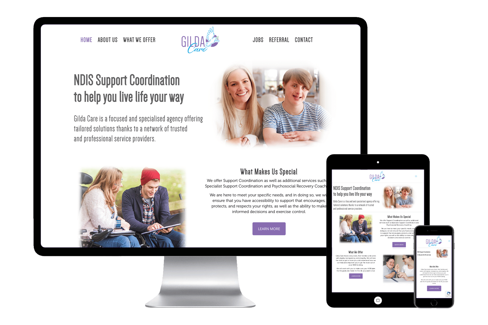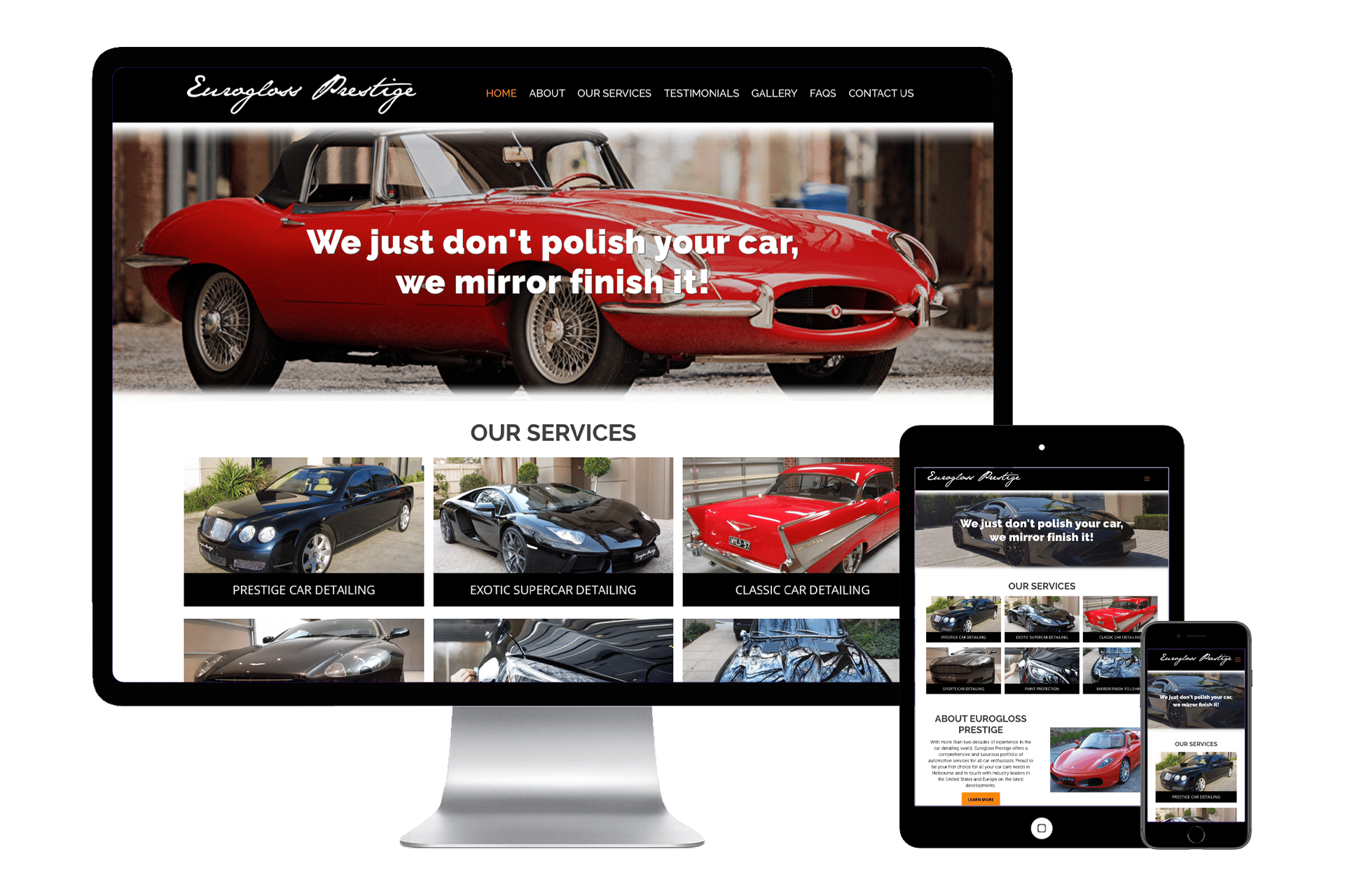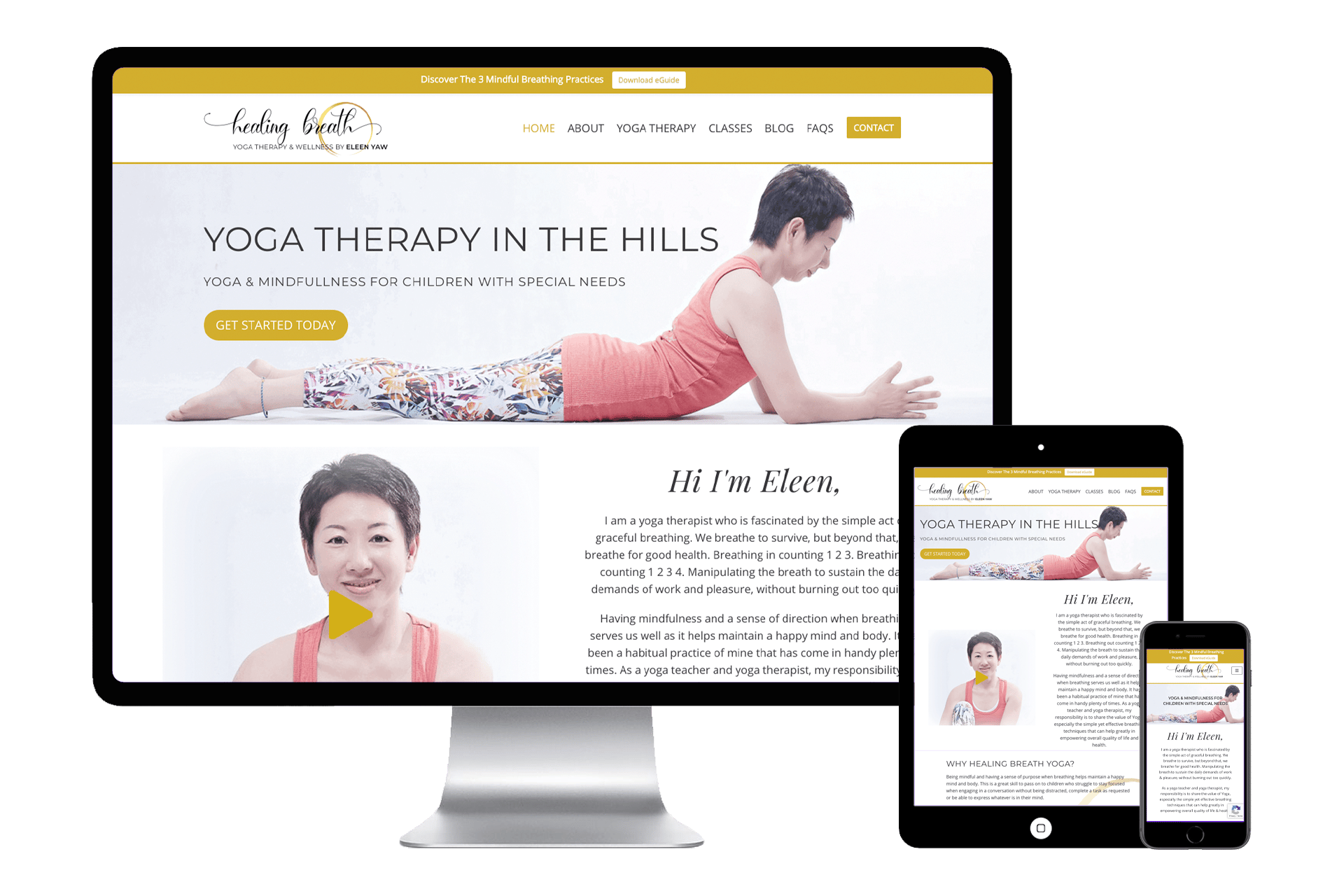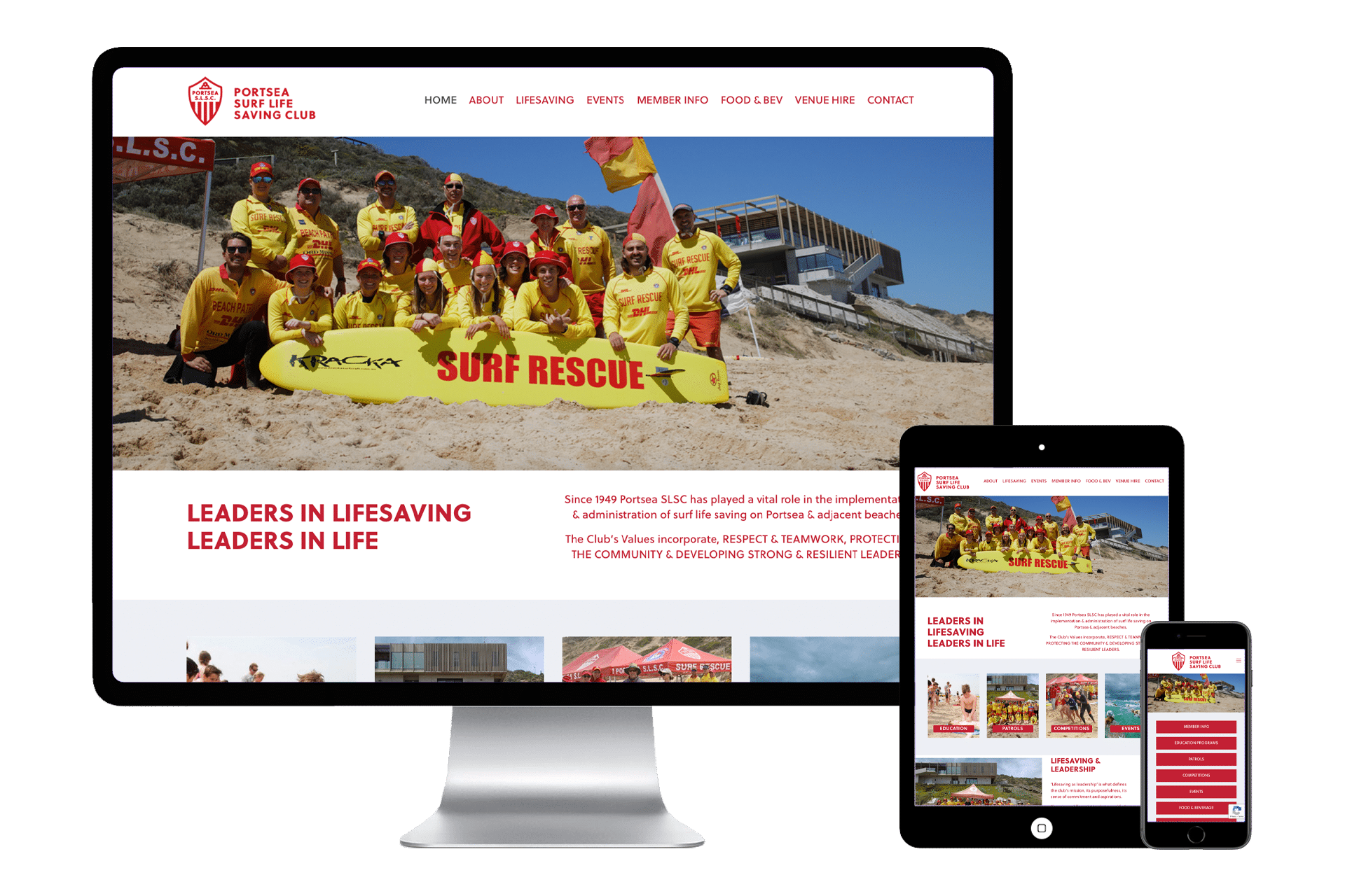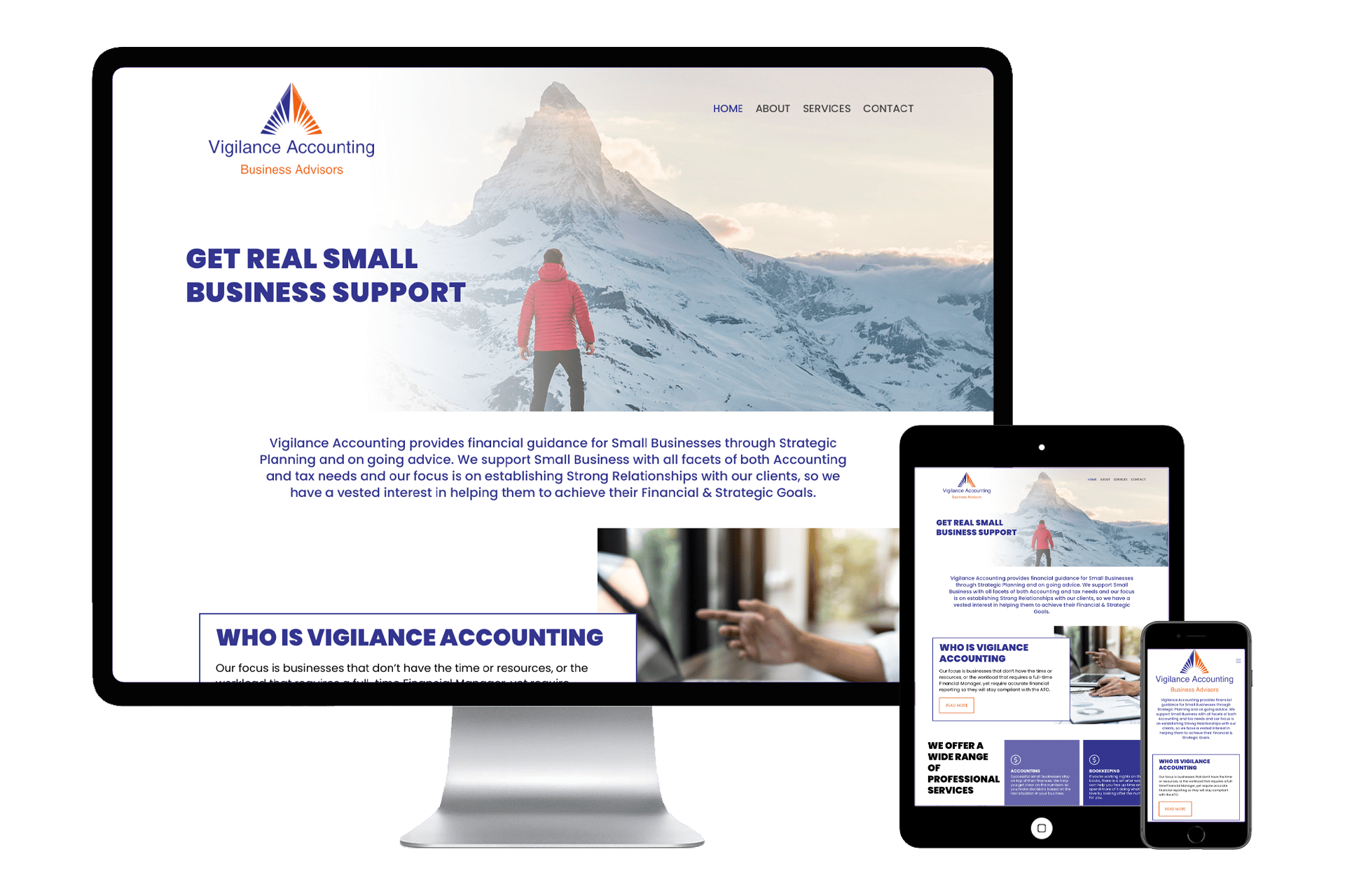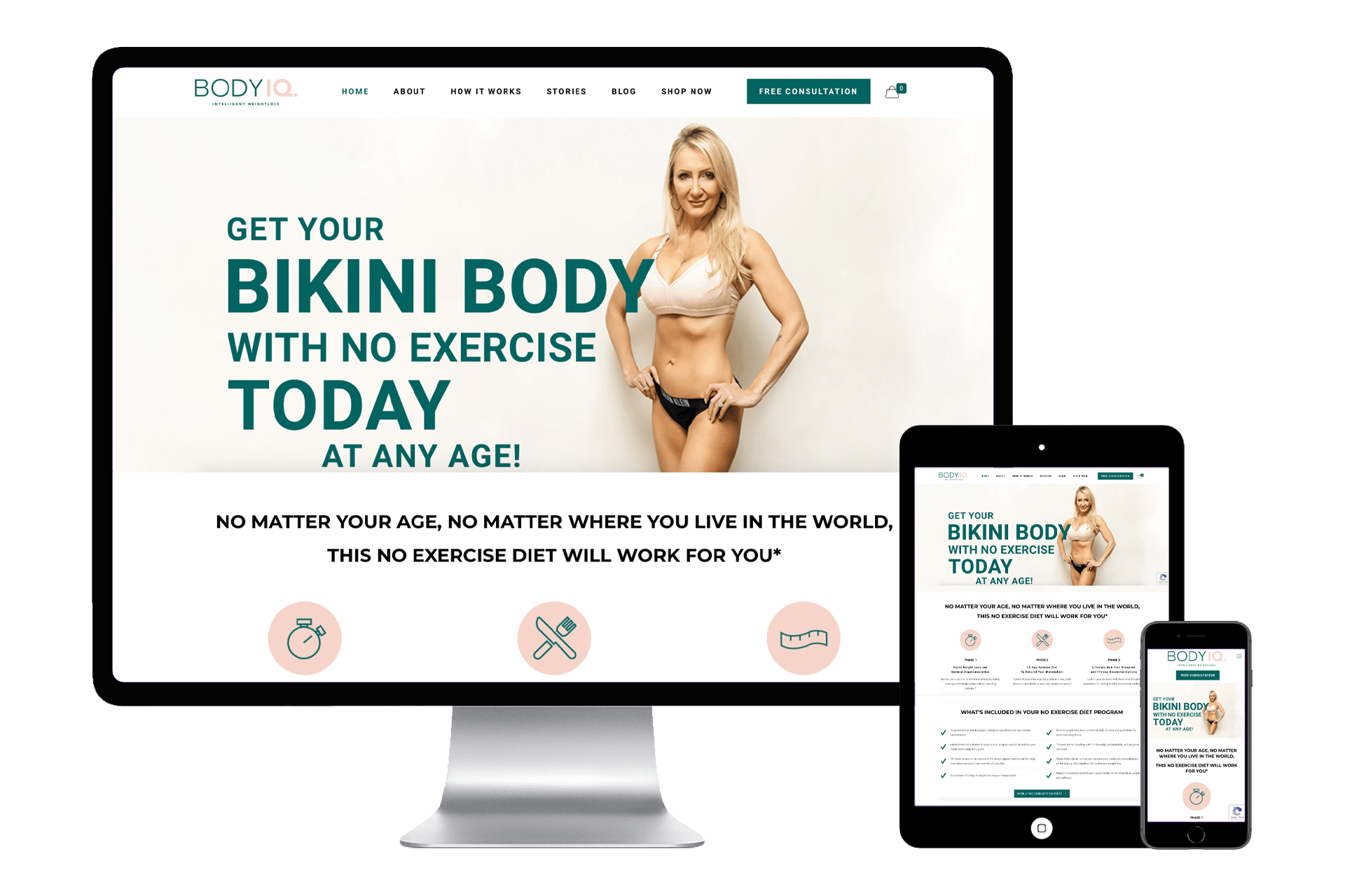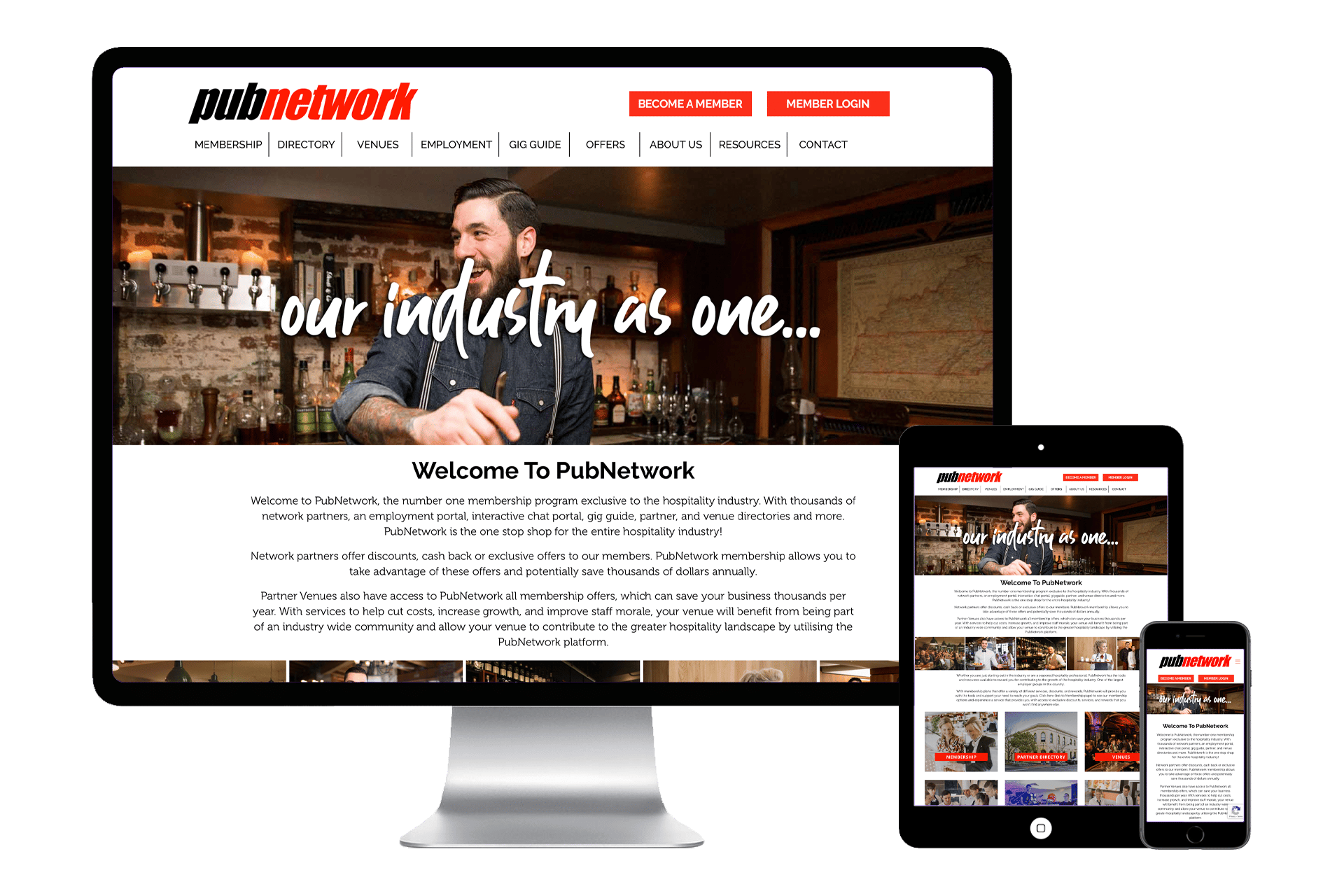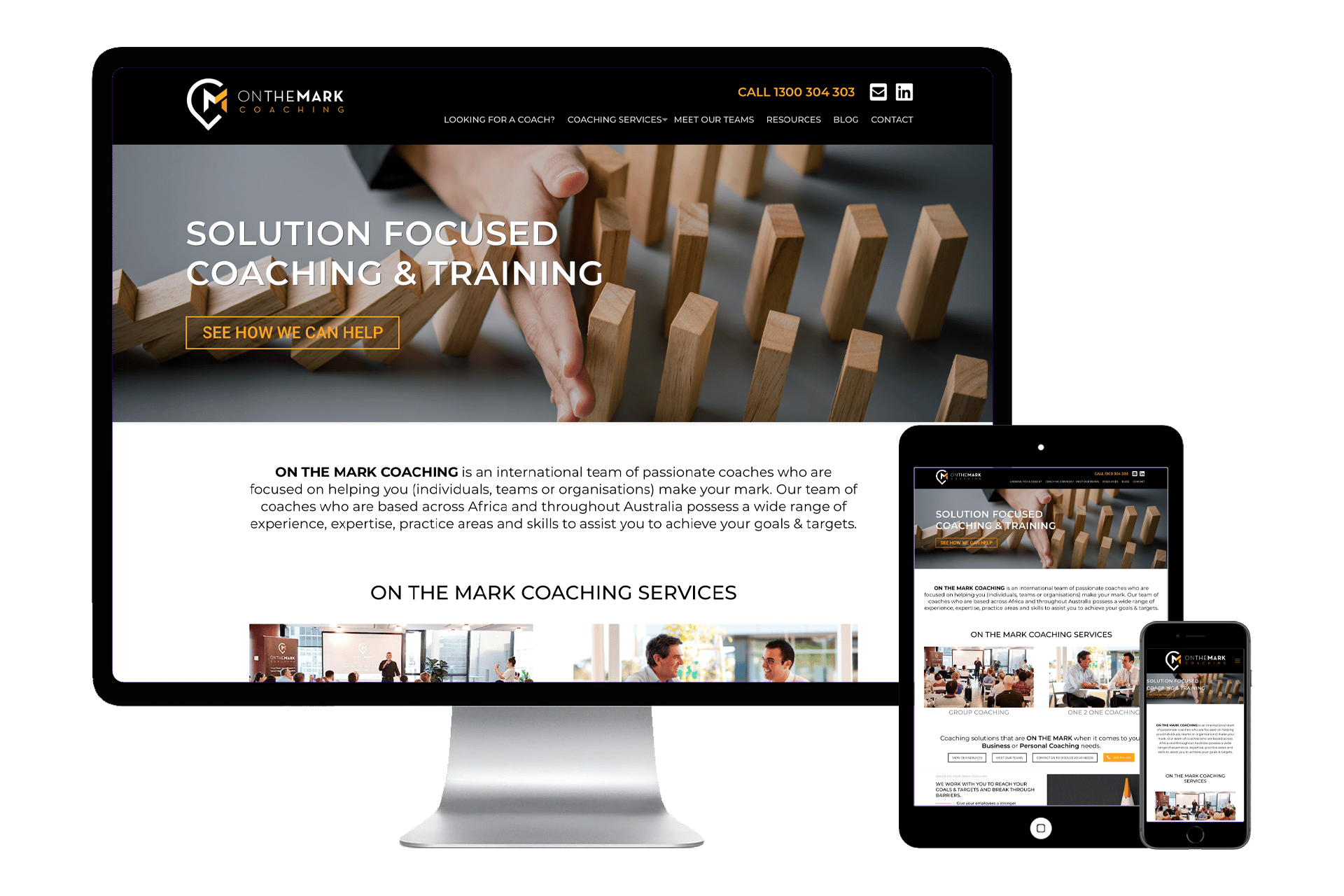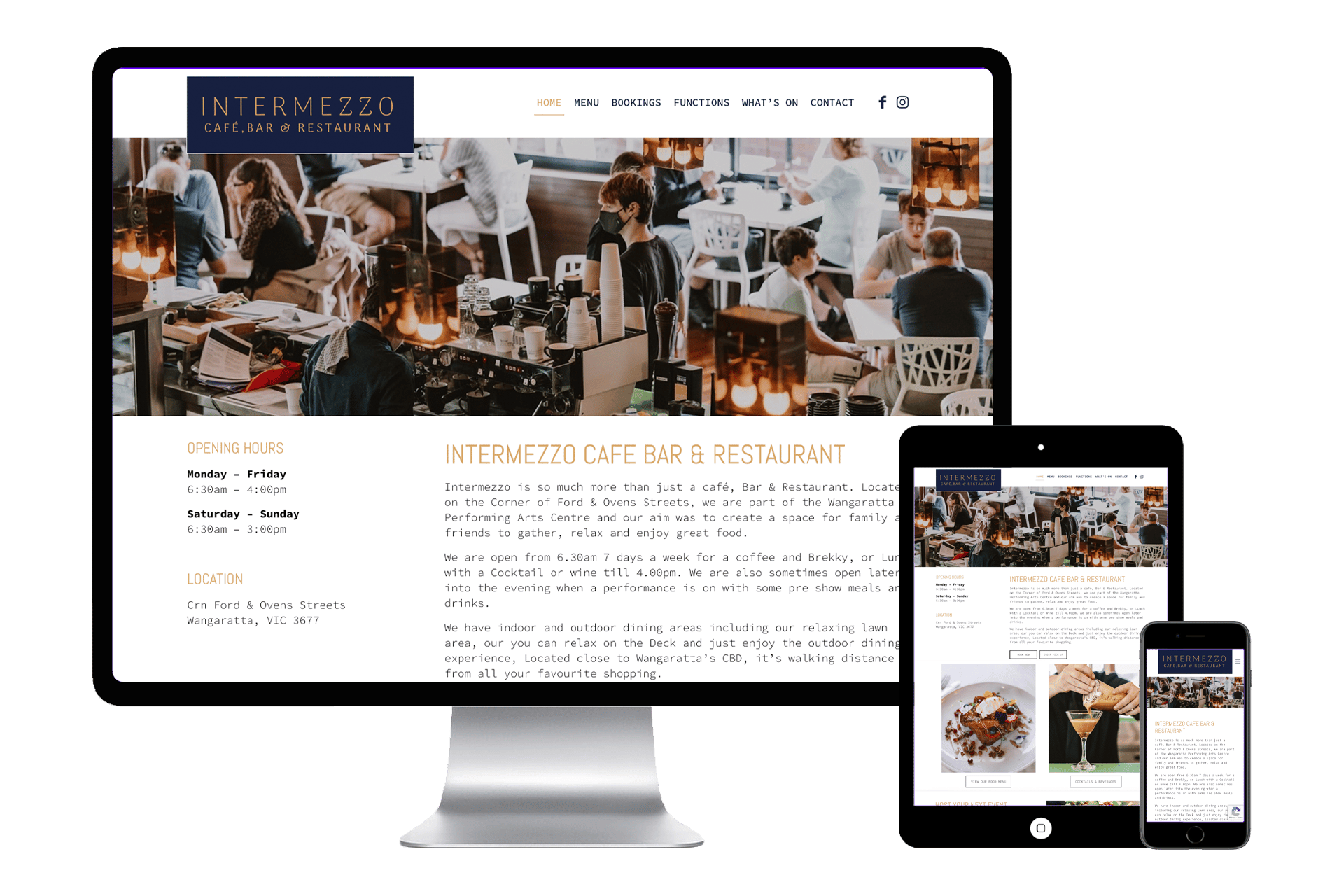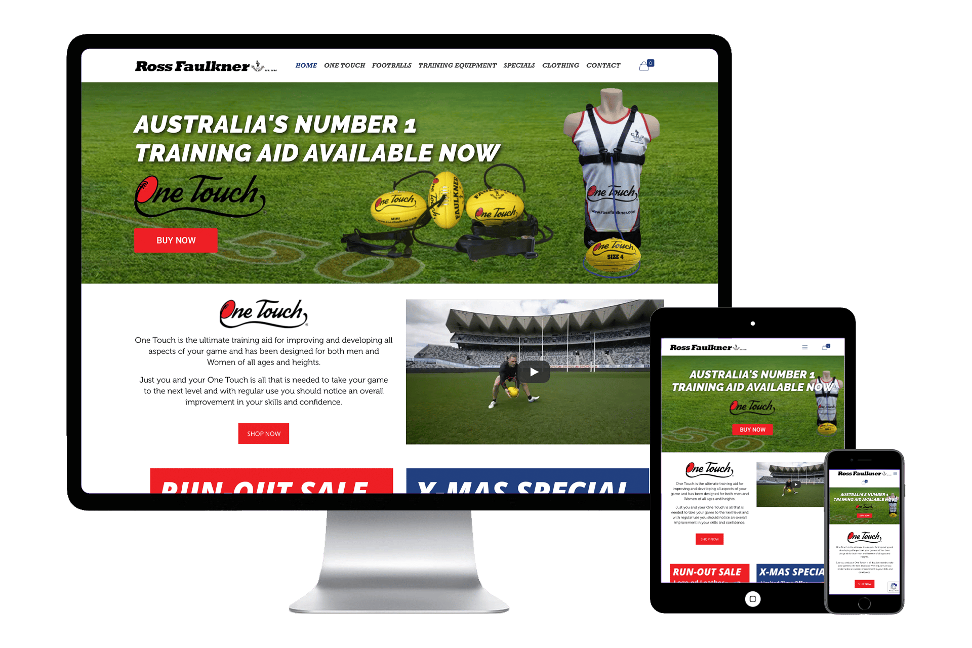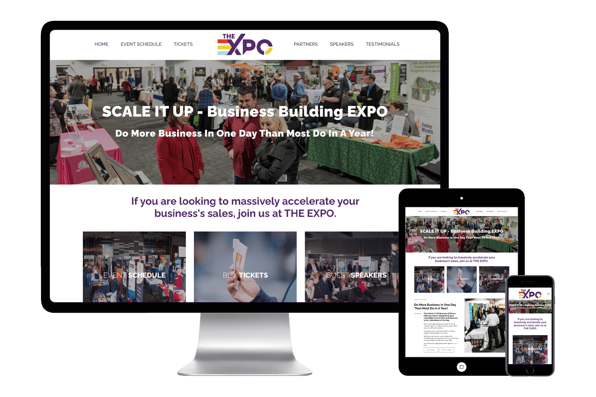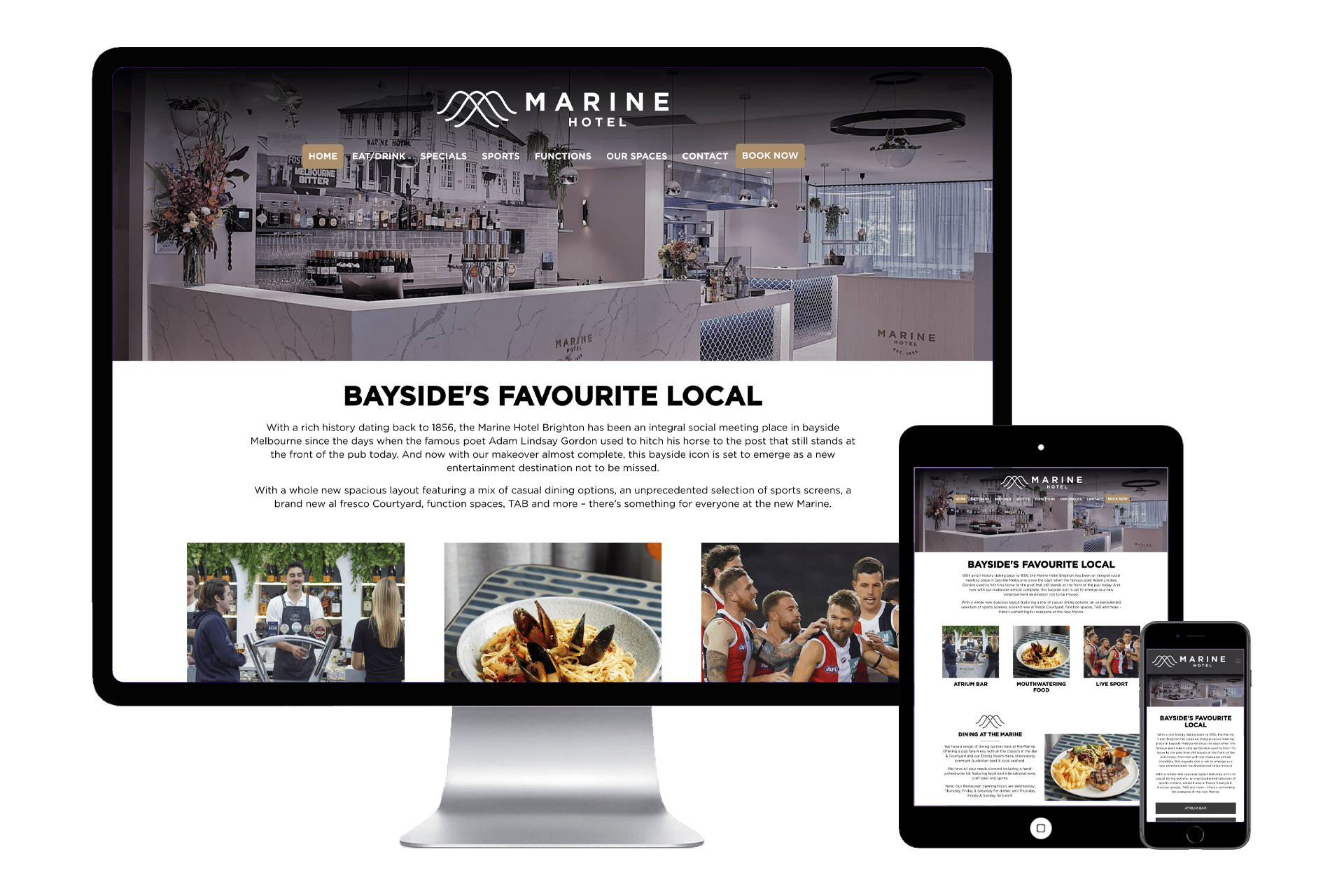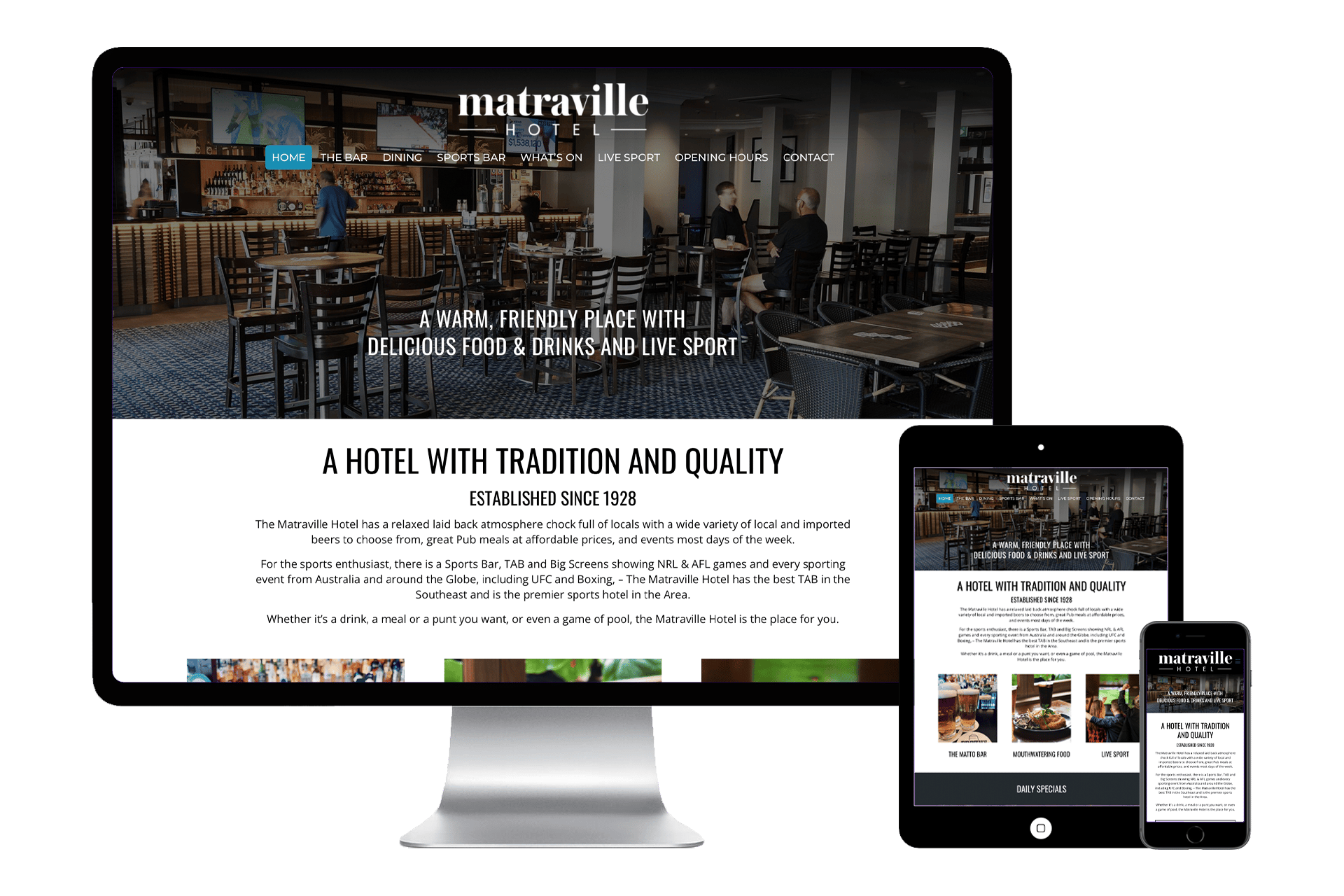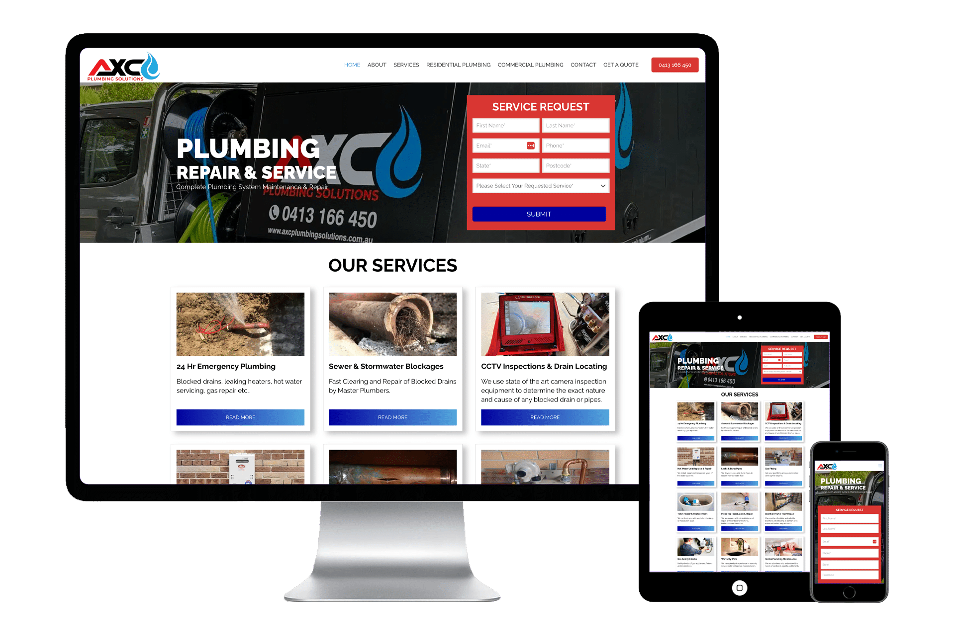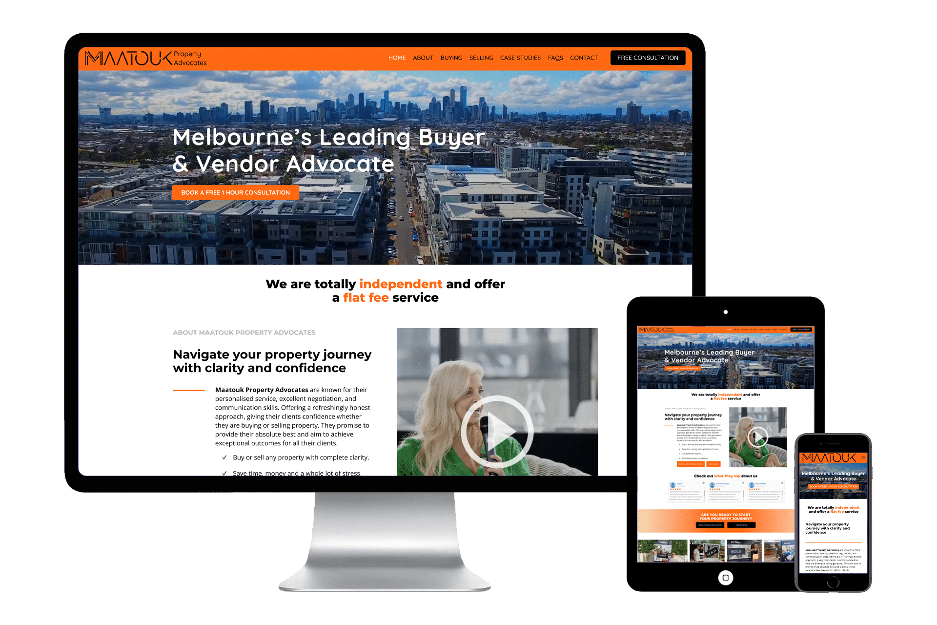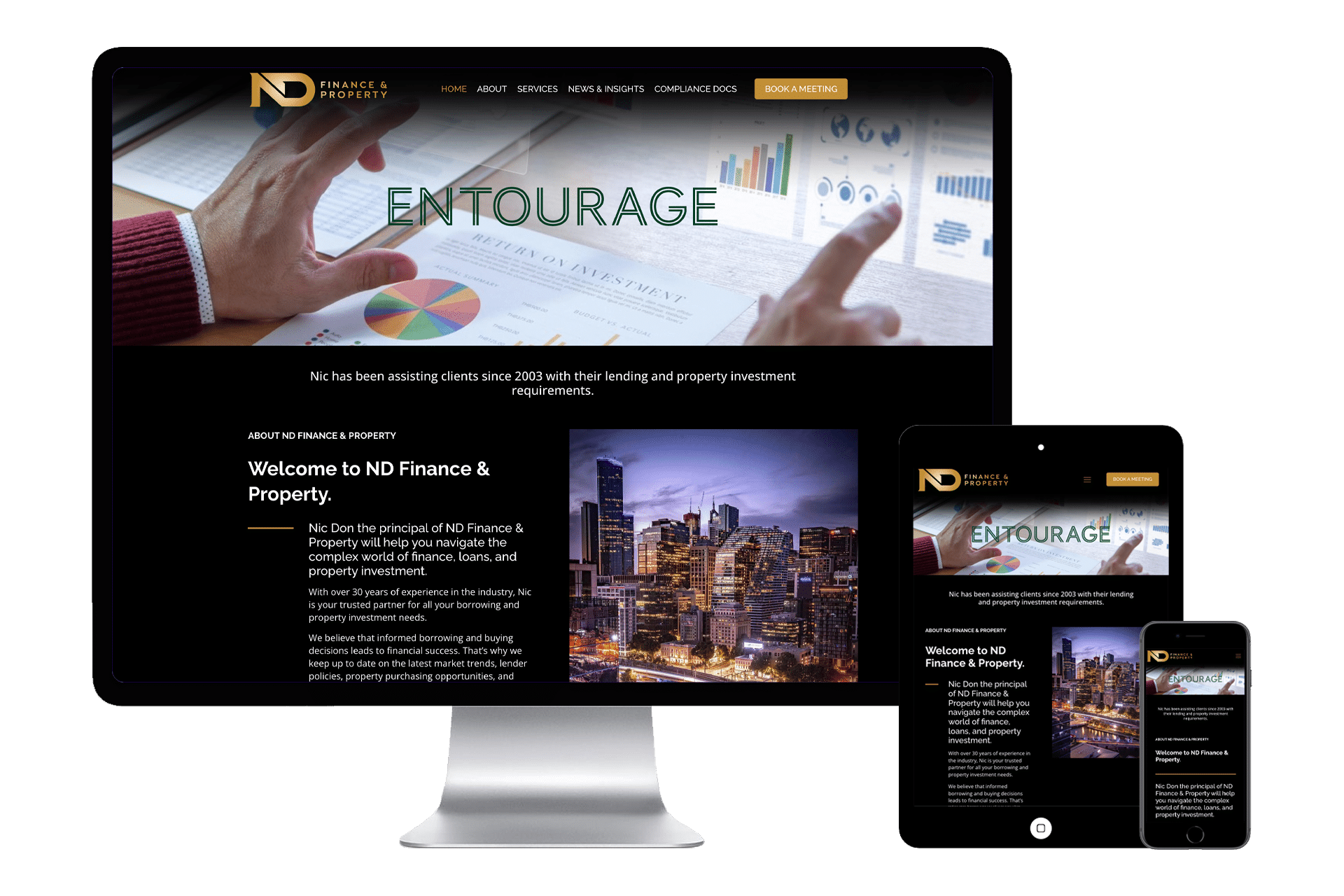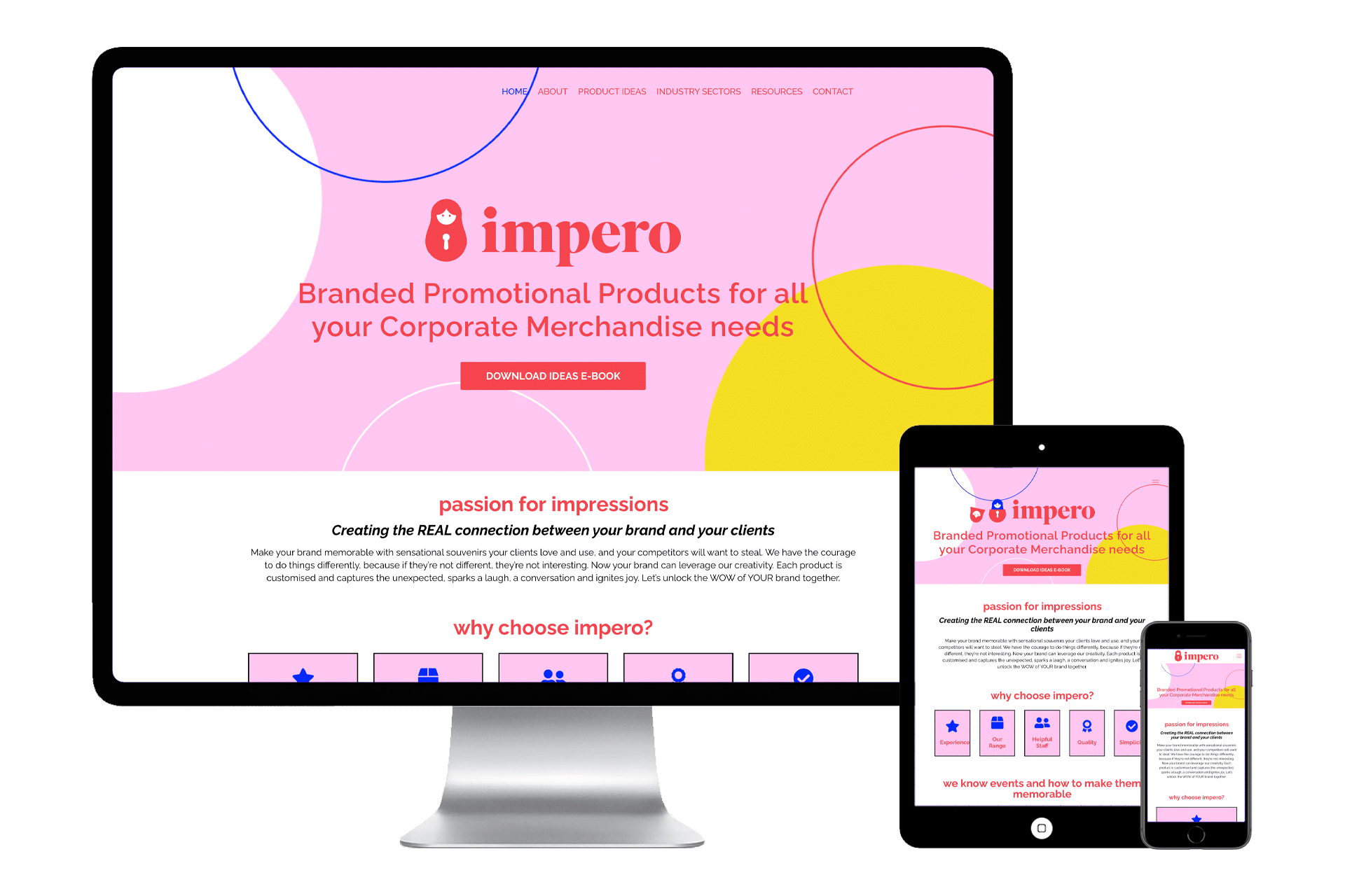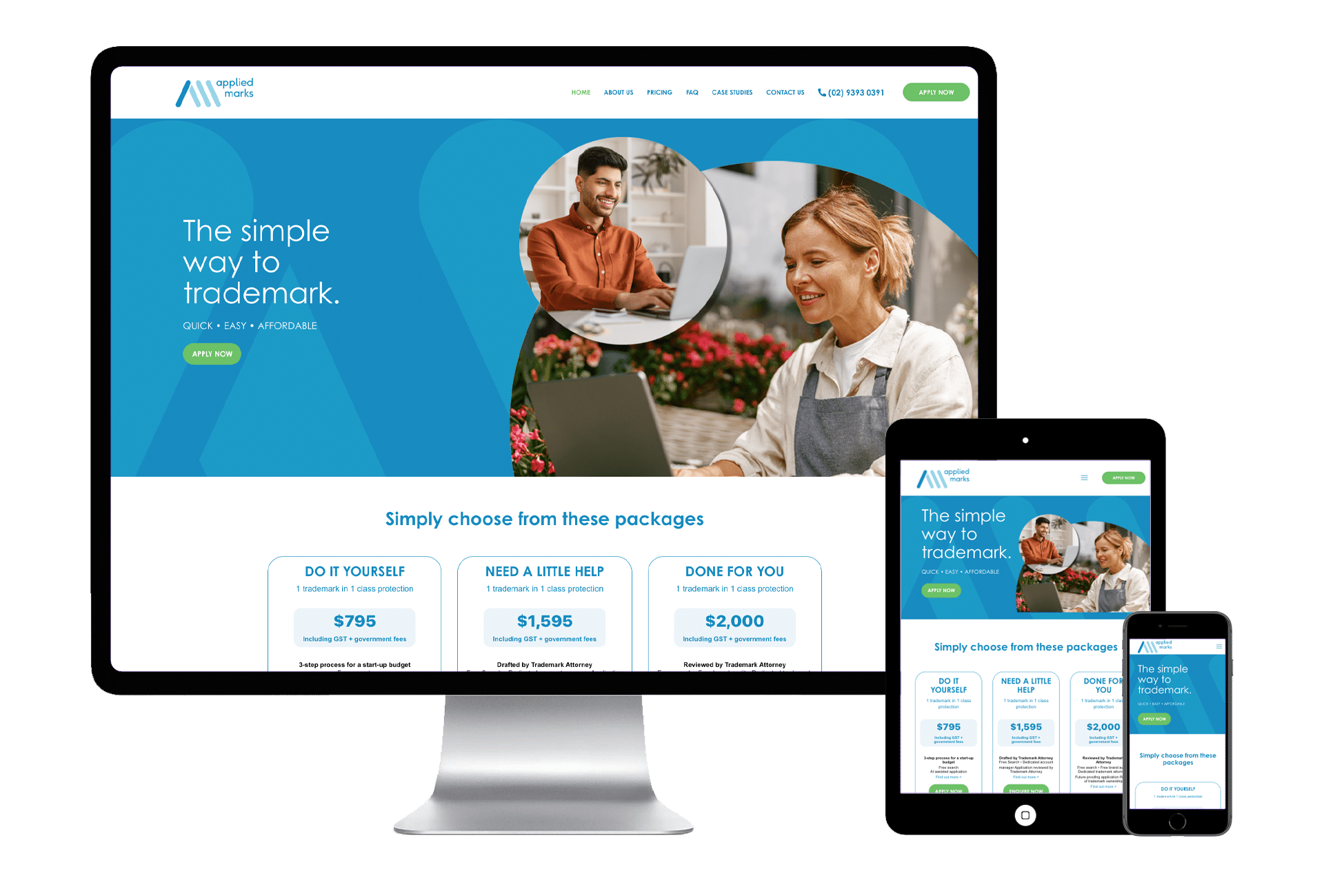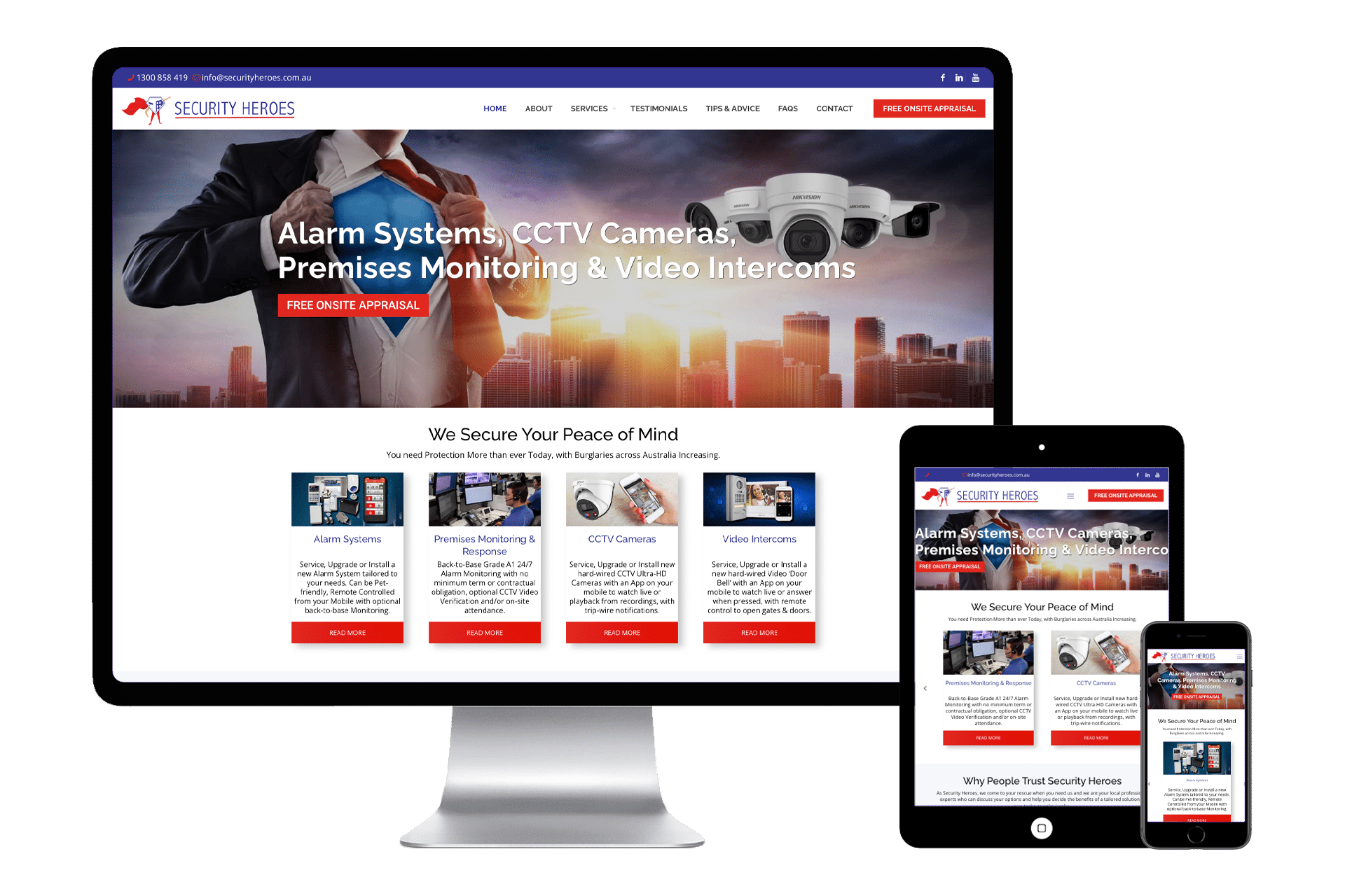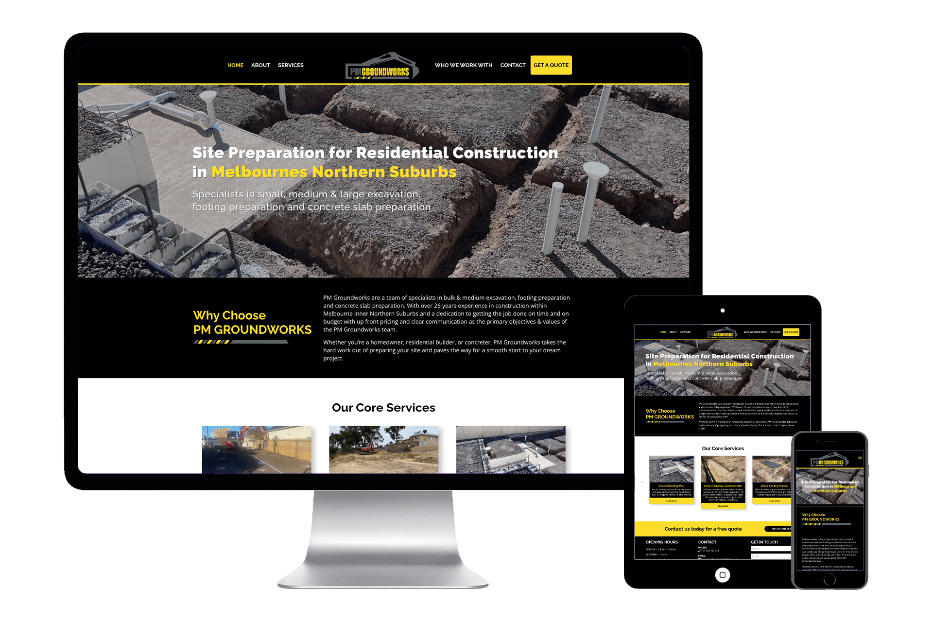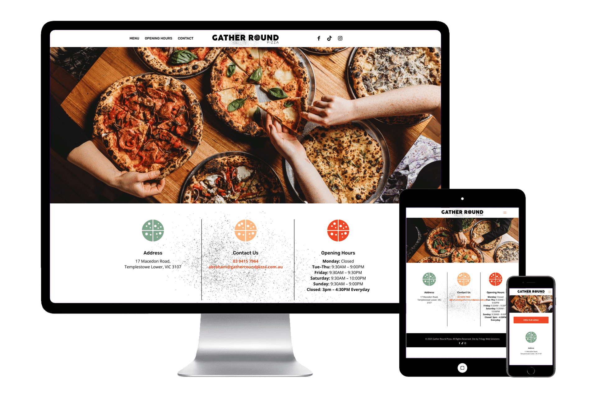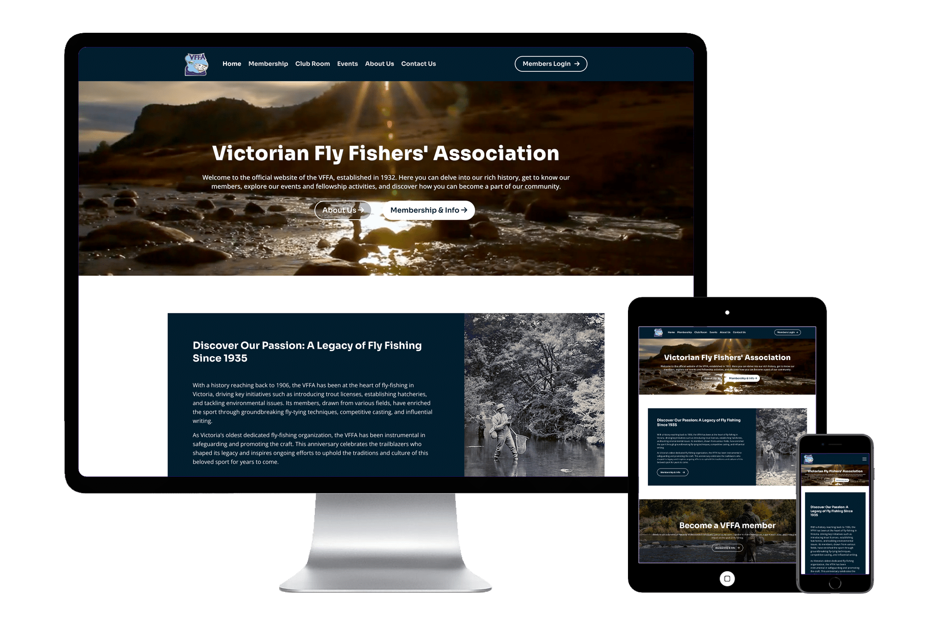
The 8 Core elements your home page Must have to convert visitors into leads
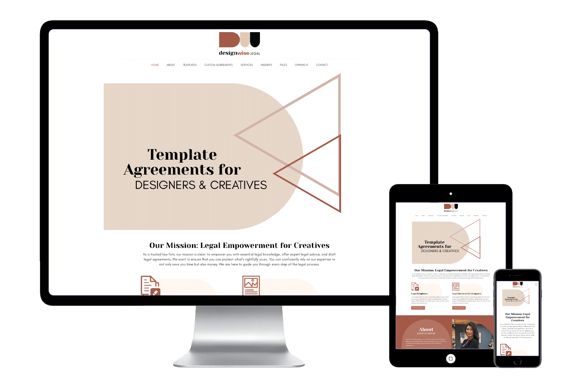
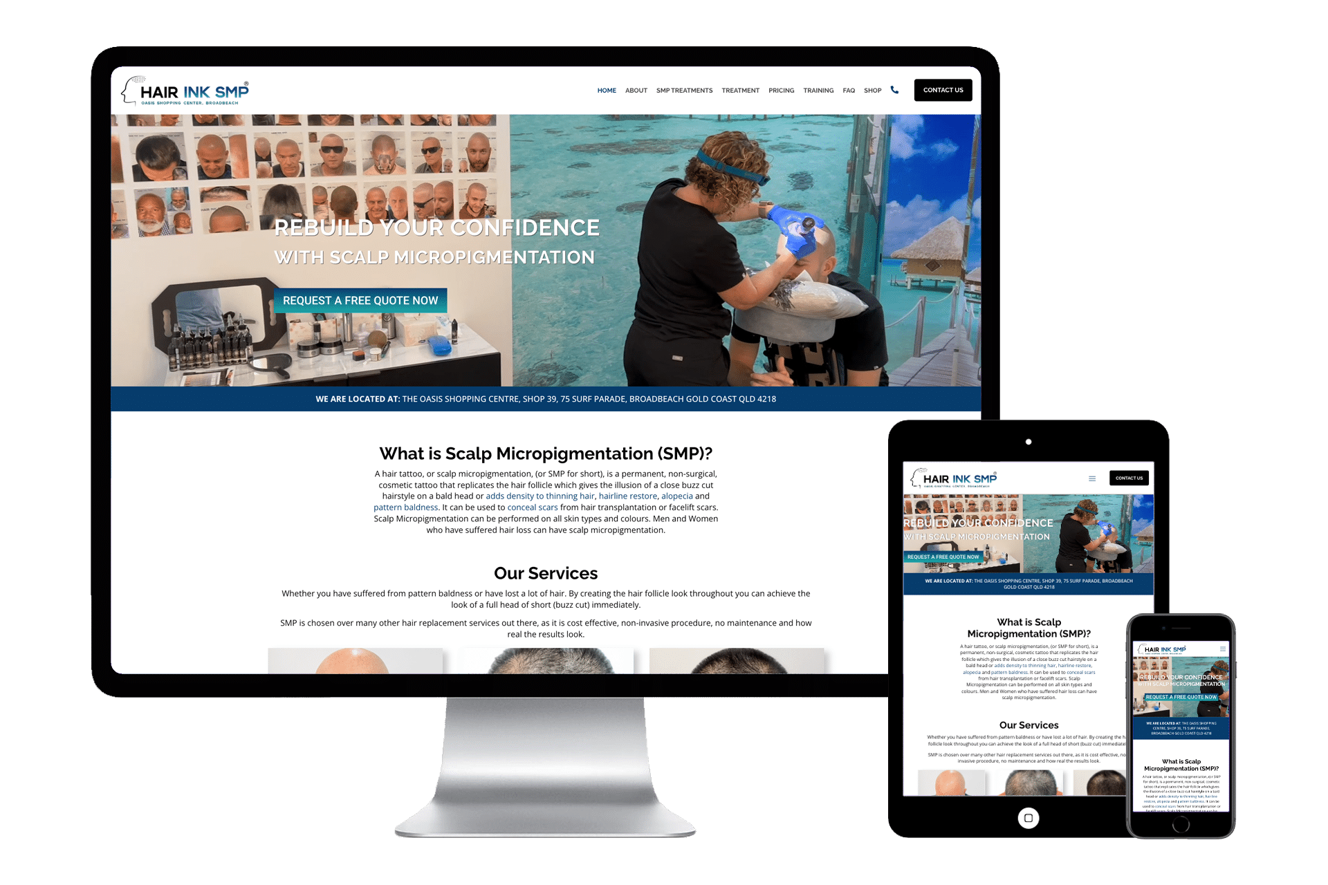
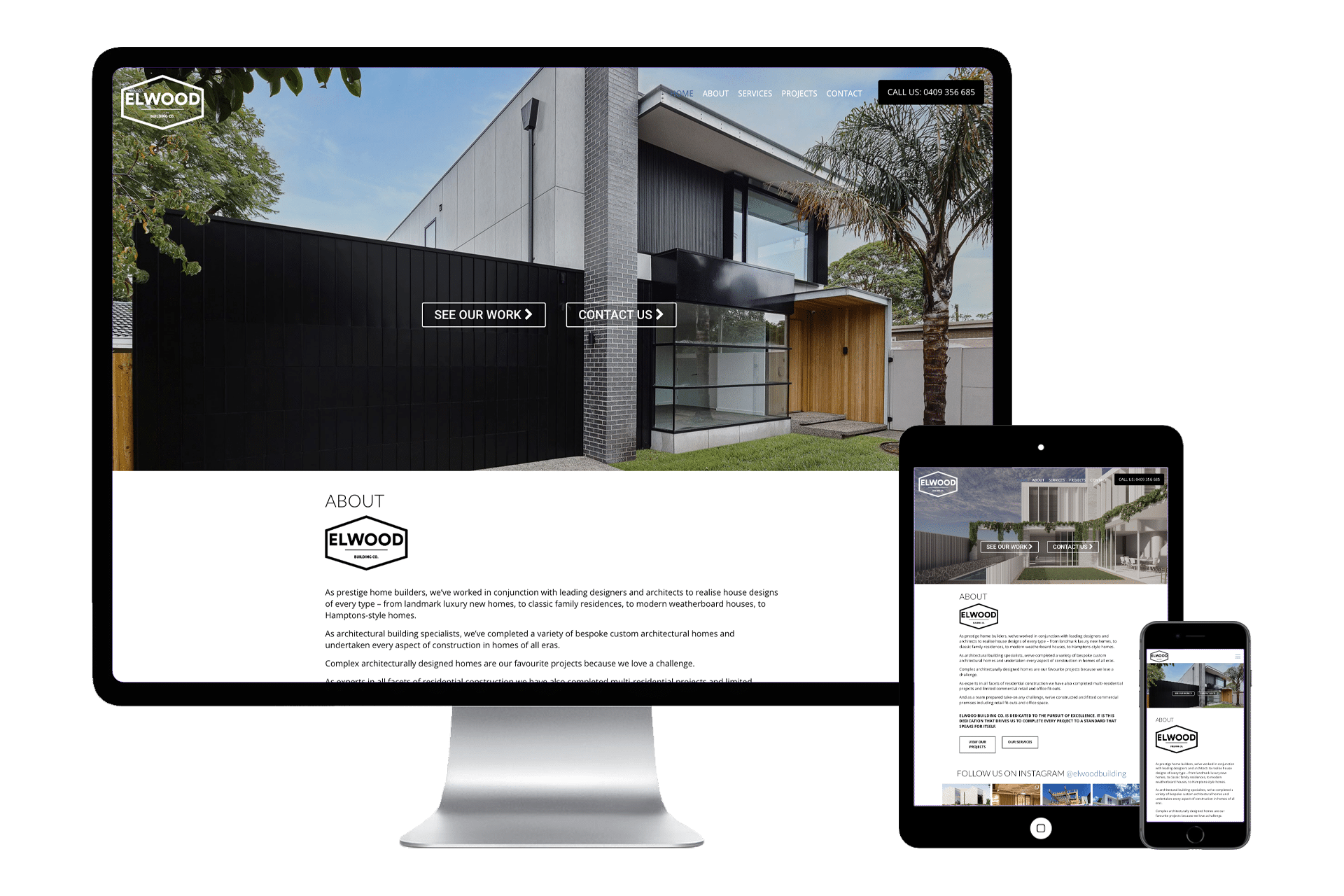
A high-converting homepage acts like a digital storefront — it must grab attention, build trust, and guide visitors toward taking action.
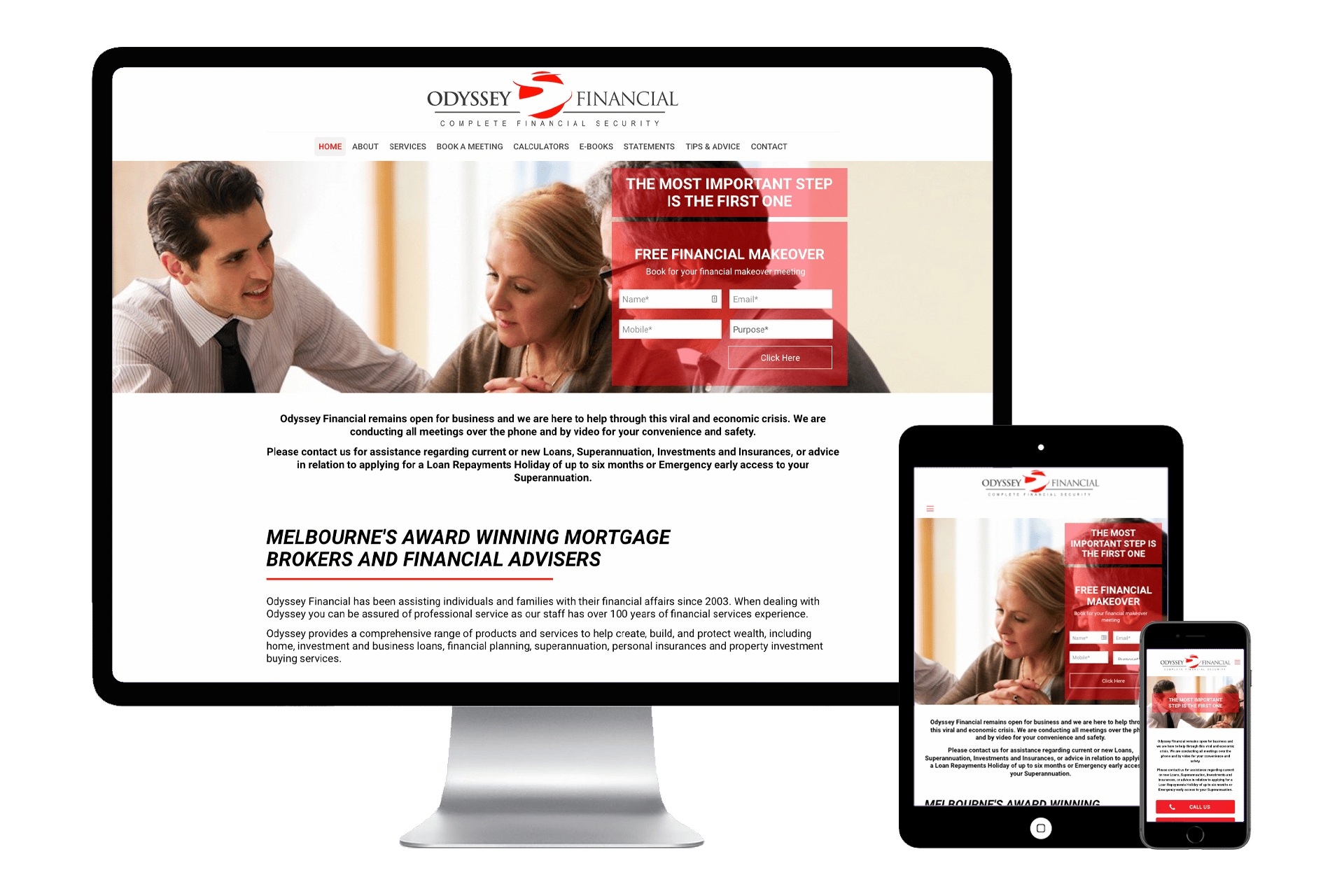
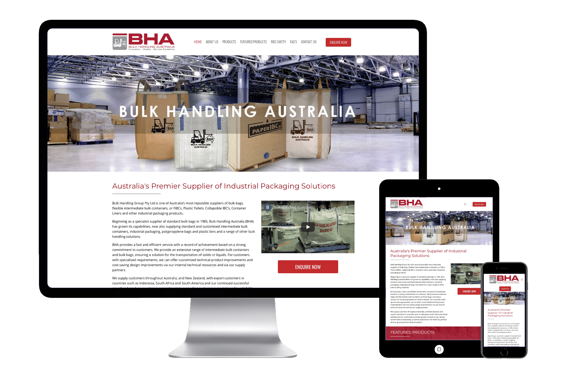
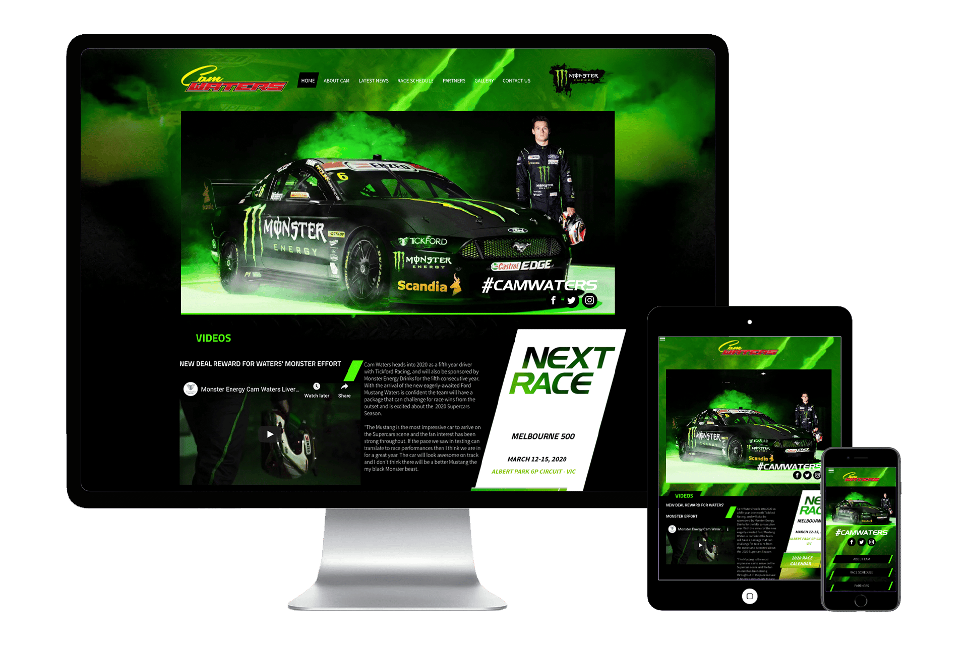
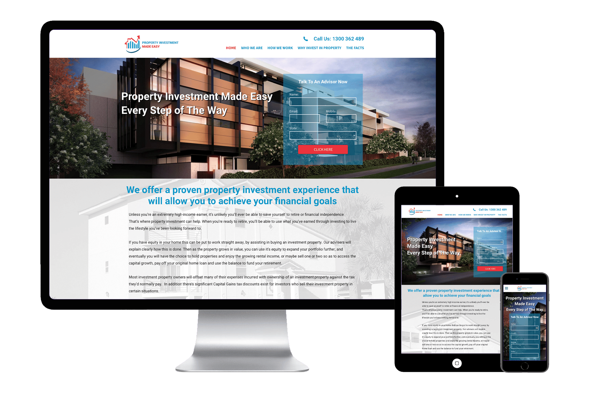
Here is what Trilogy consider to be the 8 most important components a homepage should have to convert visitors into solid leads,
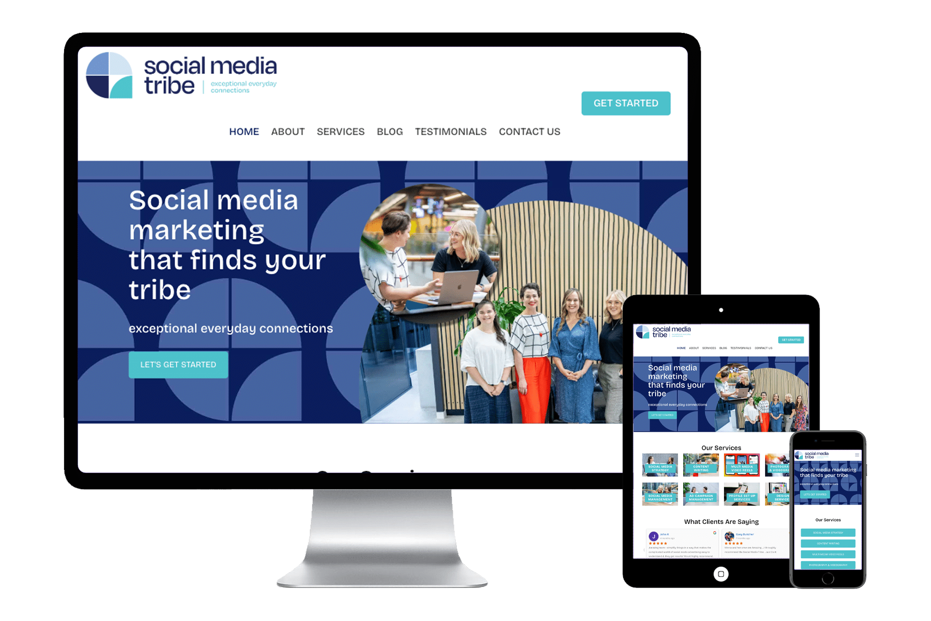
1. Clear Value Proposition (Hero Section)
Purpose: Immediately tell visitors what you offer, how it benefits them, and why they should care.
Elements:
• A powerful headline
• Sub headline with key benefits or differentiators
• Supporting image or short video
• Call-to-Action (CTA)
Test: Could a new visitor know what you do in 5 seconds or less?
2. Primary Call-to-Action (CTA)
Purpose: Guide visitors toward the next step (e.g., “Get a Free Quote”, “Schedule a Demo”, “Sign Up for Free”, “Book a Free Consultation”). If you don’t tell visitors what you want them to do, then they probably won’t do it, so be VERY clear what it is you want the visitors to your website to do.
Elements:
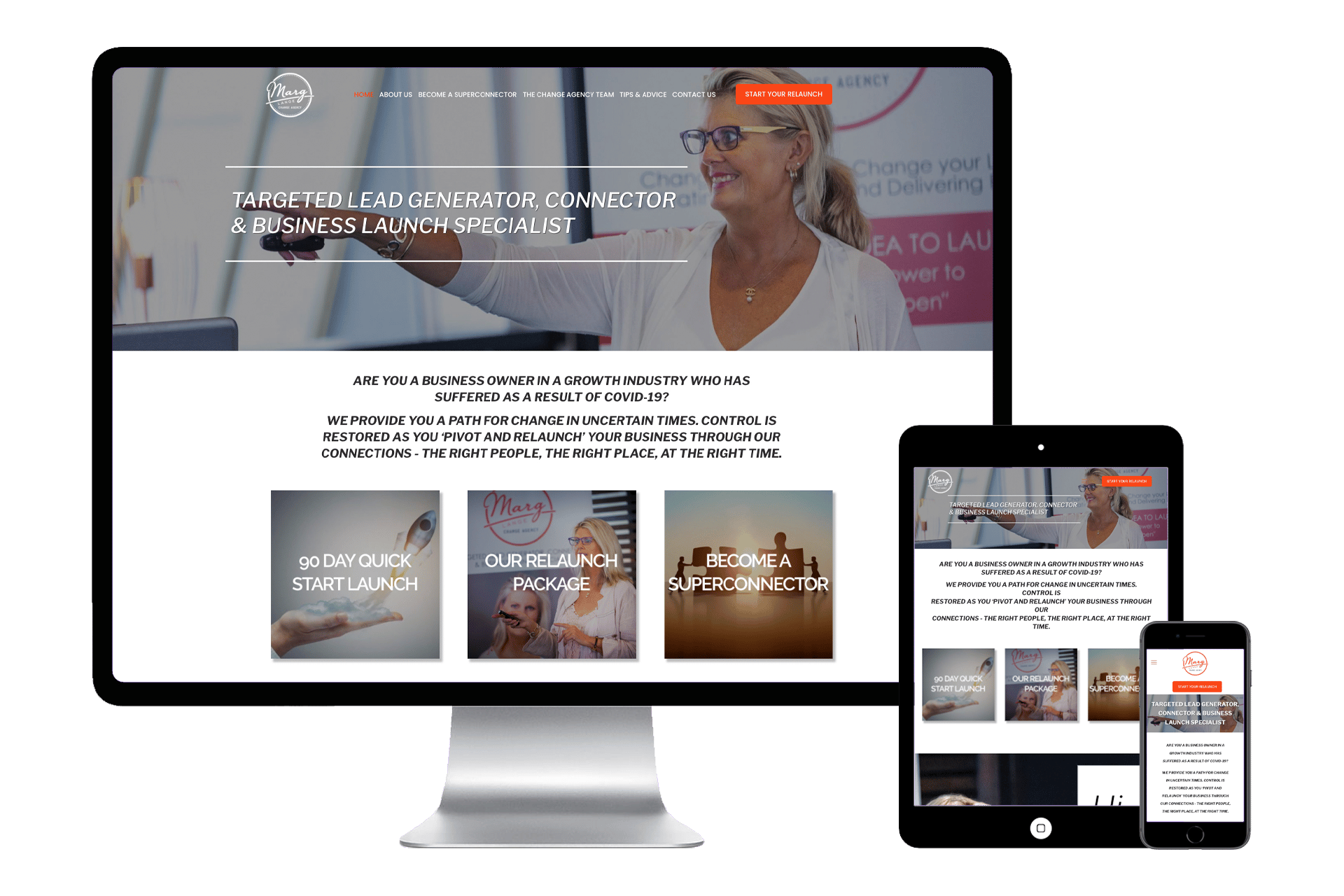
Prominent placement (above the fold and repeated throughout)
• Contrasting button color
• Action-oriented text
CTAs should match your most important conversion goal.
3. Social Proof (Trust Builders)(CTA)
Purpose: Build credibility and reduce anxiety around taking action.
Types:
• Testimonials
• Case studies
• Logos of companies you’ve worked with
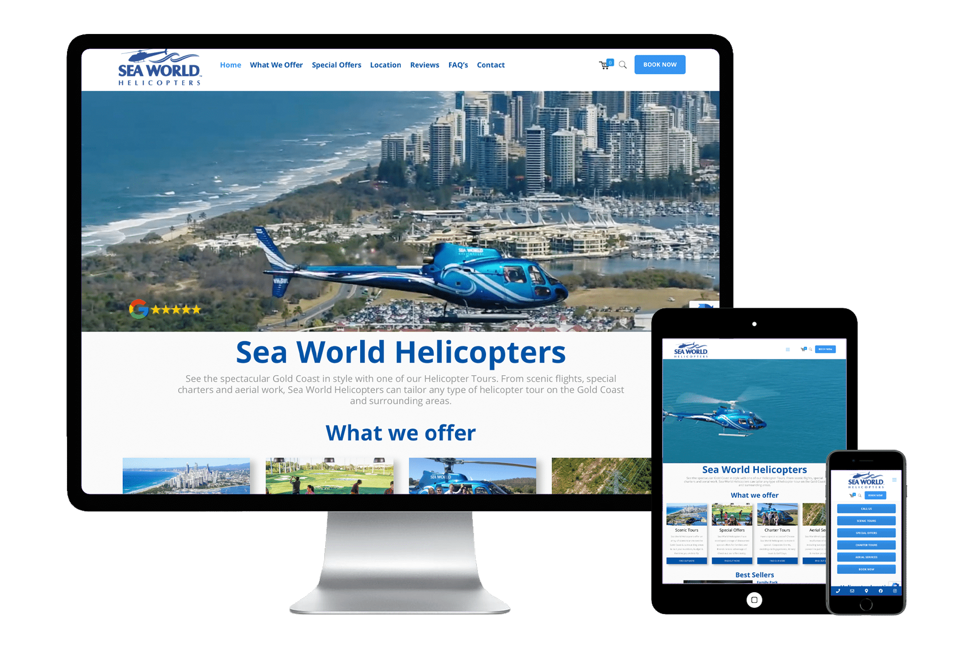
• Google Reviews and Star ratings
“If others trust you, I can trust you.”
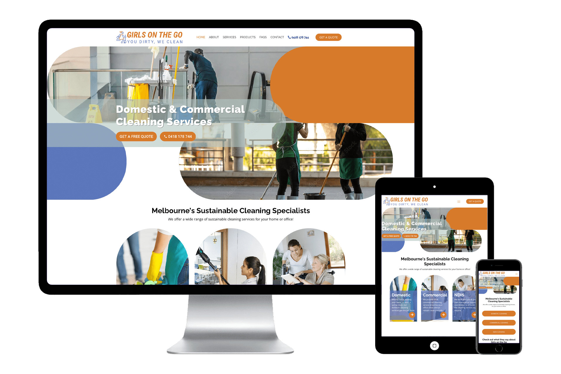
4. Overview of Services / Key Features
Purpose: Quickly communicate what problems you solve and how.
Structure:
• Bullet points or icons with brief descriptions
• Optional “Learn More” links.
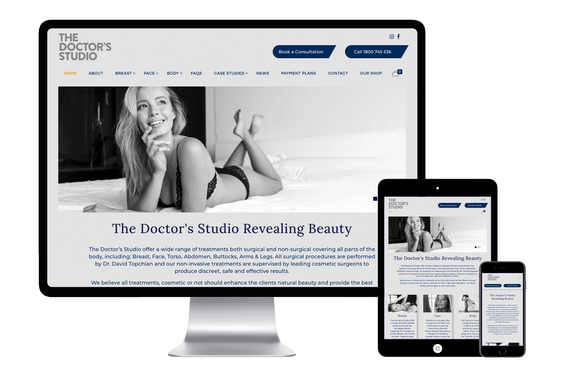
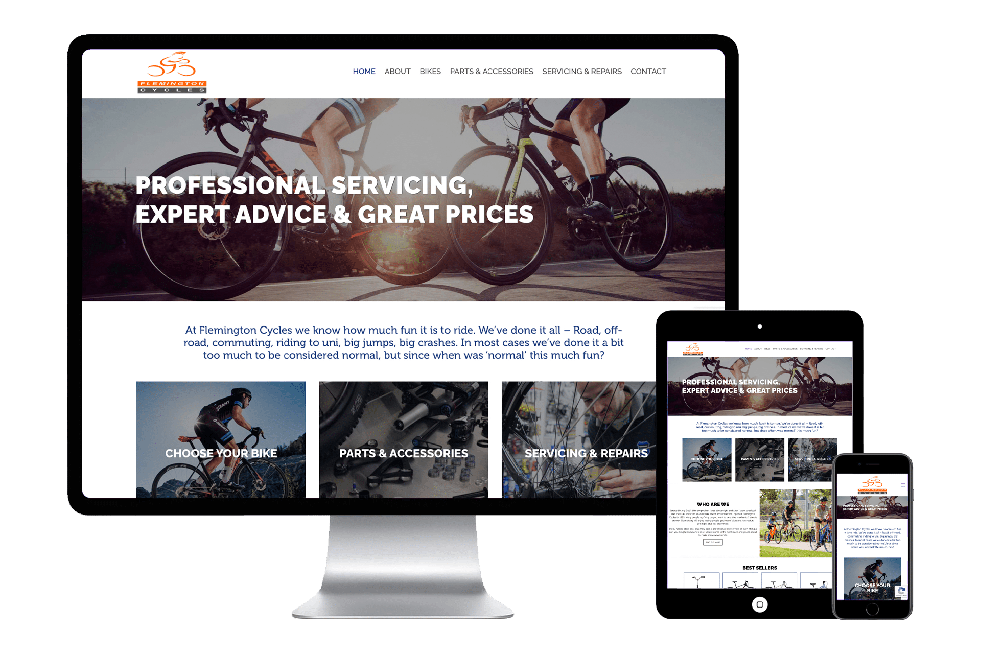
• Use images that showcase what each service offering is
• Have the name of each service over the top of each image.
Don’t overwhelm — keep it simple and scannable.
5. Lead Capture Form / Entry Point
Purpose: Turn traffic into leads by collecting visitor info.
Formats:
• Newsletter signup
• Contact form
• Free trial or download form
Offer something of value in exchange (lead magnet, free resource, etc.)
6. Navigation with Clear User Flow
Purpose: Help visitors find what they need with minimal friction.
Best Practices:
• Minimal top-level links (5–7 max)
• Logical hierarchy
• A CTA in the nav (e.g., “Contact Us” or “Book a Call”)
Avoid decision fatigue — guide, don’t confuse.
7. Visual & UX Design That Supports Clarity
Purpose: Make a strong first impression and keep users engaged.
Includes:
• Clean, modern design
• Mobile responsiveness
• Fast load times
• Consistent branding
Looks matter — but clarity and usability matter more.
8. Trust Signals & Guarantees
Purpose: Reduce objections and instil confidence.
Examples:
• SSL certificate (visible padlock)
• Money-back guarantees
• “As seen on…” media mentions
• Certifications or awards
Especially crucial for e-commerce, and service providers.
