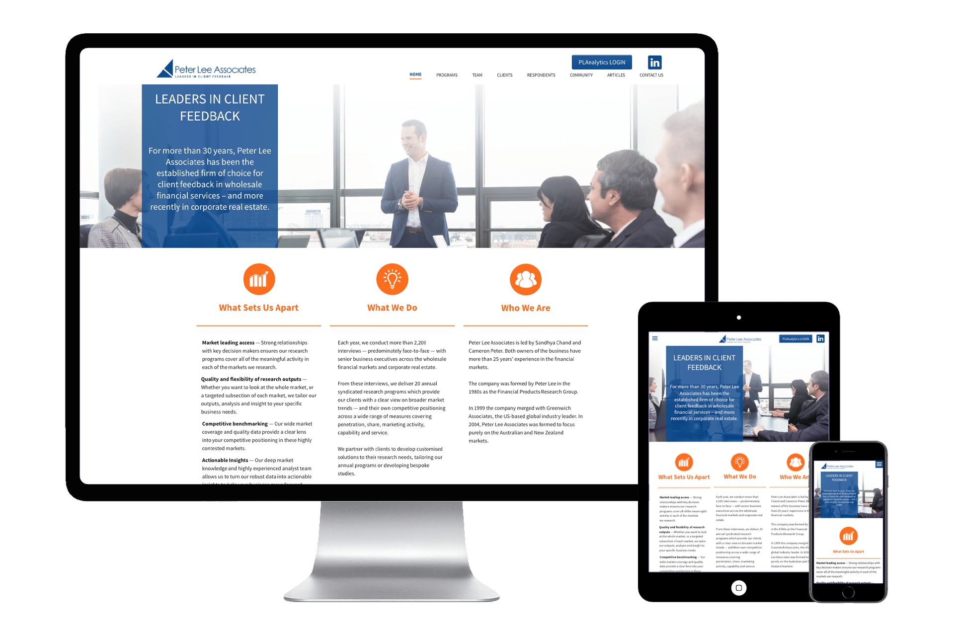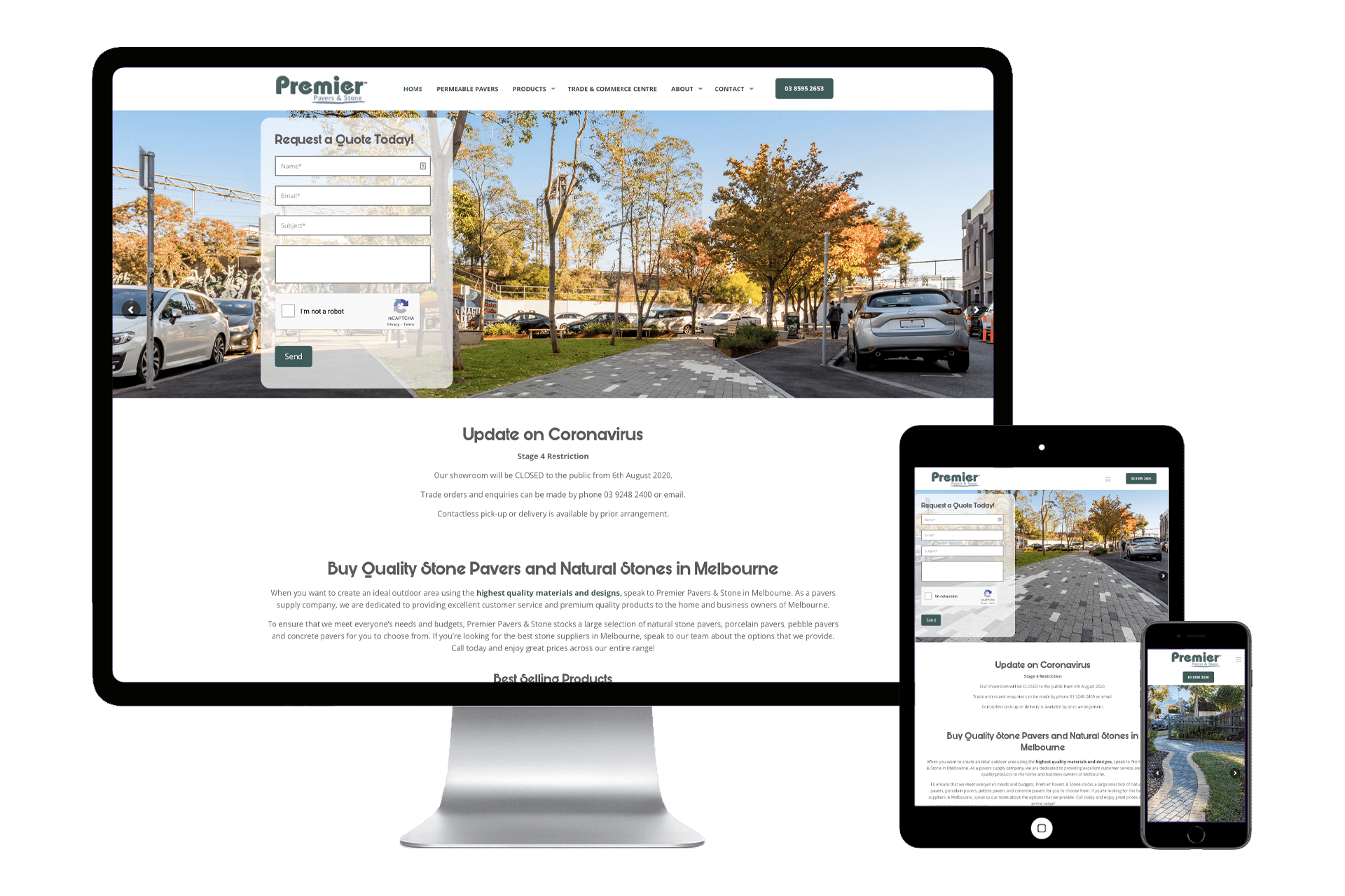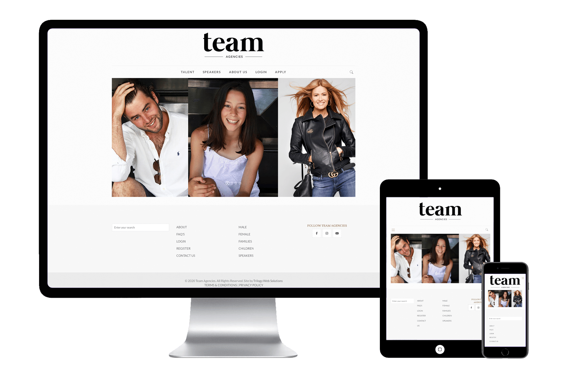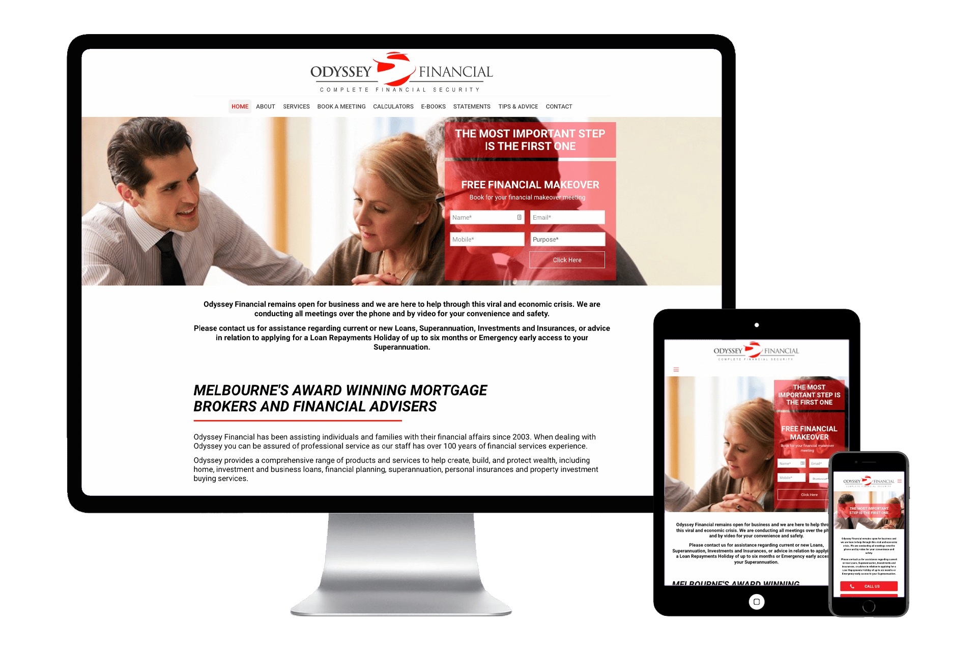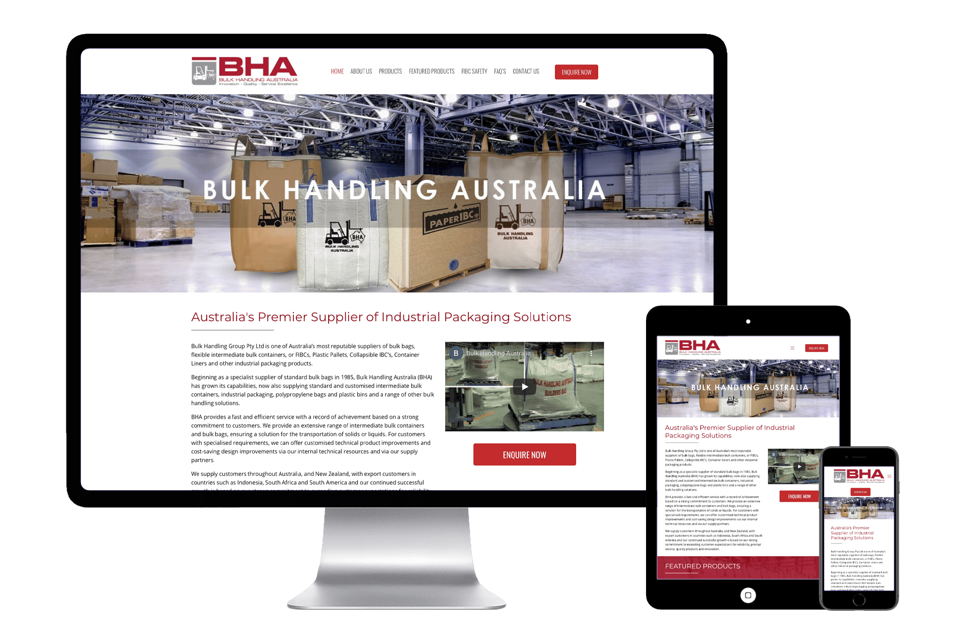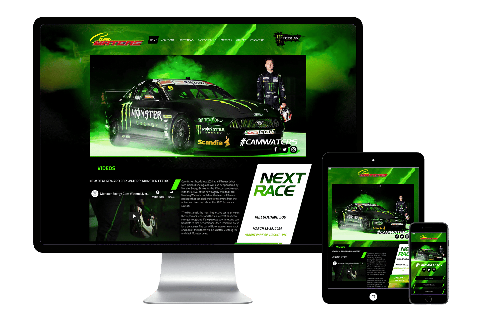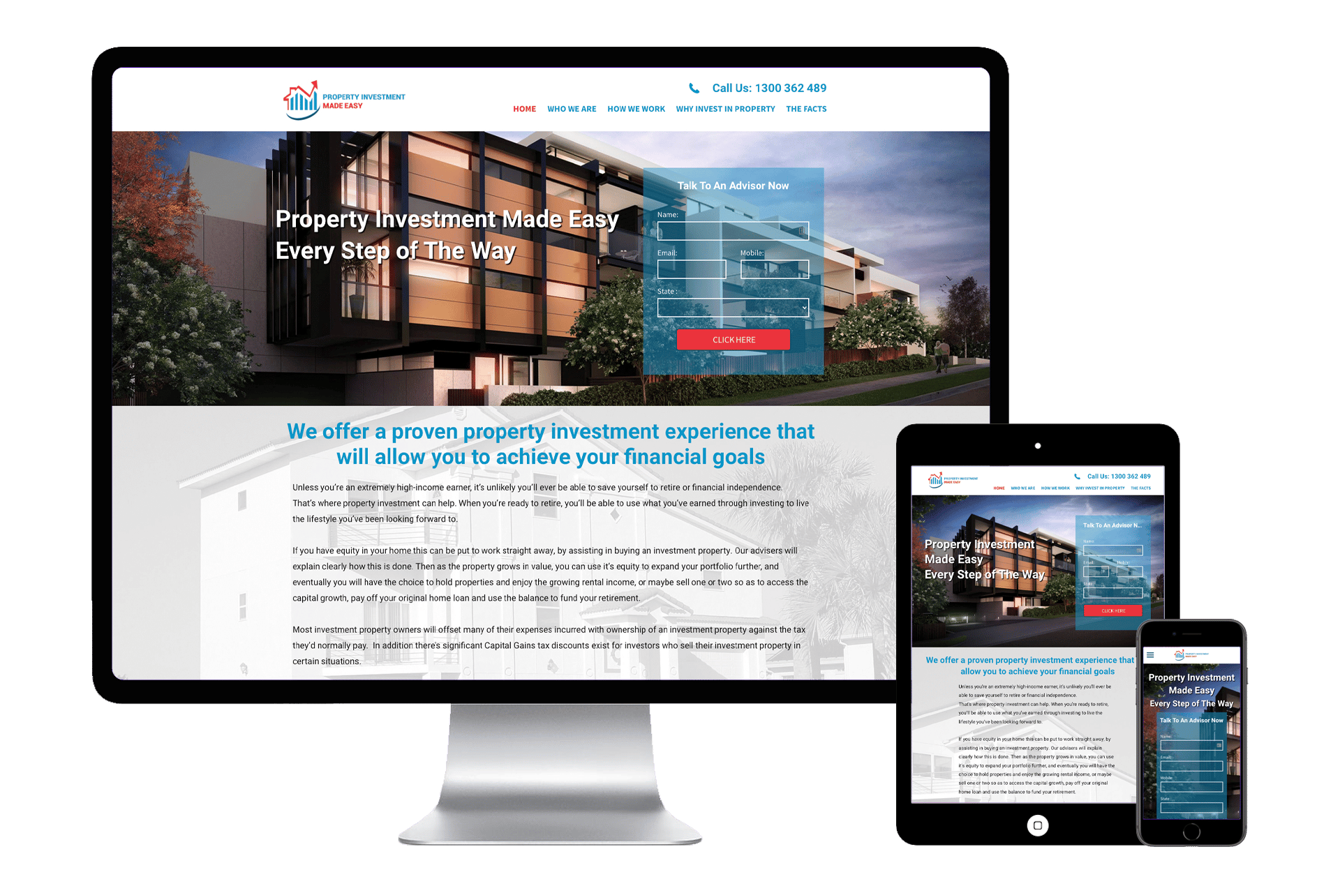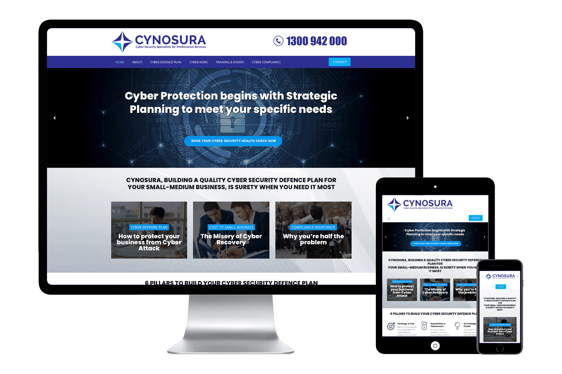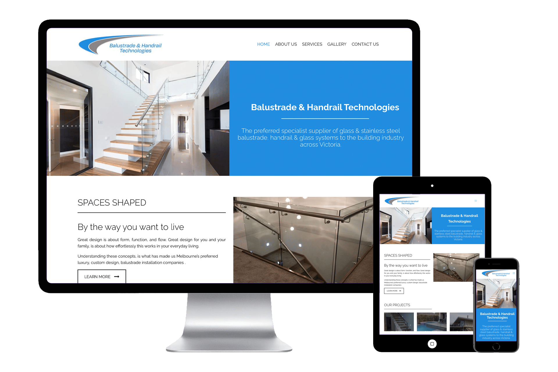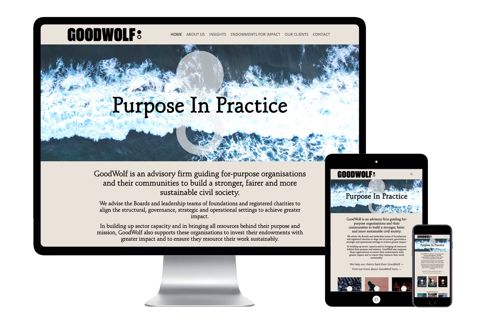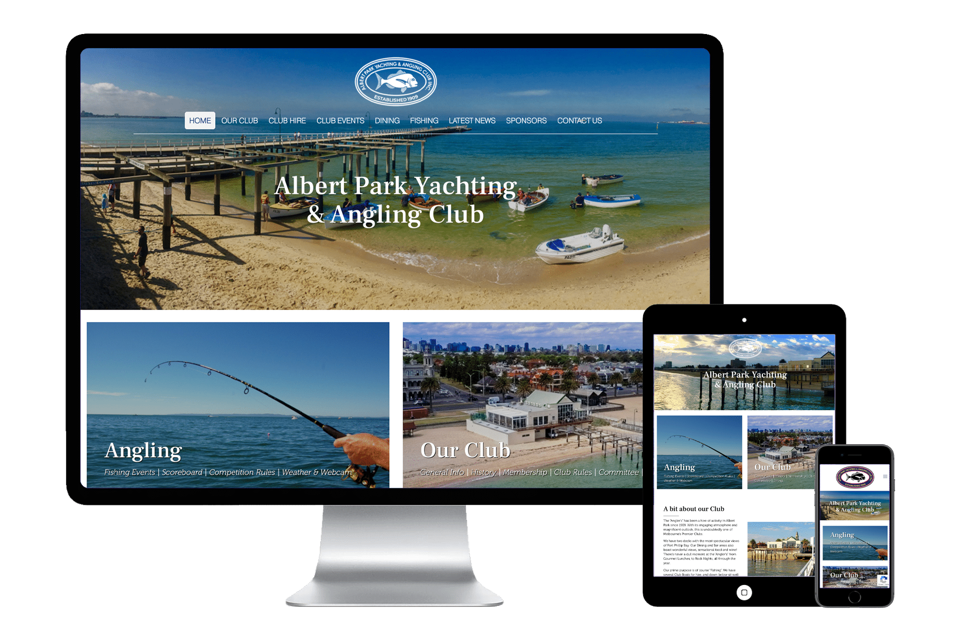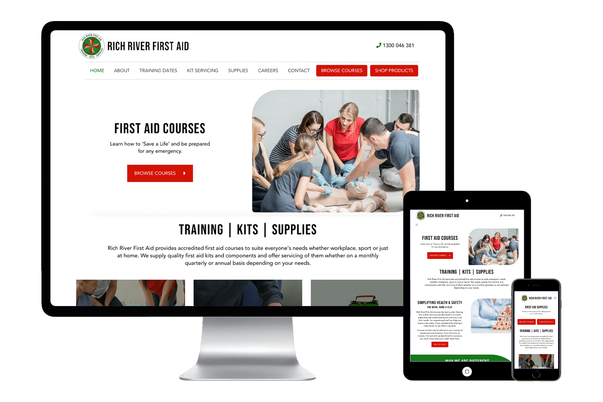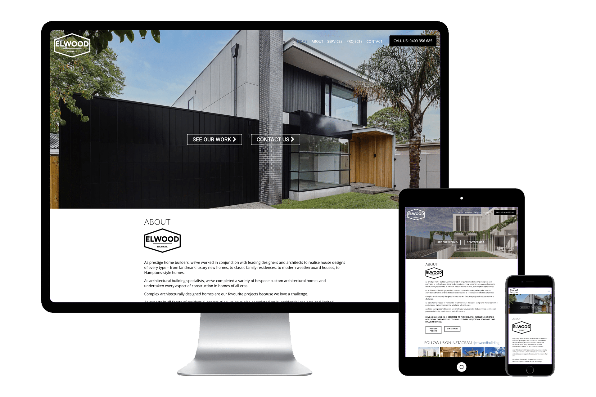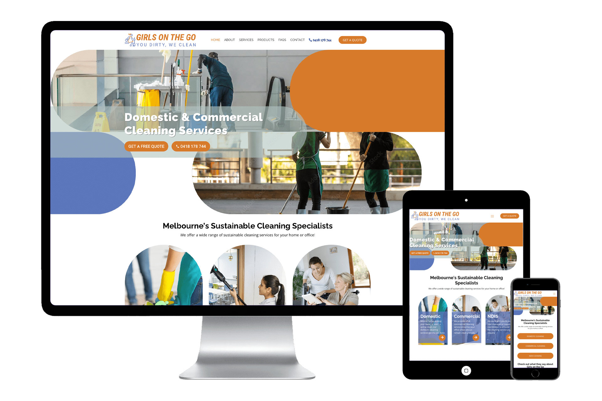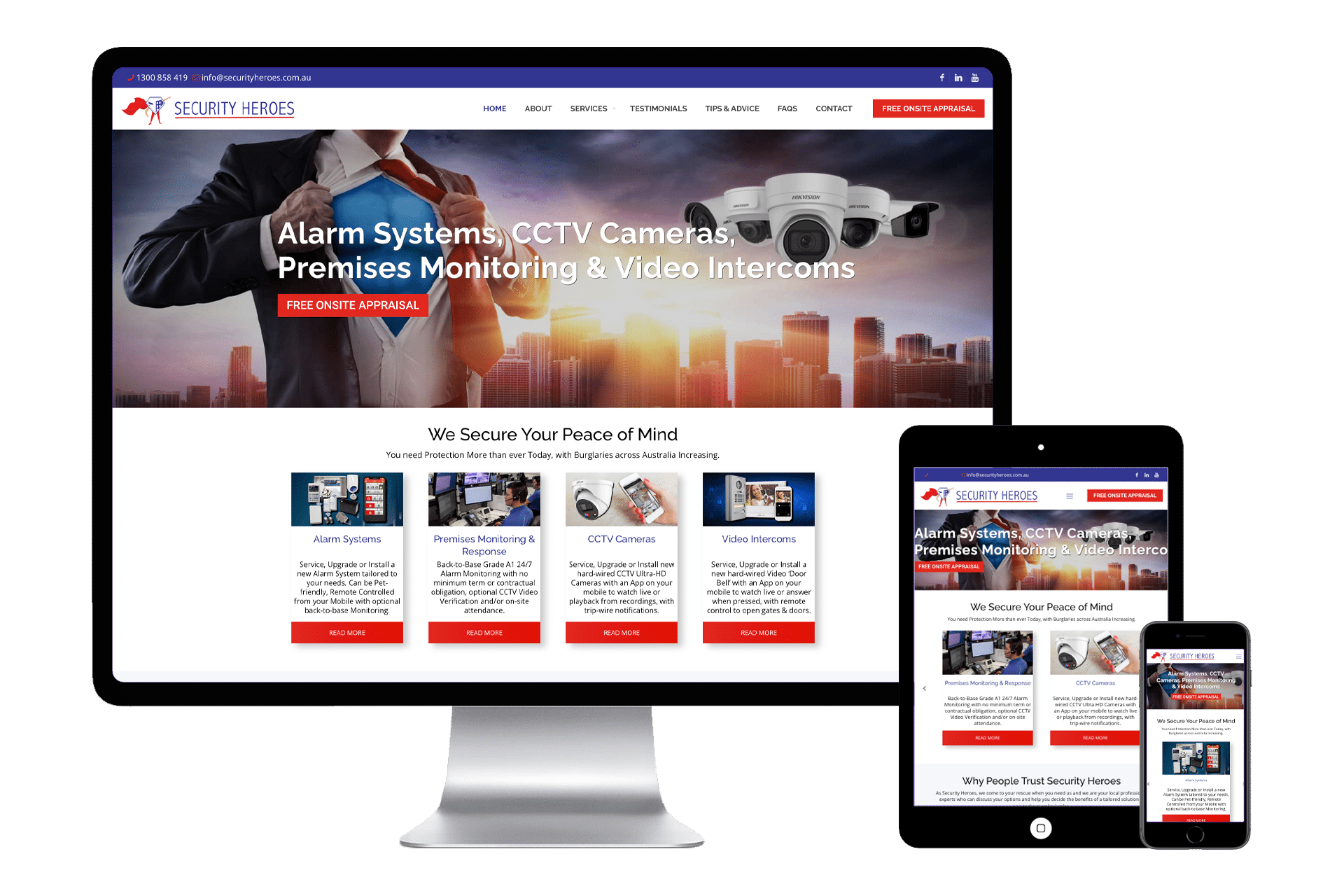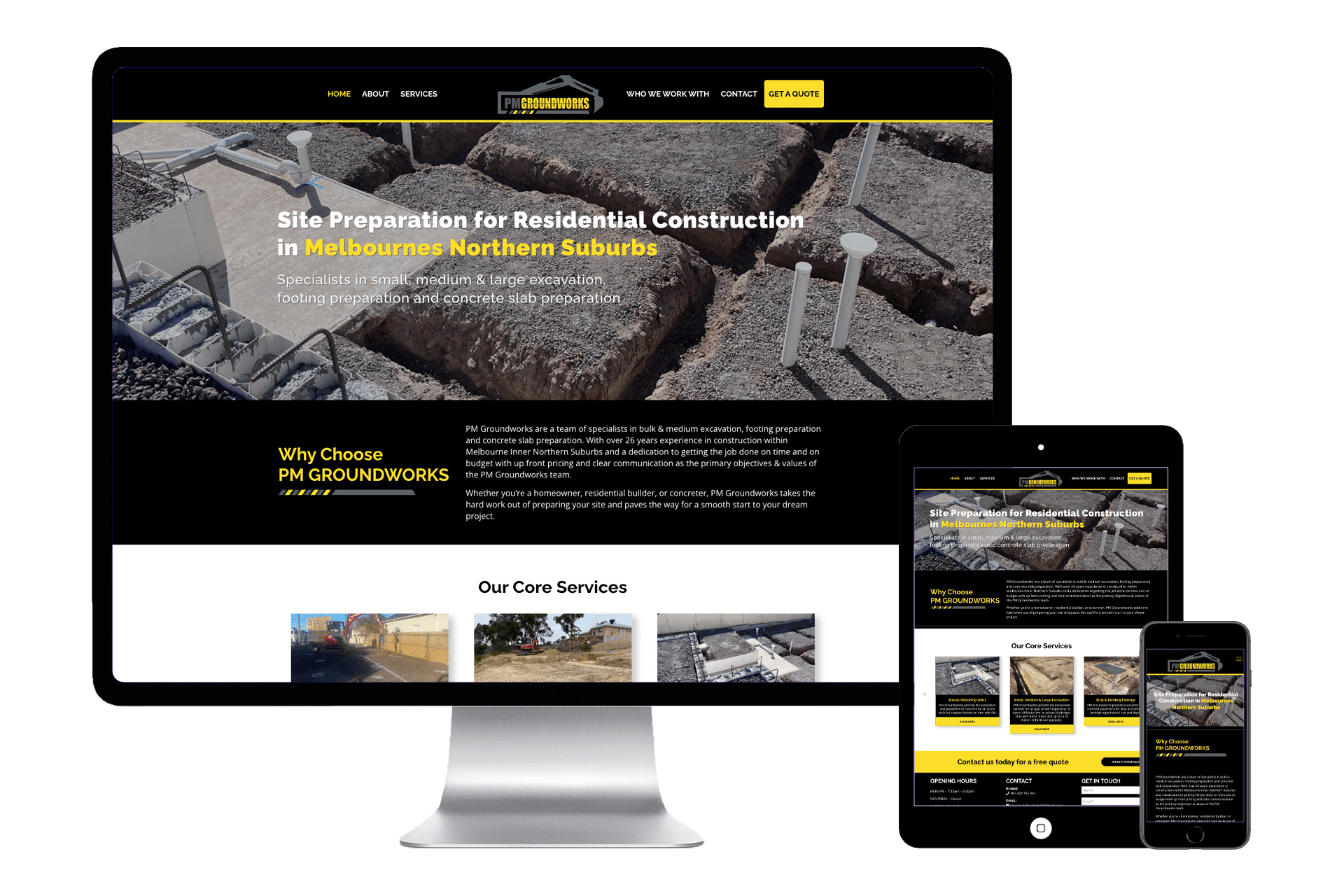
A very wise man once told me that if I can’t tell people what my business is all about in 30 seconds, I need to practice harder. Yes, this wise old man was describing what’s commonly referred to as, “The Elevator Pitch.”
So, what is it really? Well, good old Wikipedia tells us this: An elevator pitch, elevator speech, or elevator statement is a short description of an idea, product, company, or oneself that explains the concept in a way such that any listener can understand it in a short period of time. This description typically explains who the product/company is for, what it does, why it is needed, and how it will get done.
The whole idea is you should be able to do that in the same time it takes for an elevator ride, so between 30 seconds and two minutes.
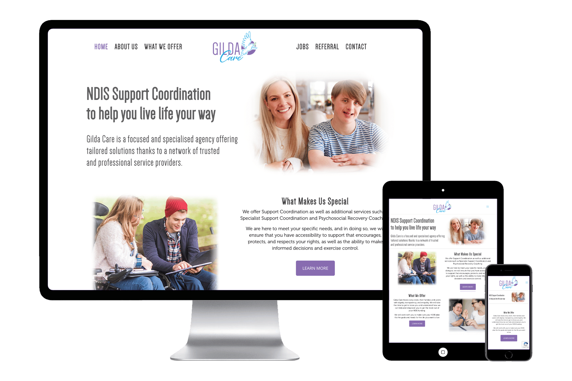
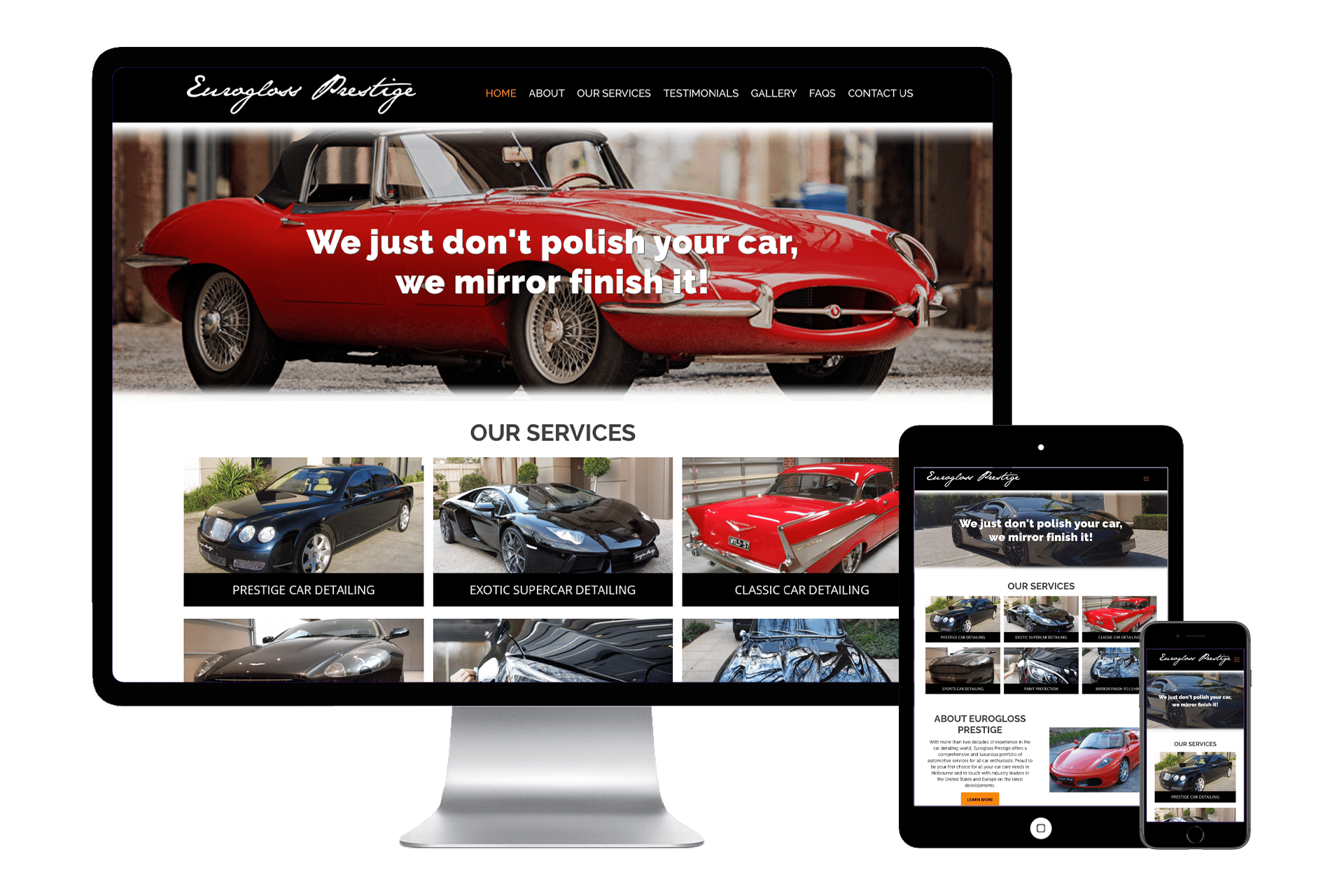
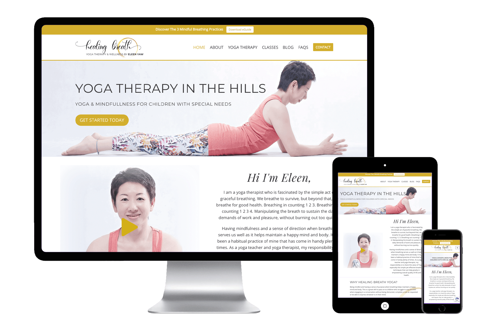
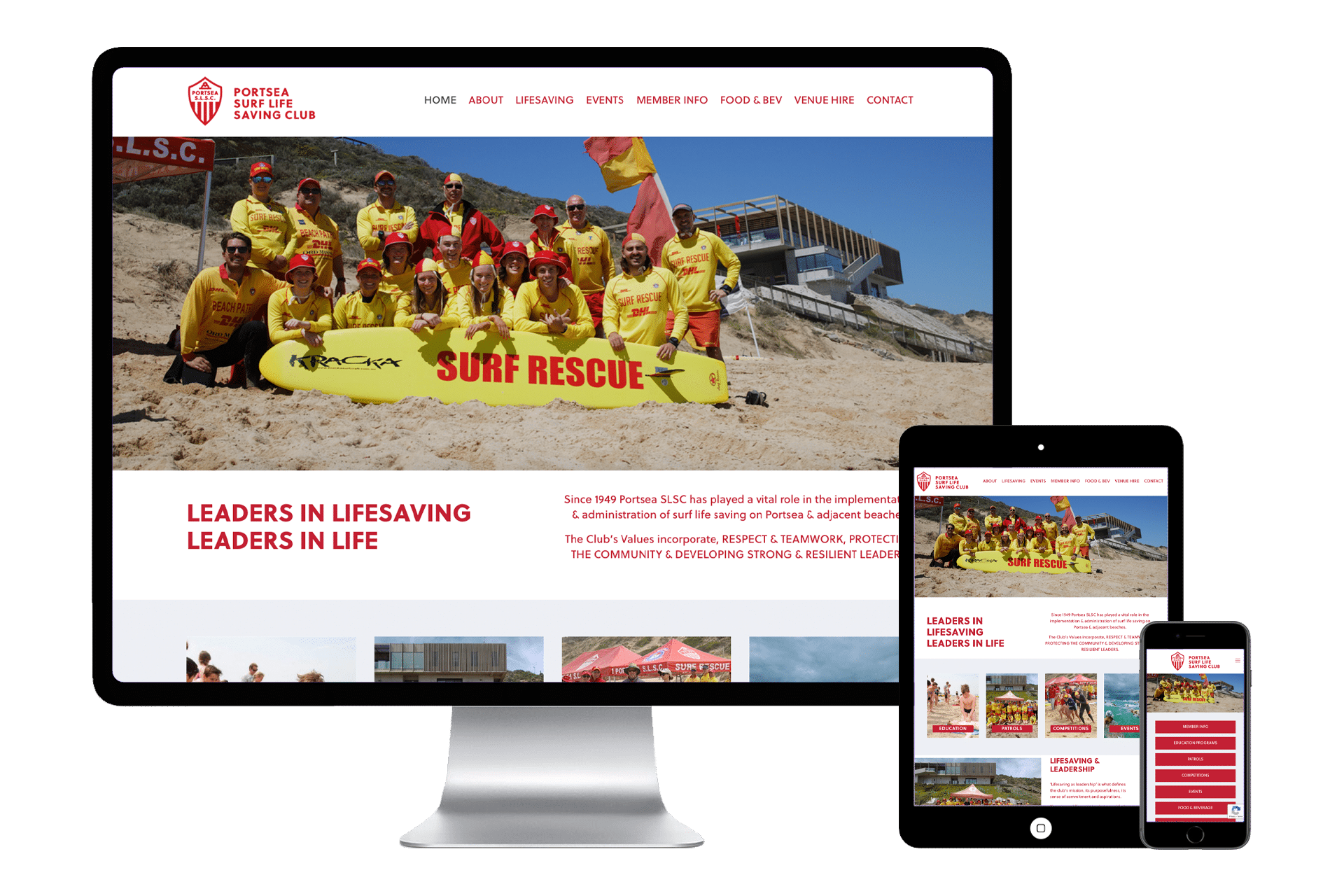
I thought a lot about that today. Why? Well, I look at literally hundreds of websites every month and today, you know what I thought? We have to get to the point where a website has to be like an elevator pitch, however with a website we have much less than 30 seconds. Some research will tell you only have 10 seconds before a visitor to your website will decide to either delve further or hit the “X” and get out of your website altogether.
I looked at a bunch of sites with that in mind. I was, to be honest, shocked!
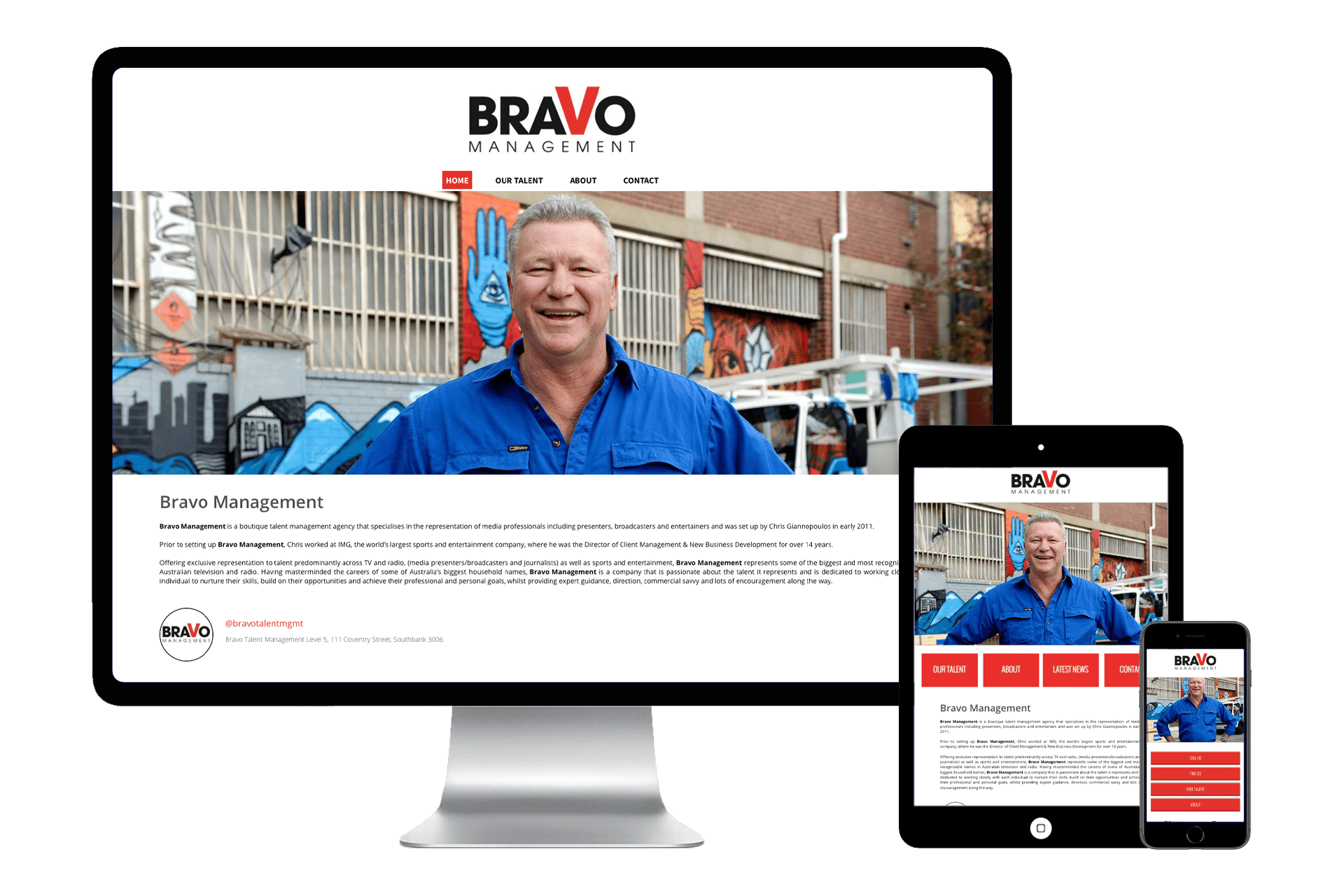
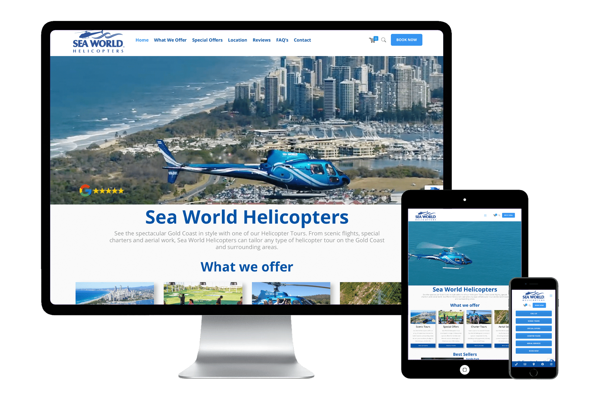
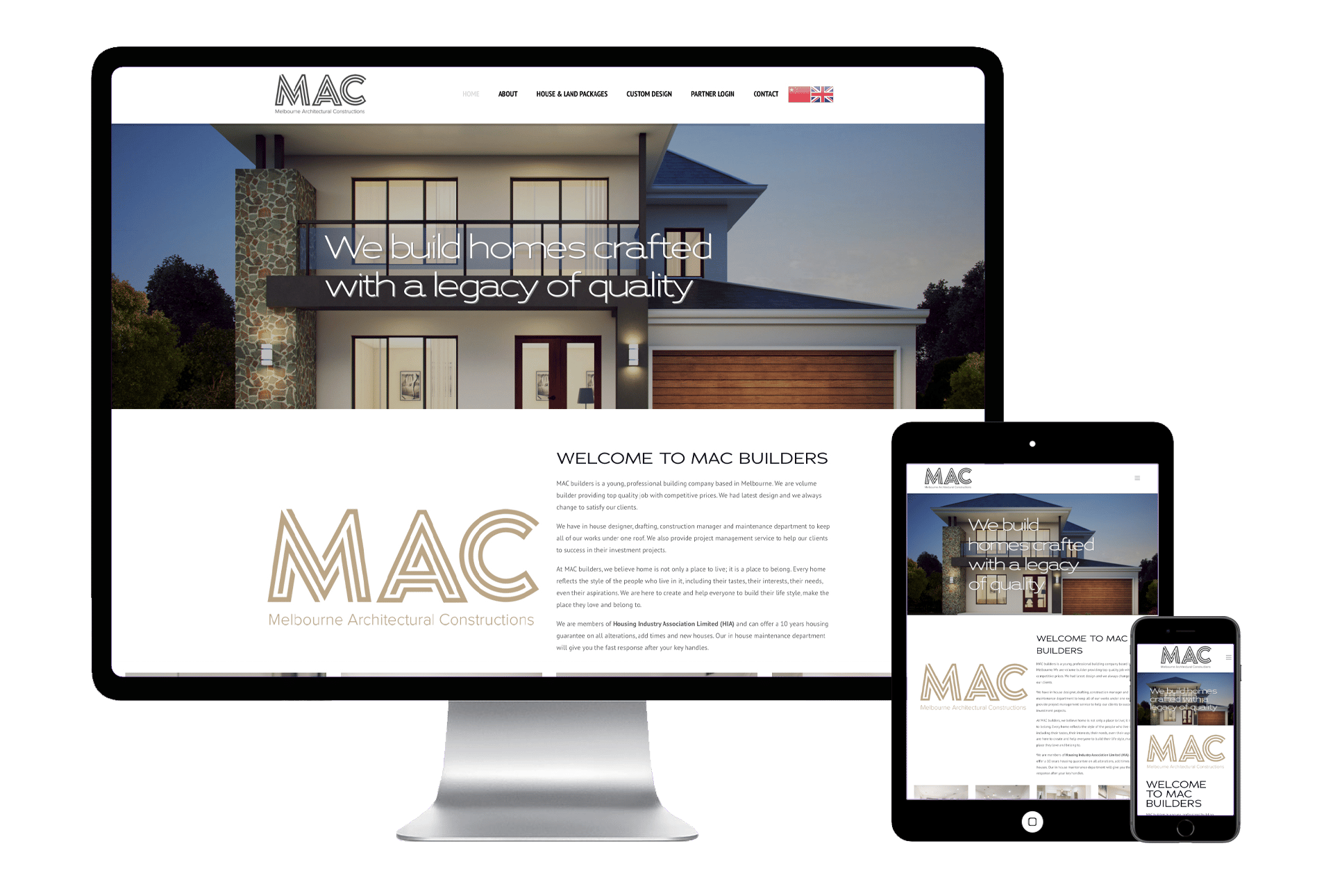
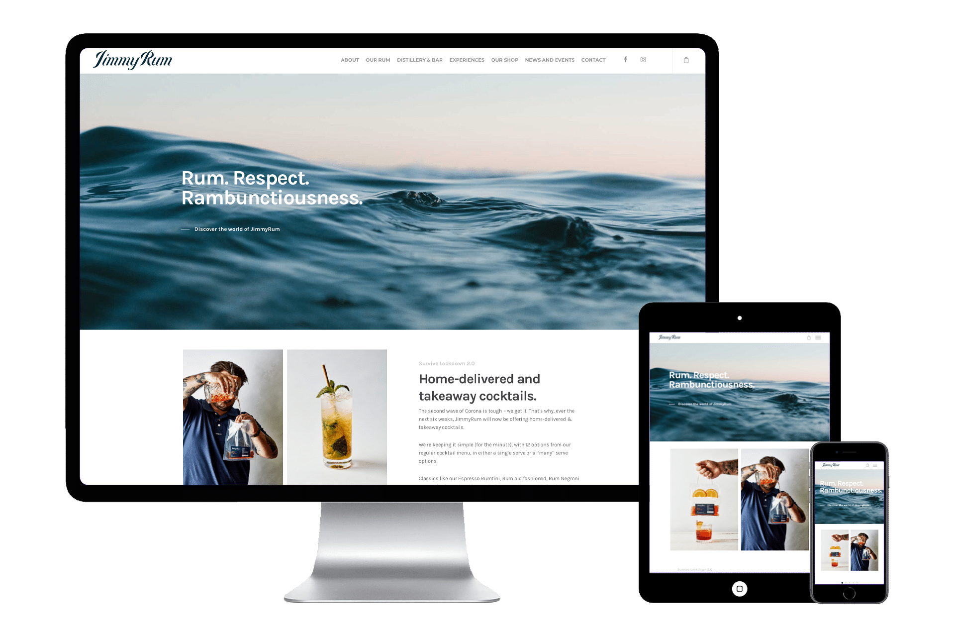
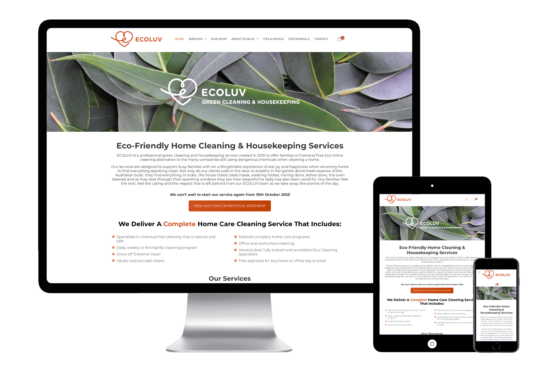
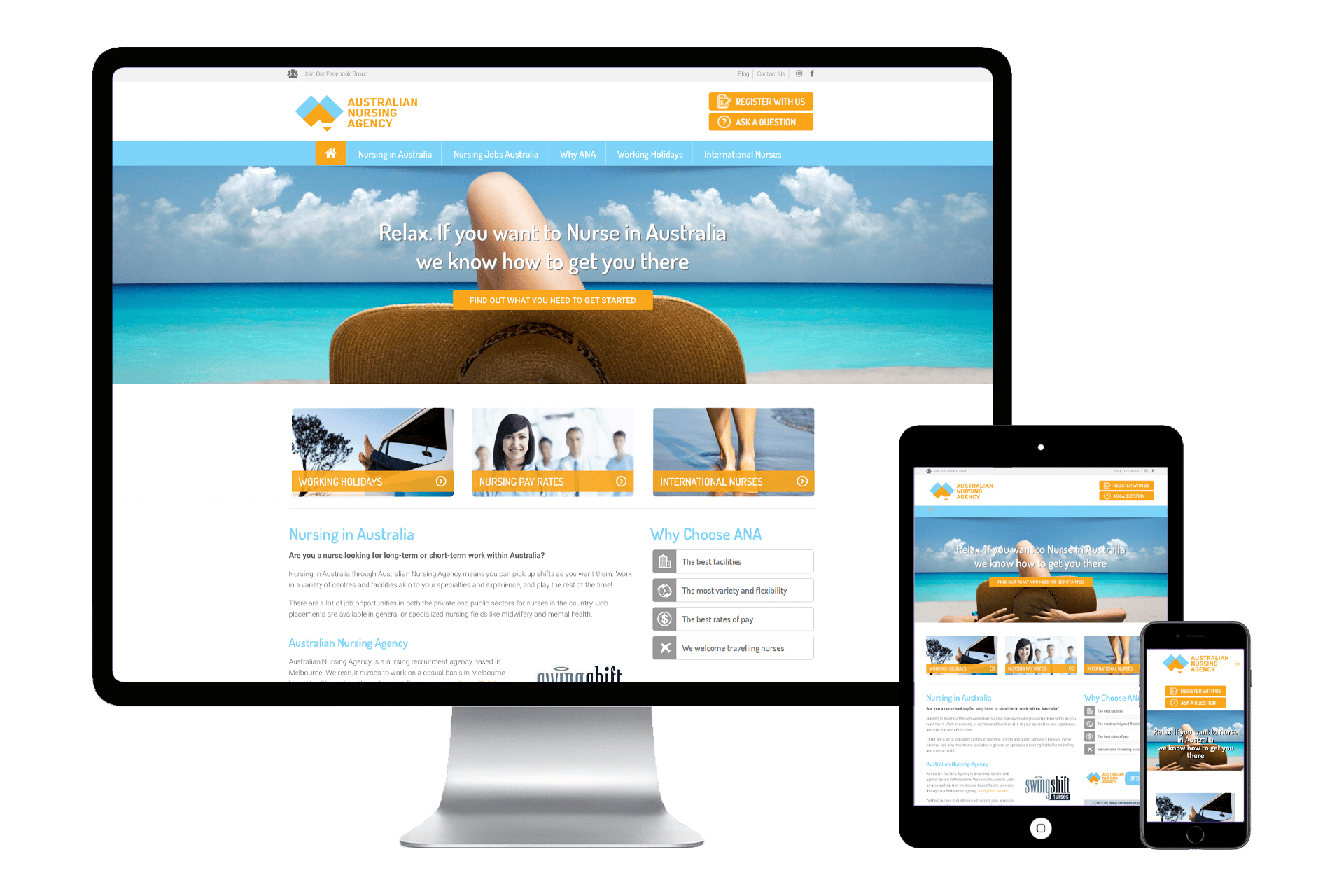
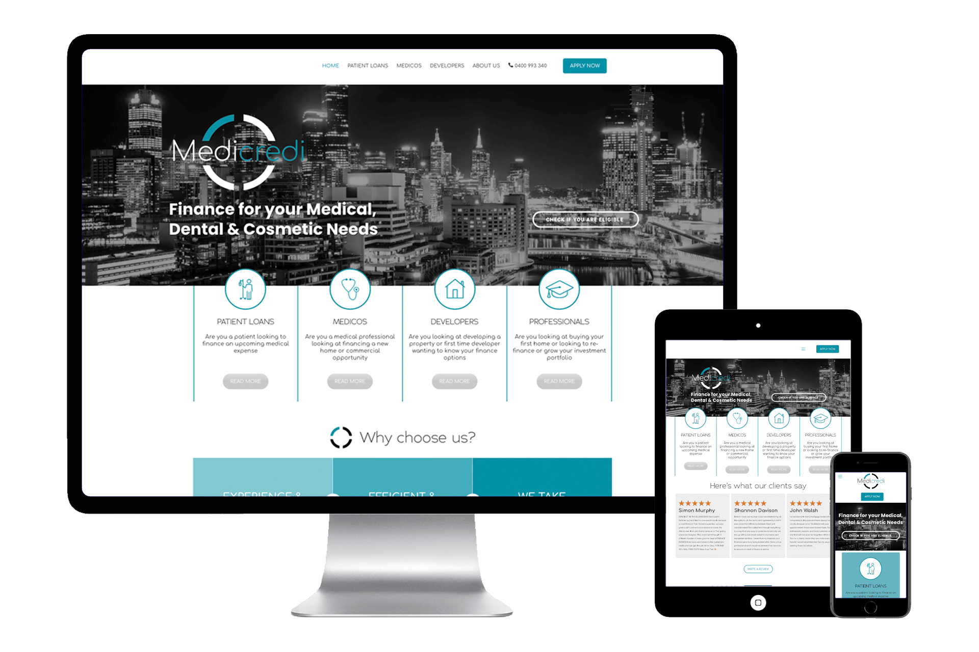
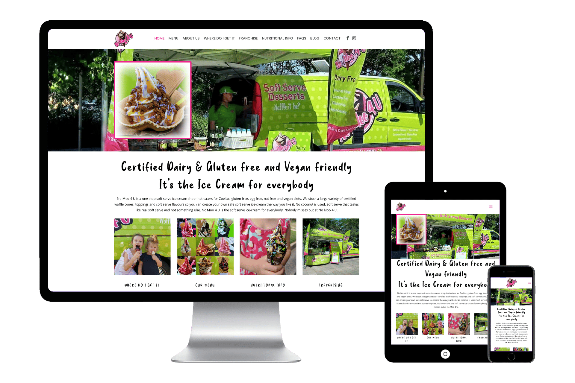
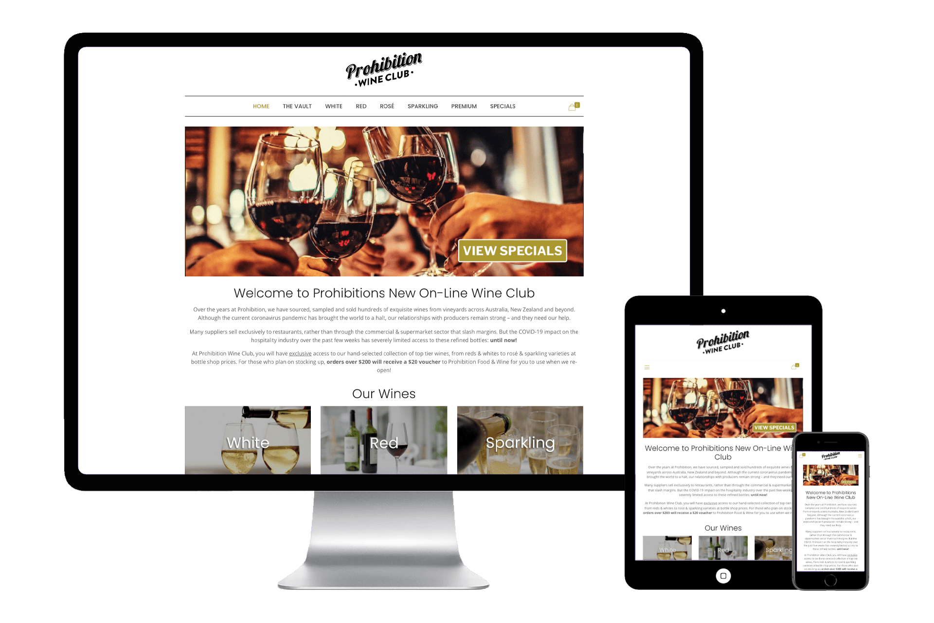
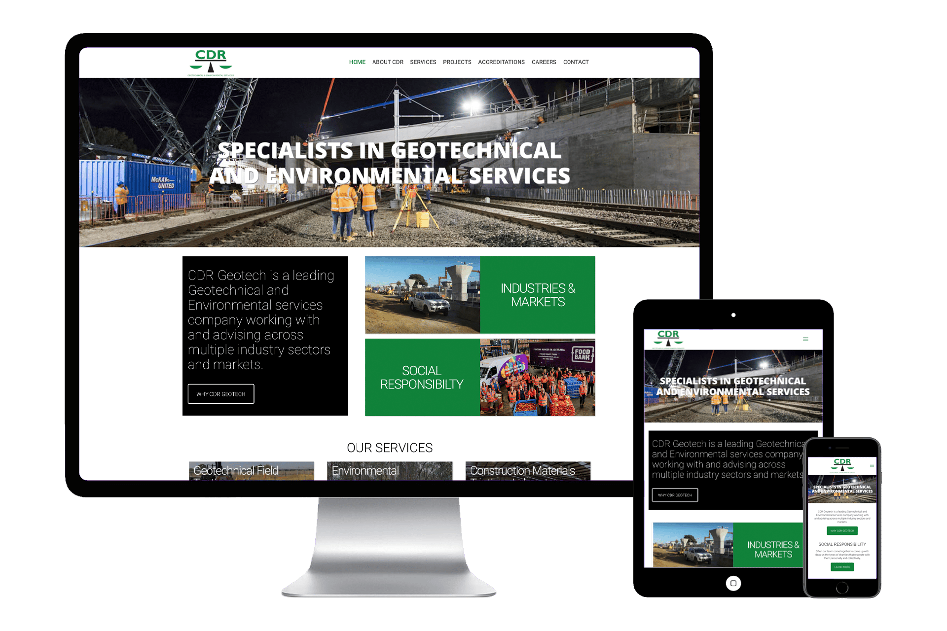
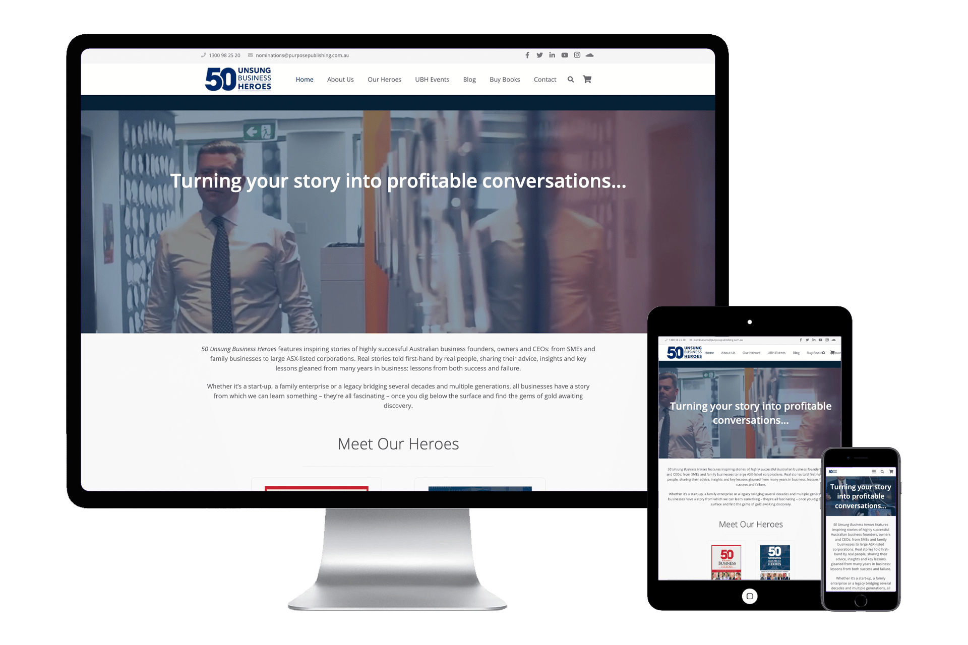
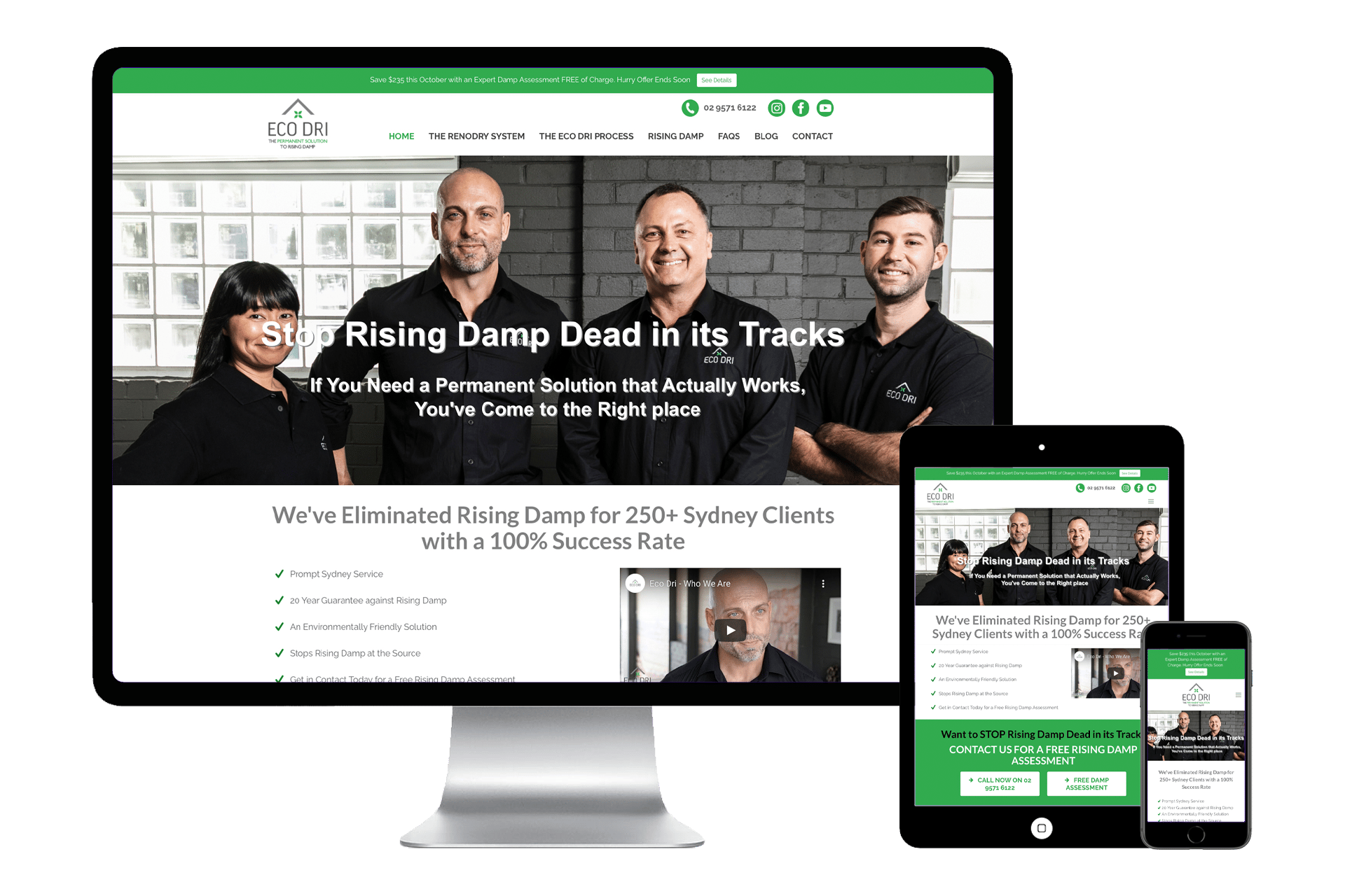
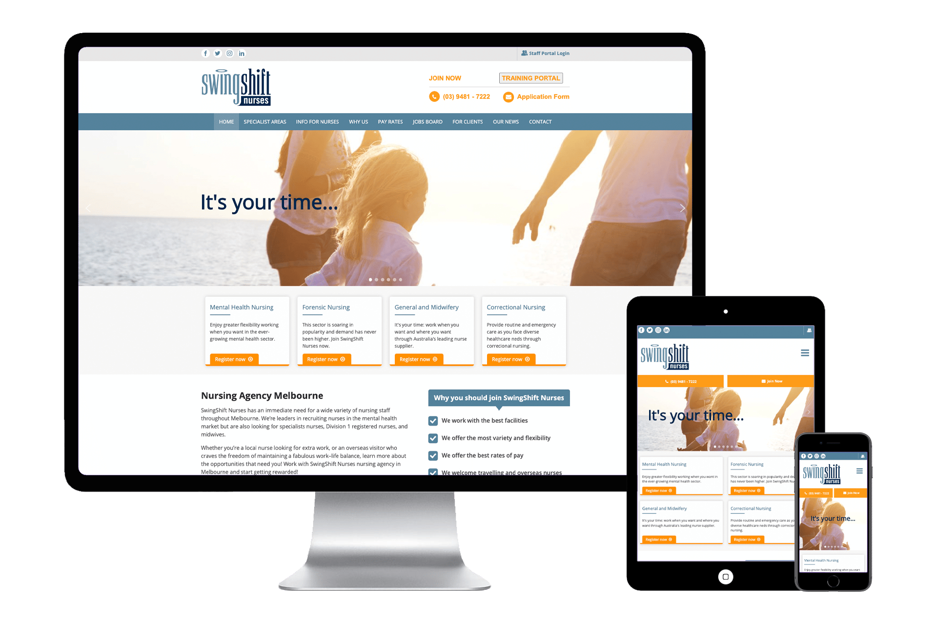
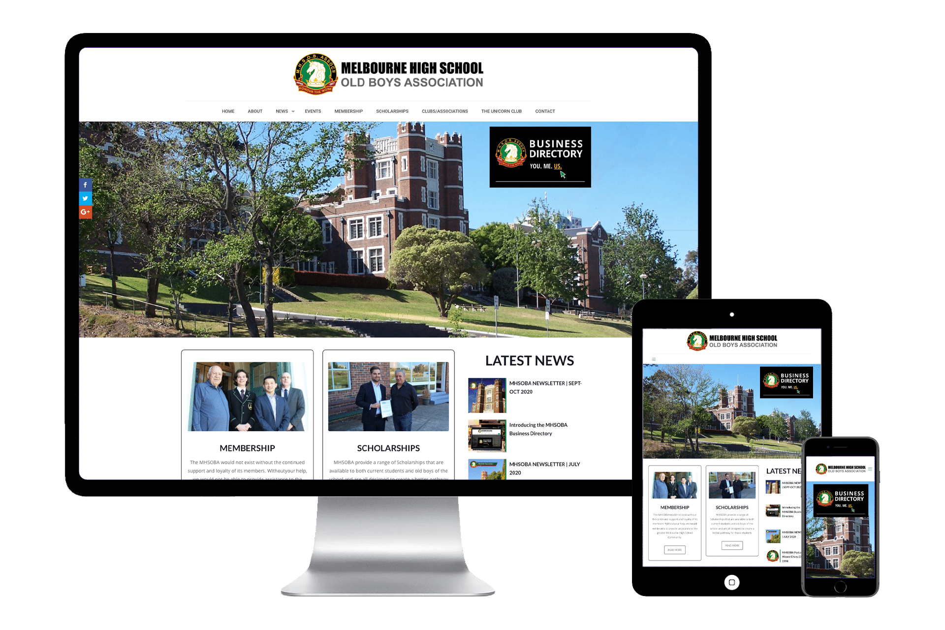
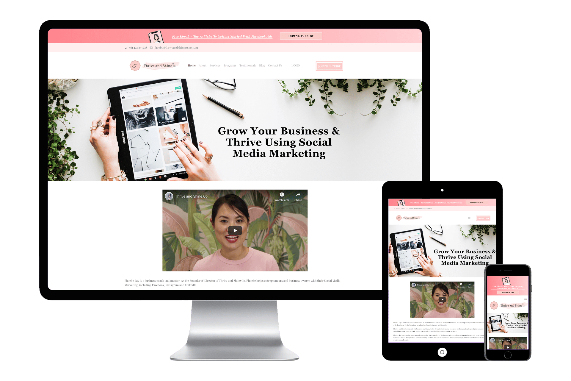
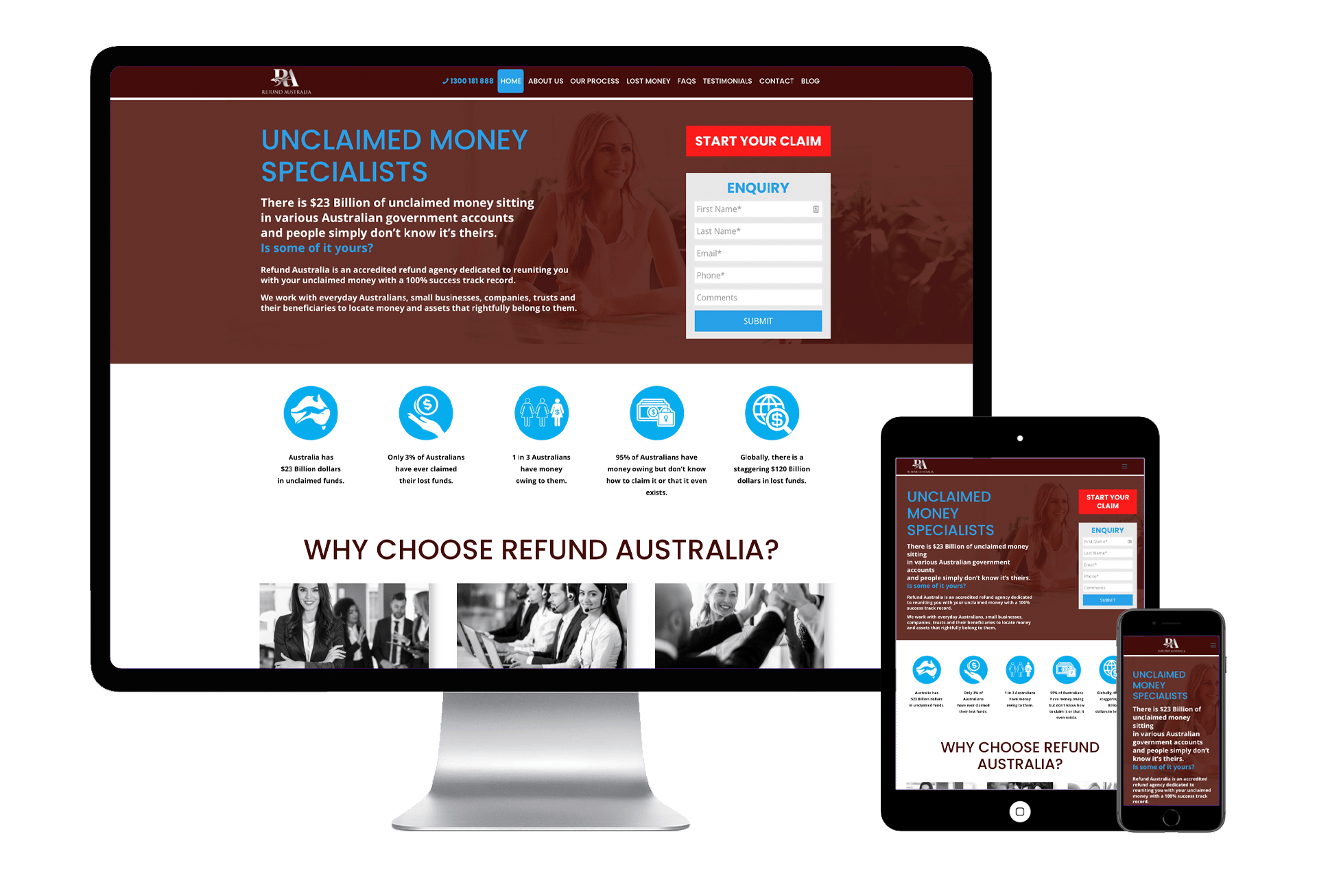
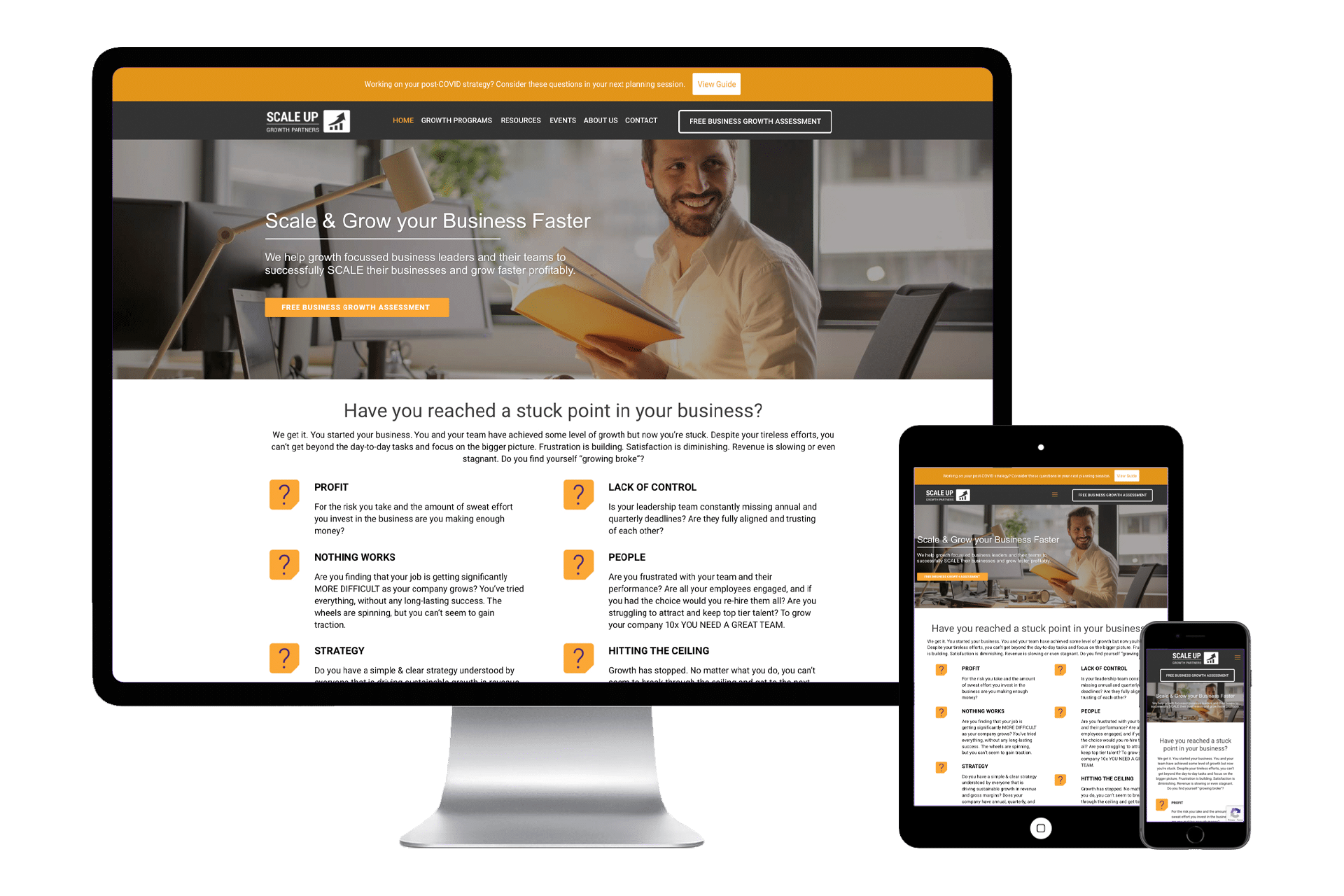
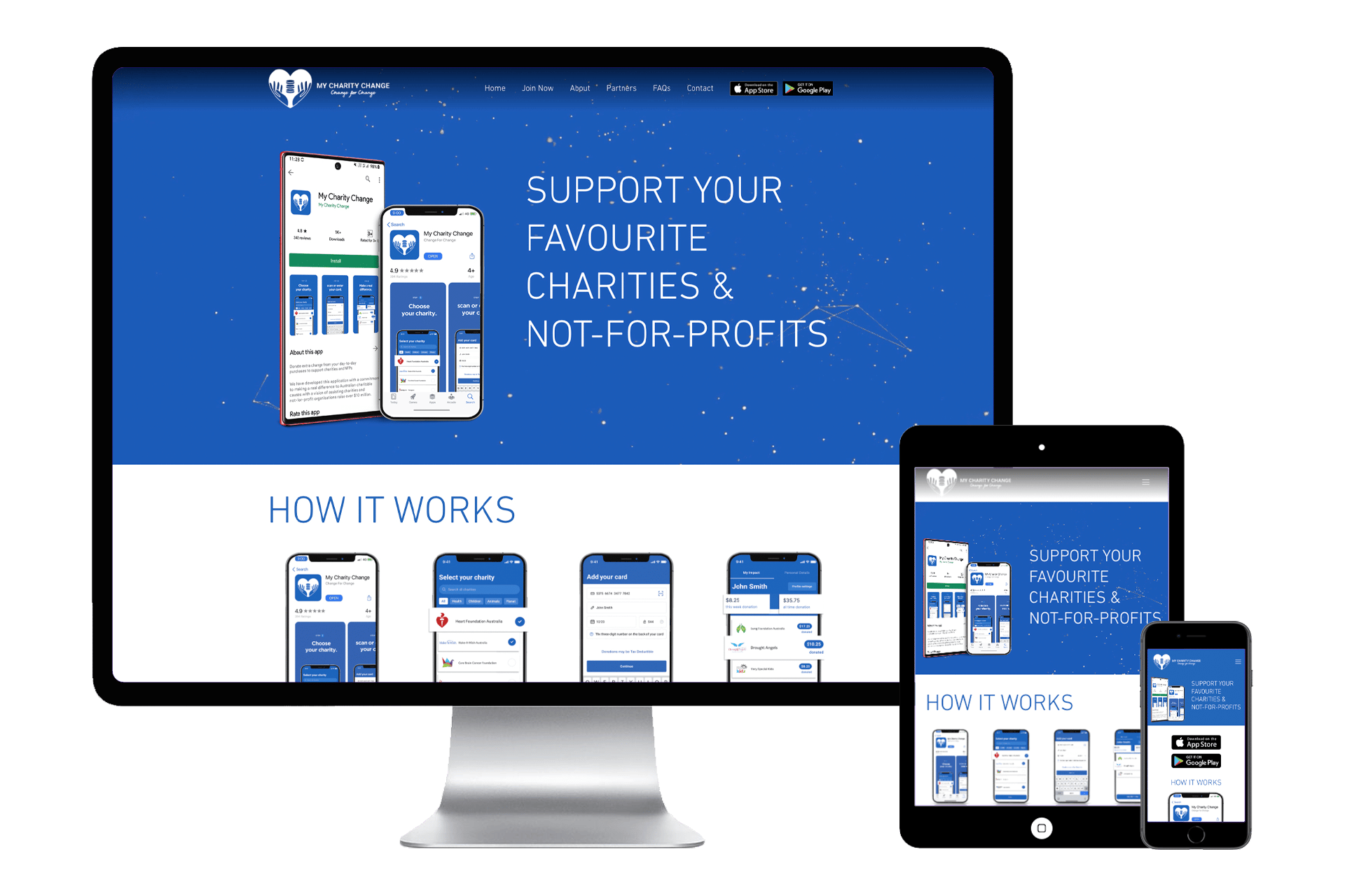
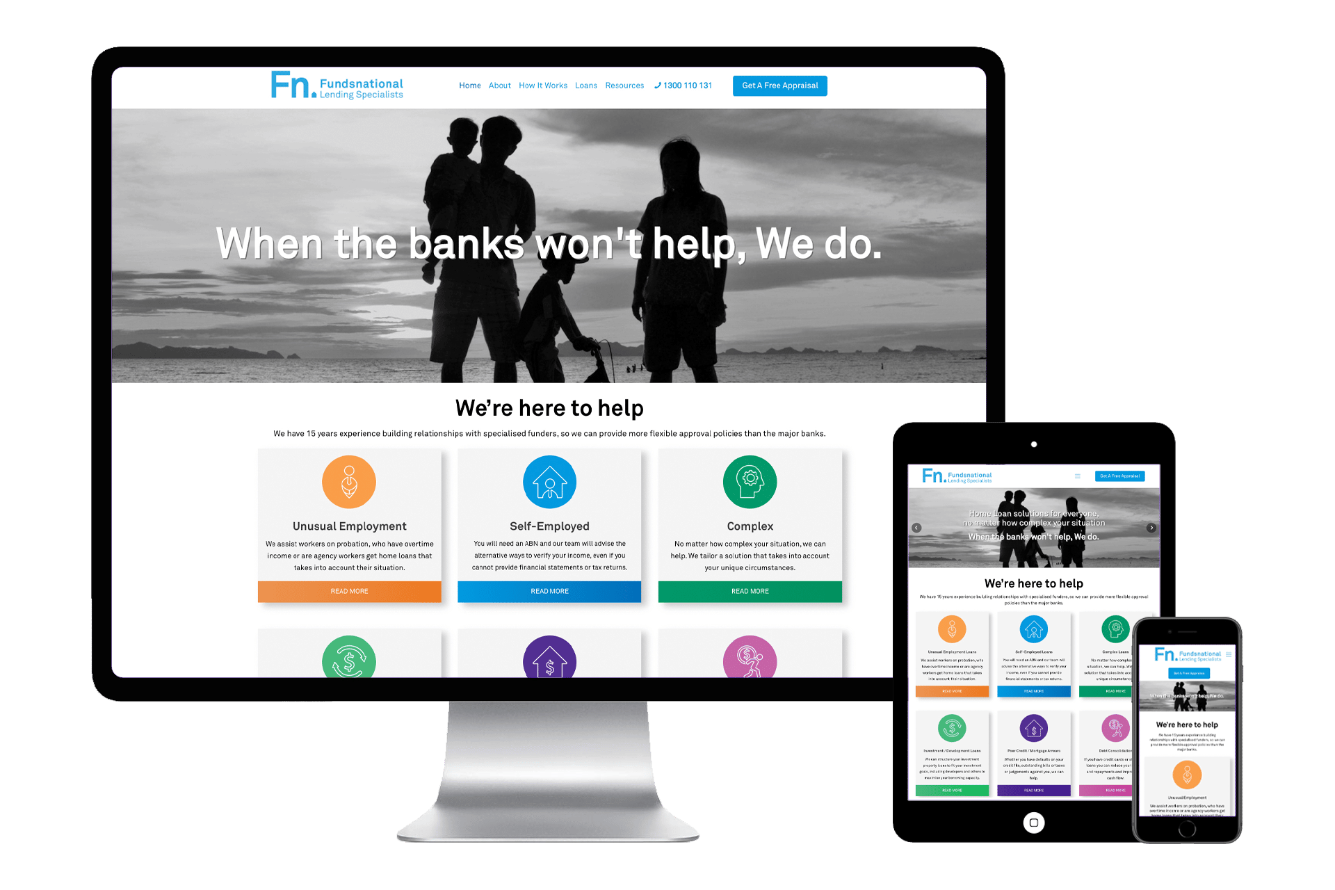
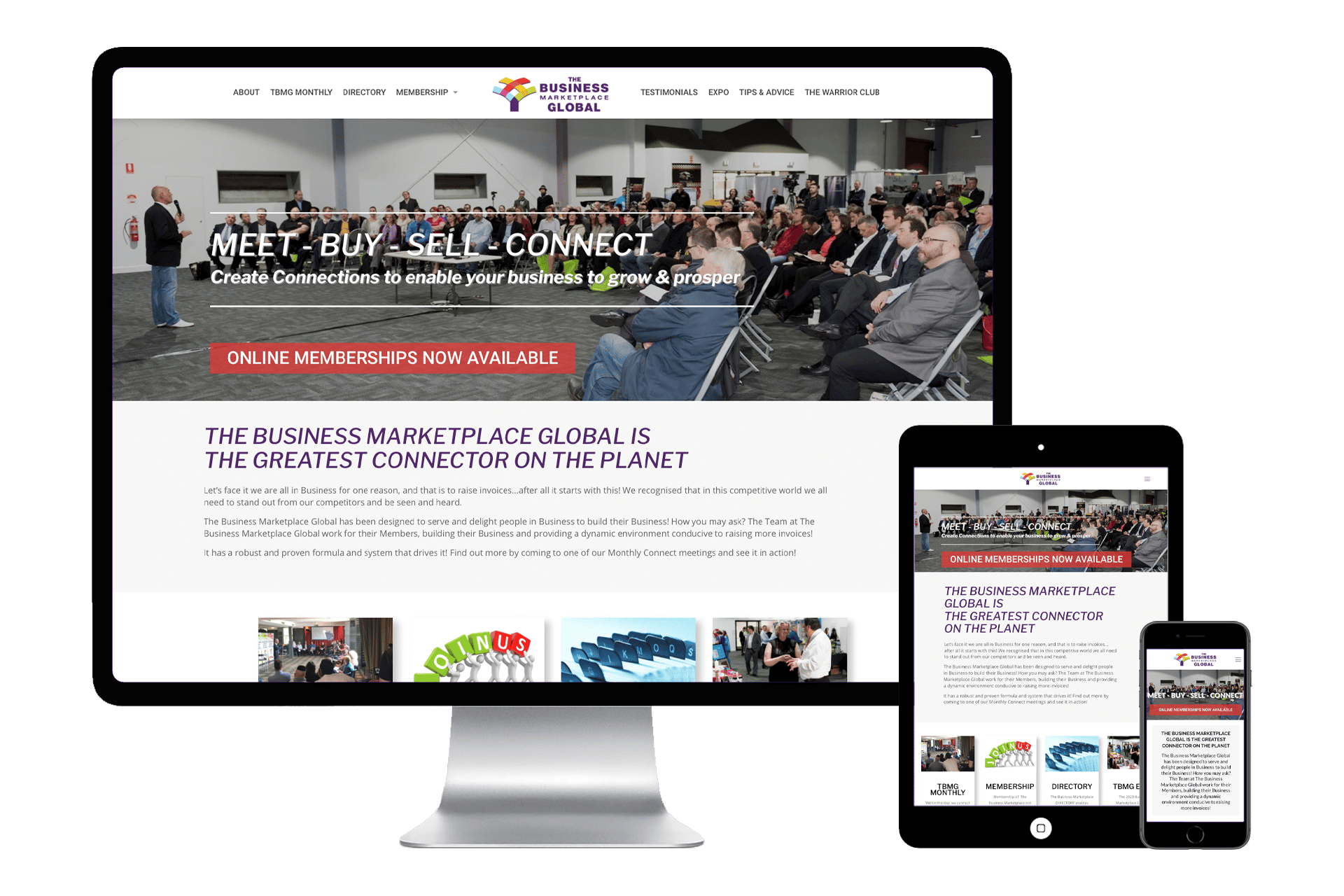
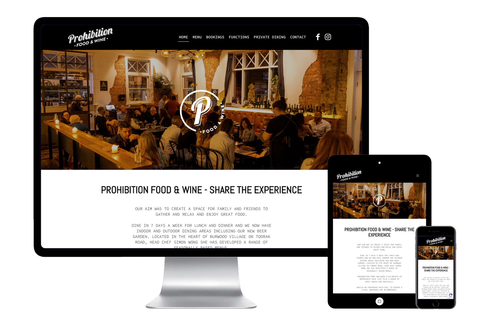
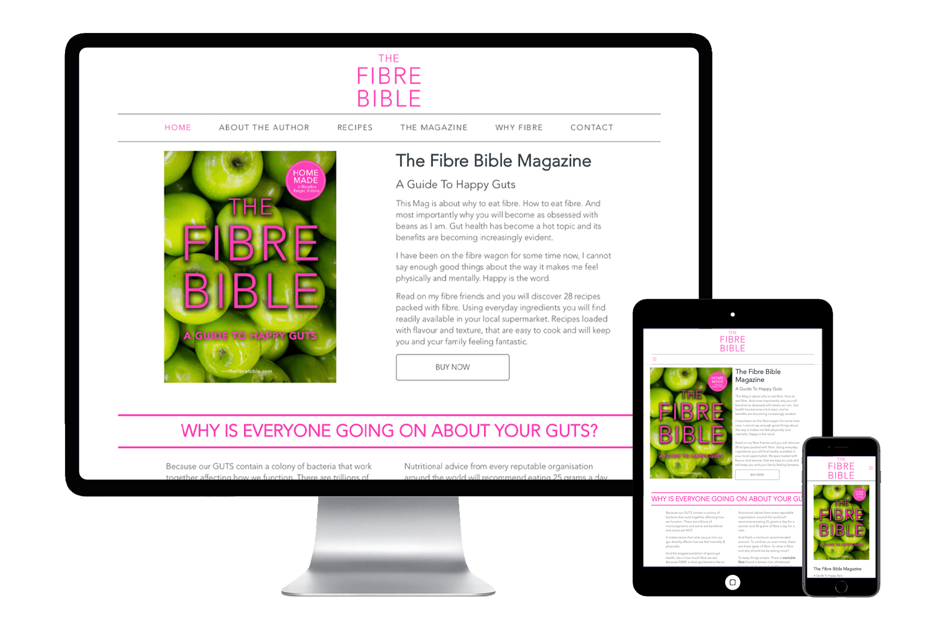
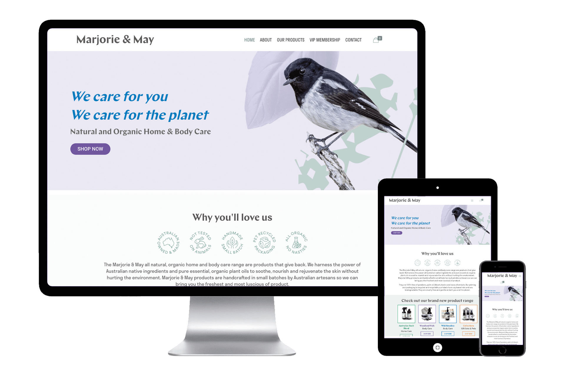
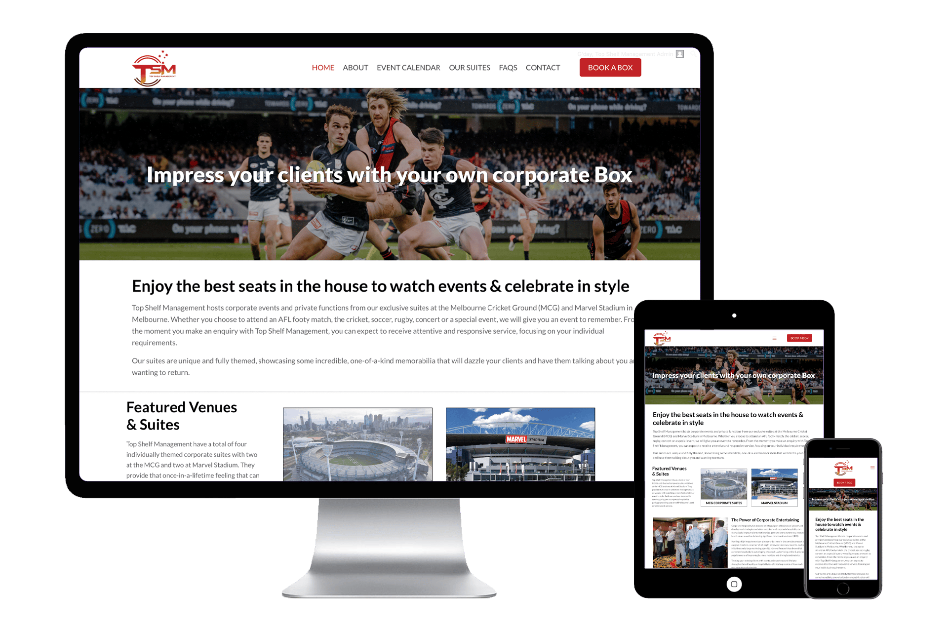
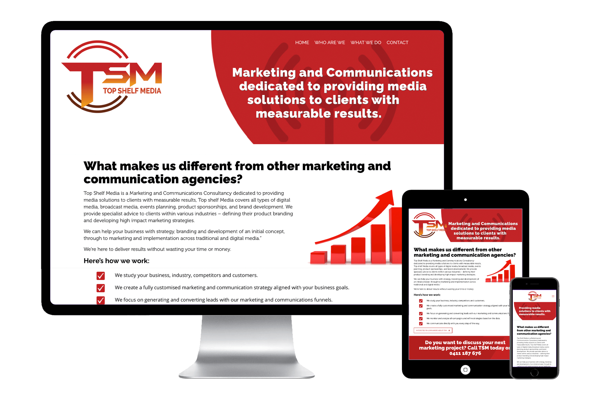
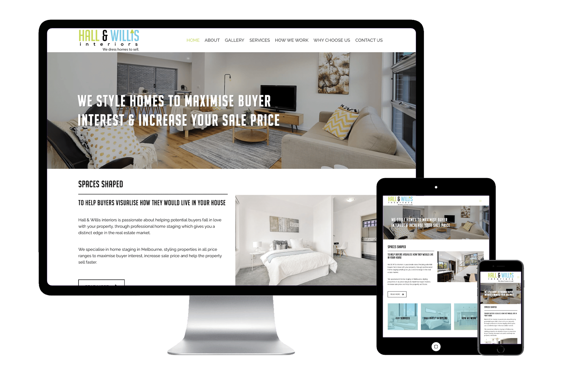
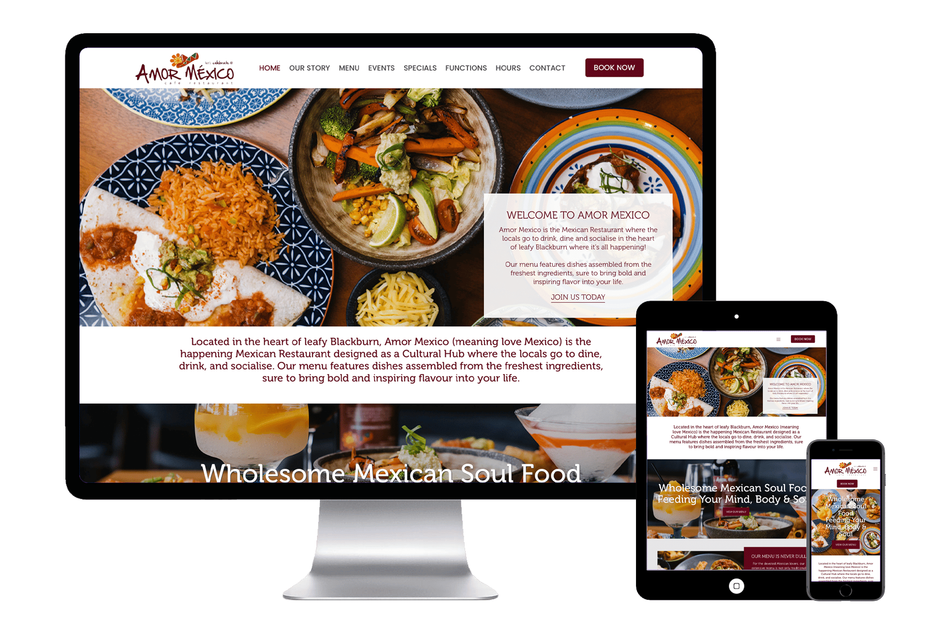
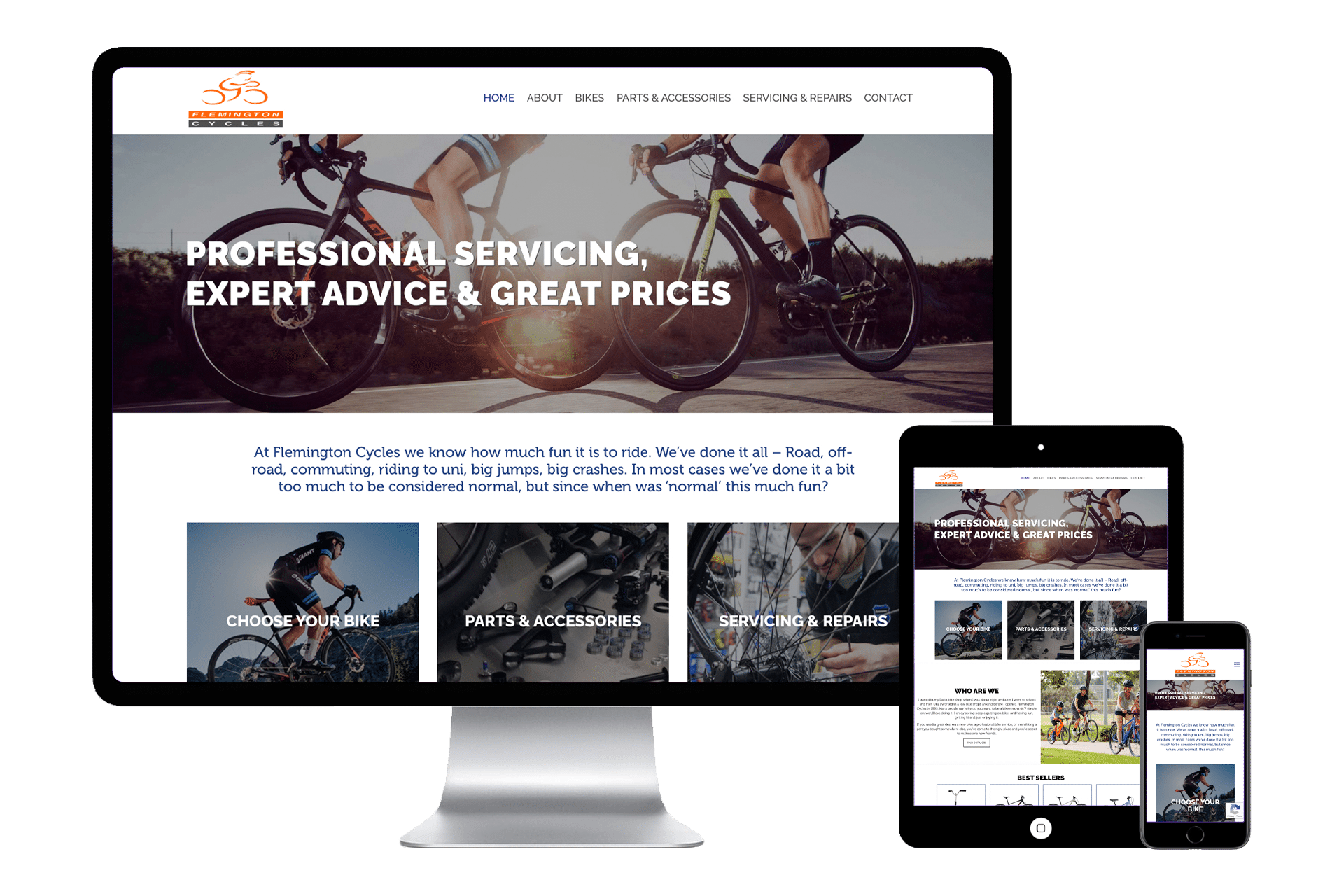
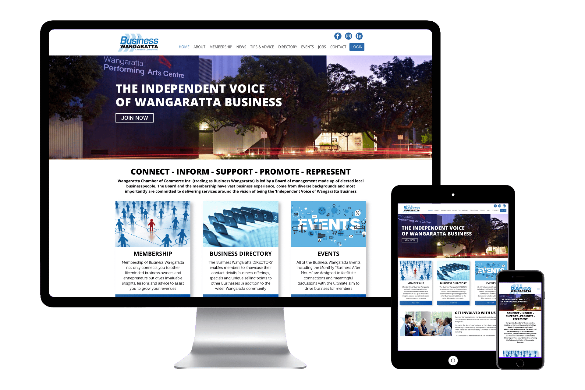
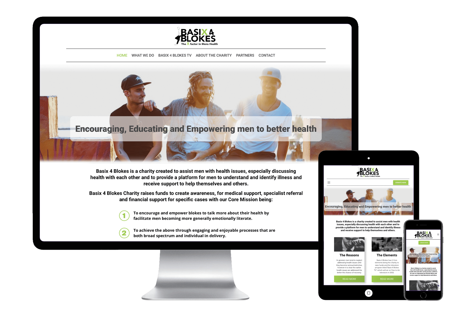
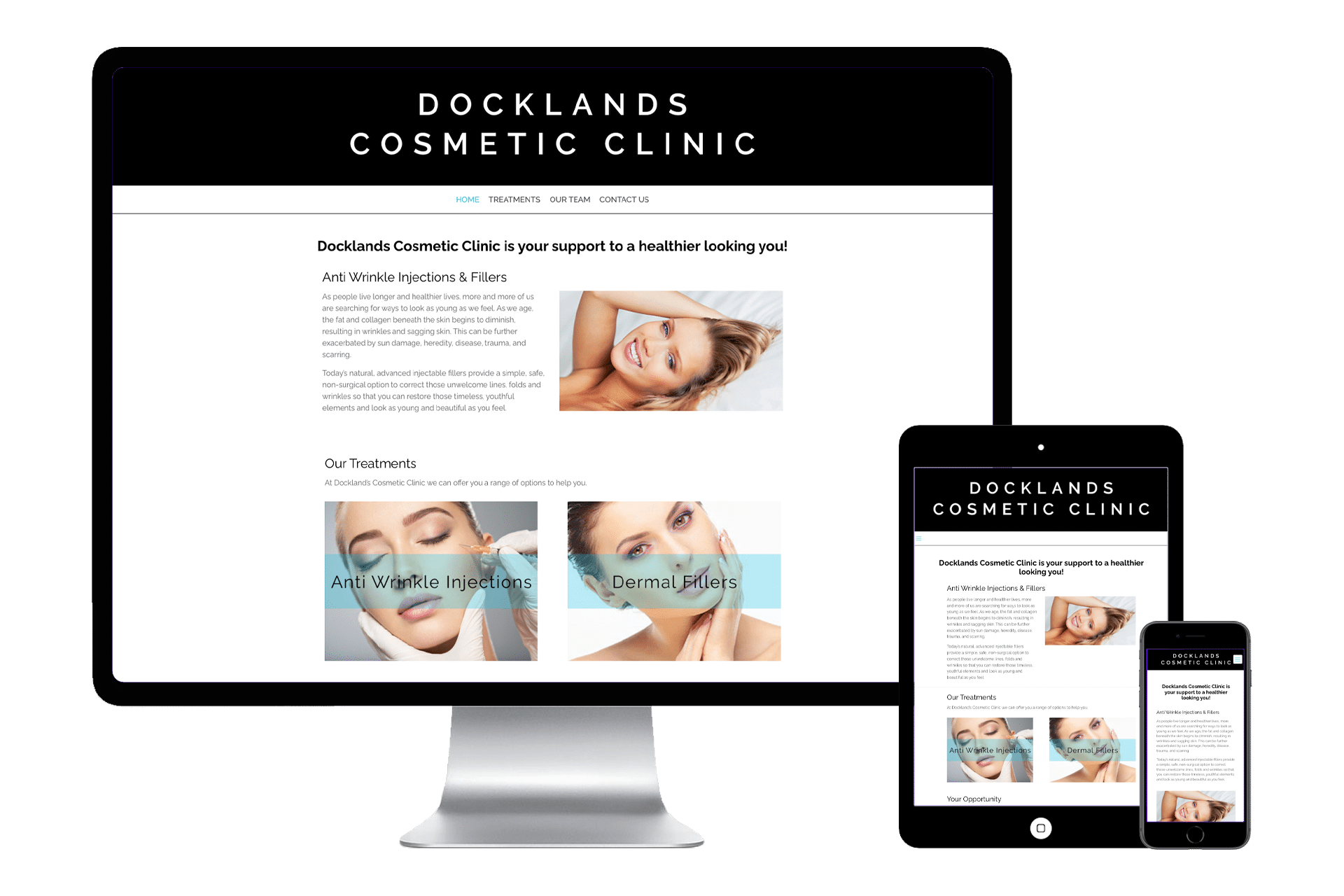
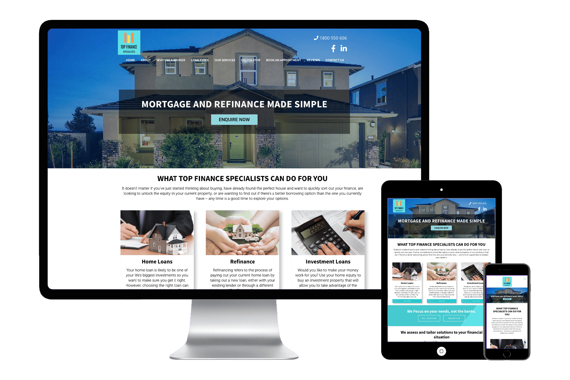
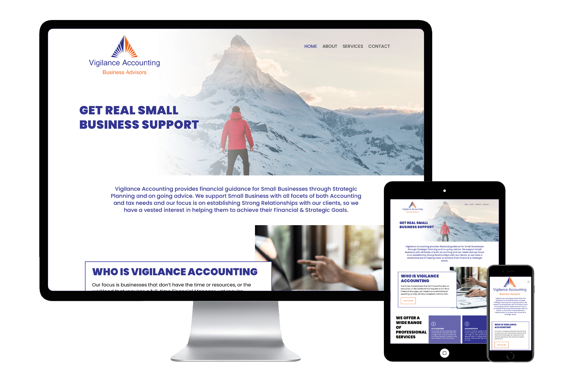
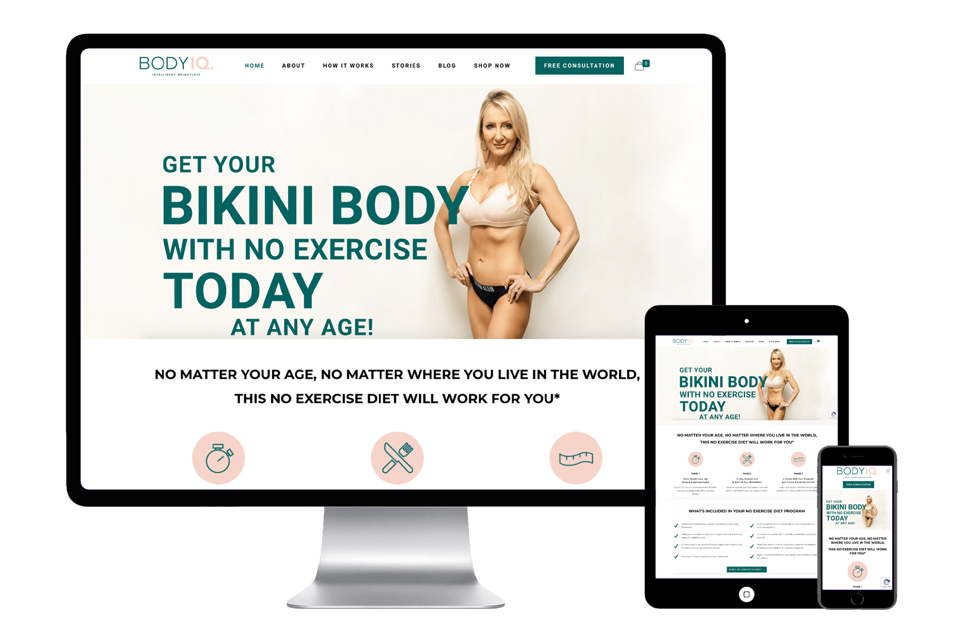
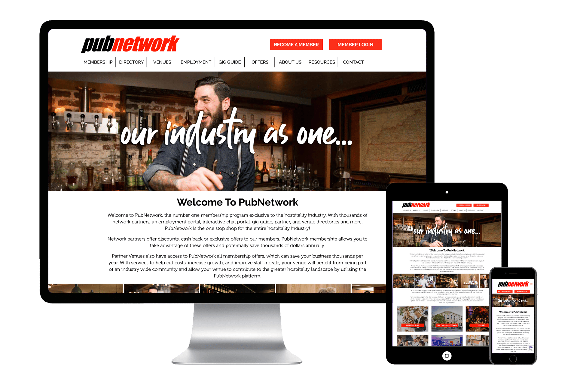
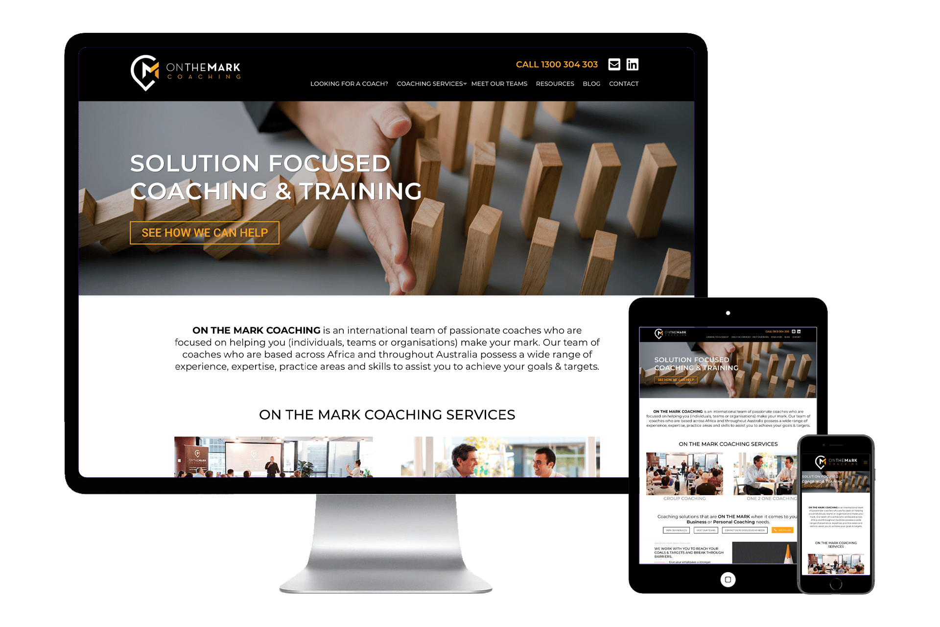
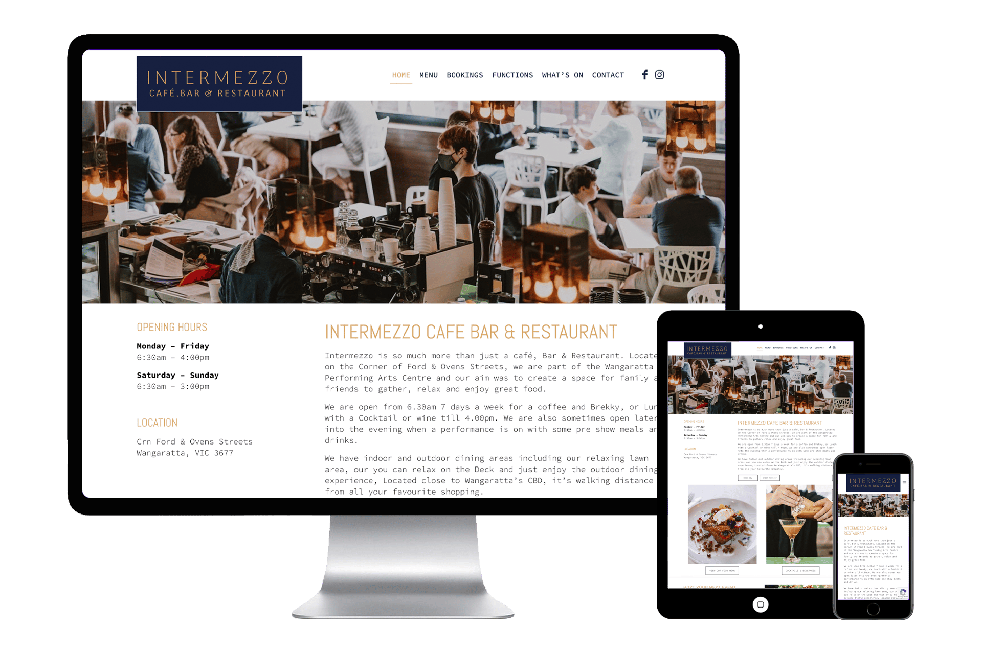
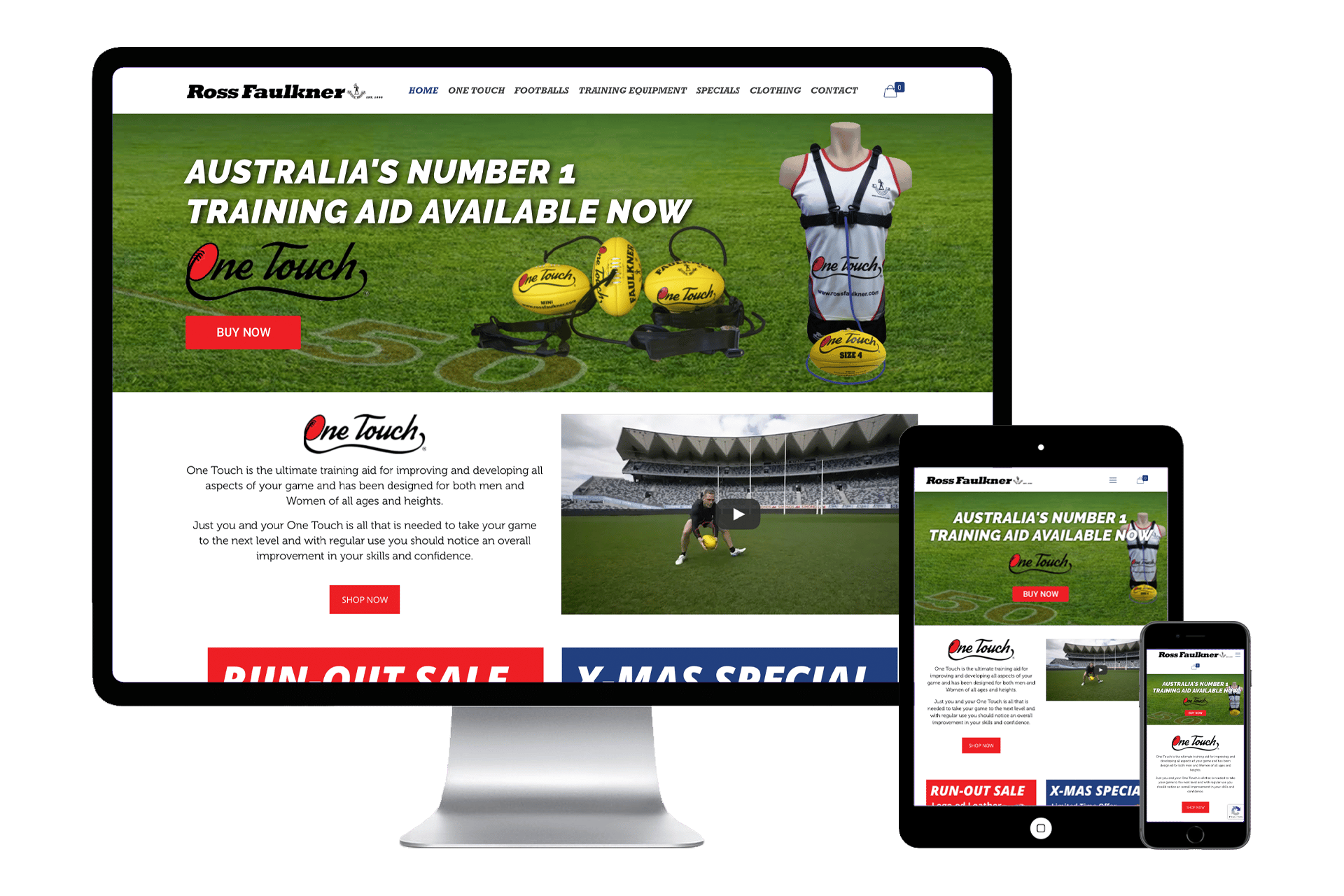
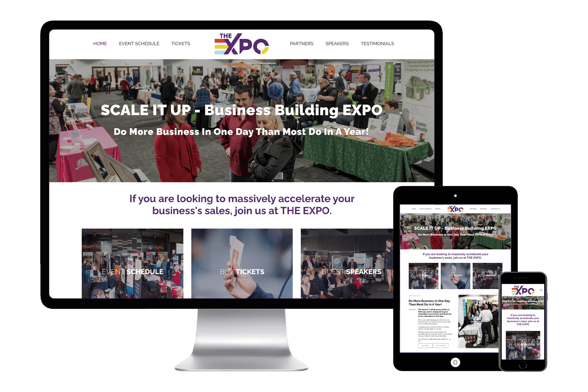
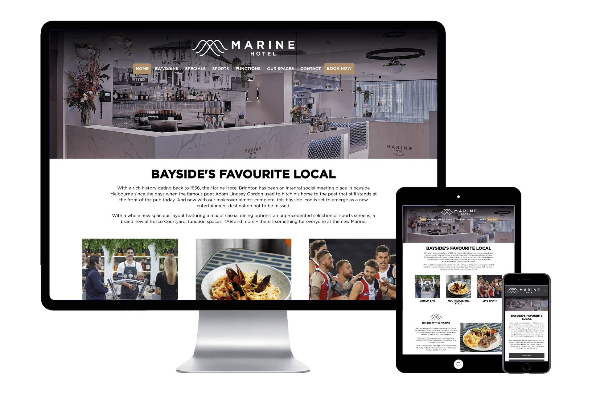
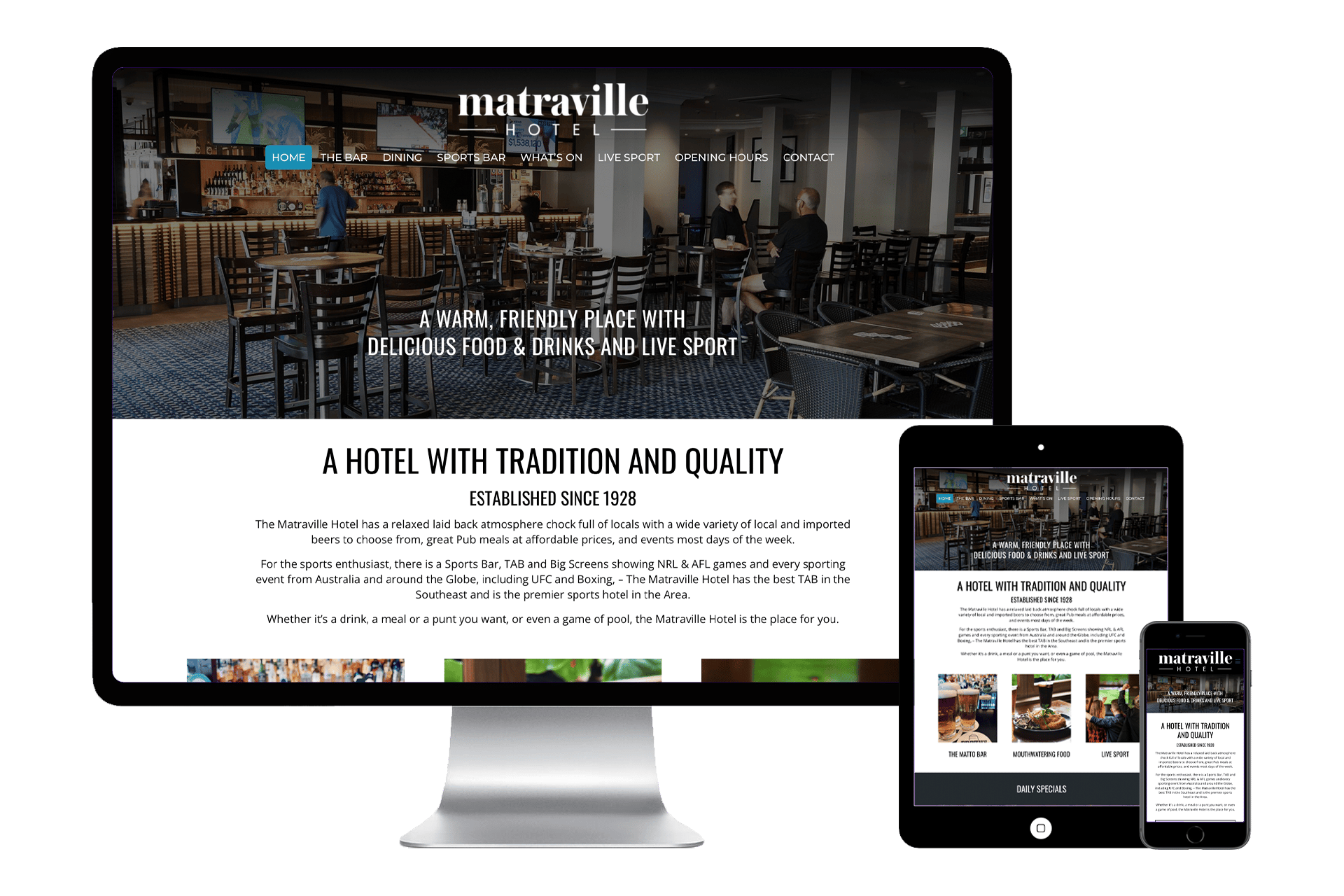
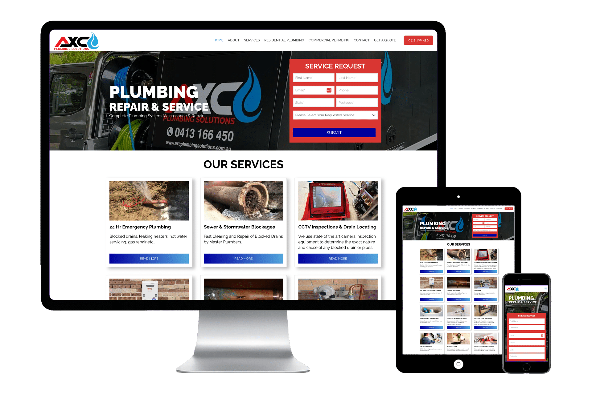
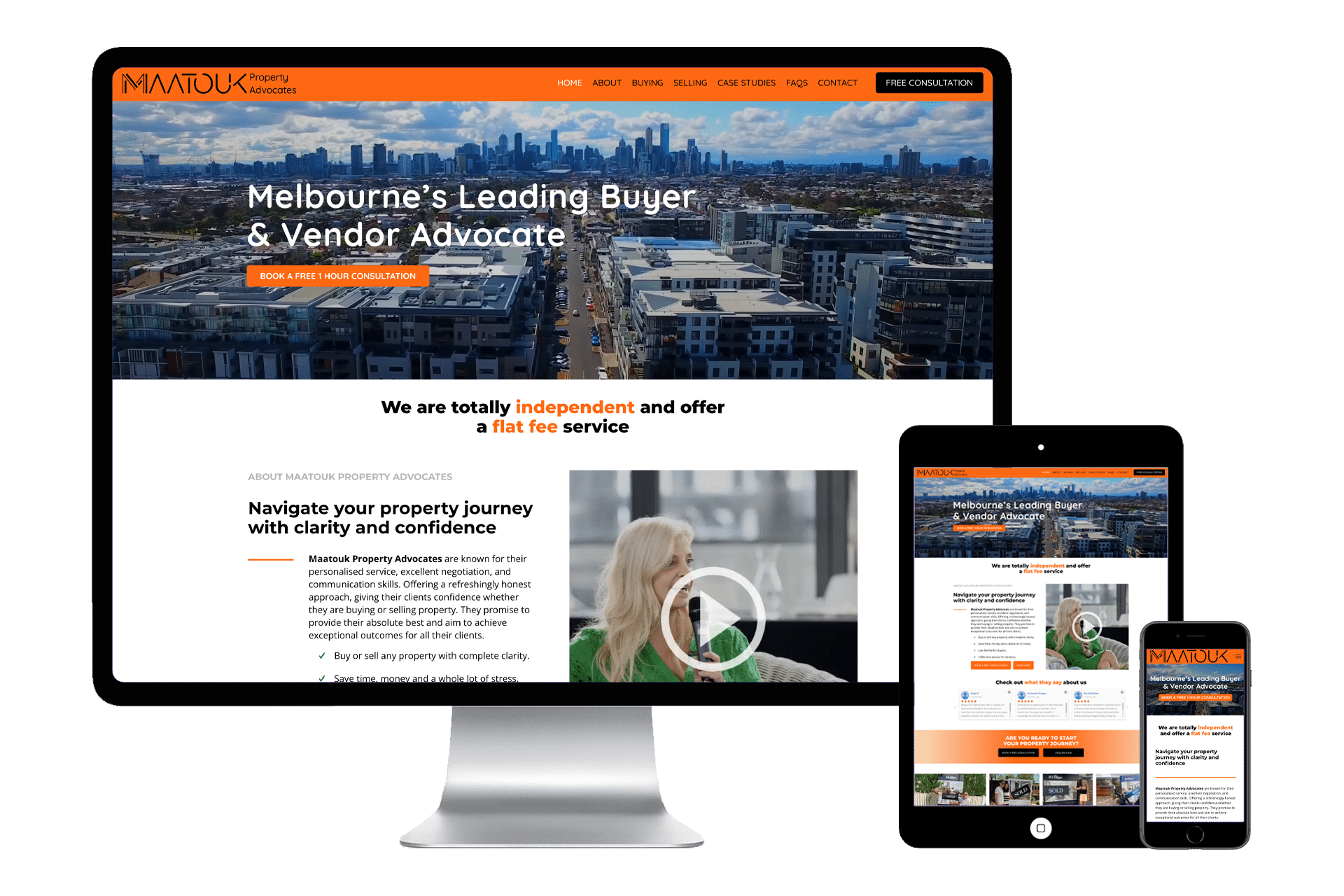
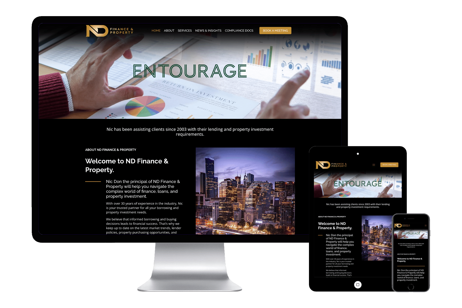
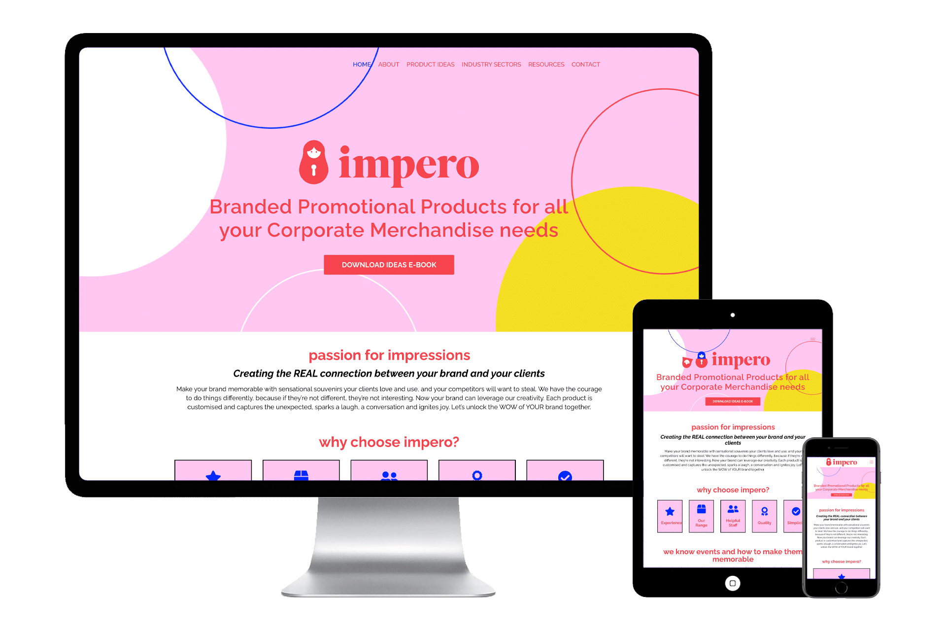
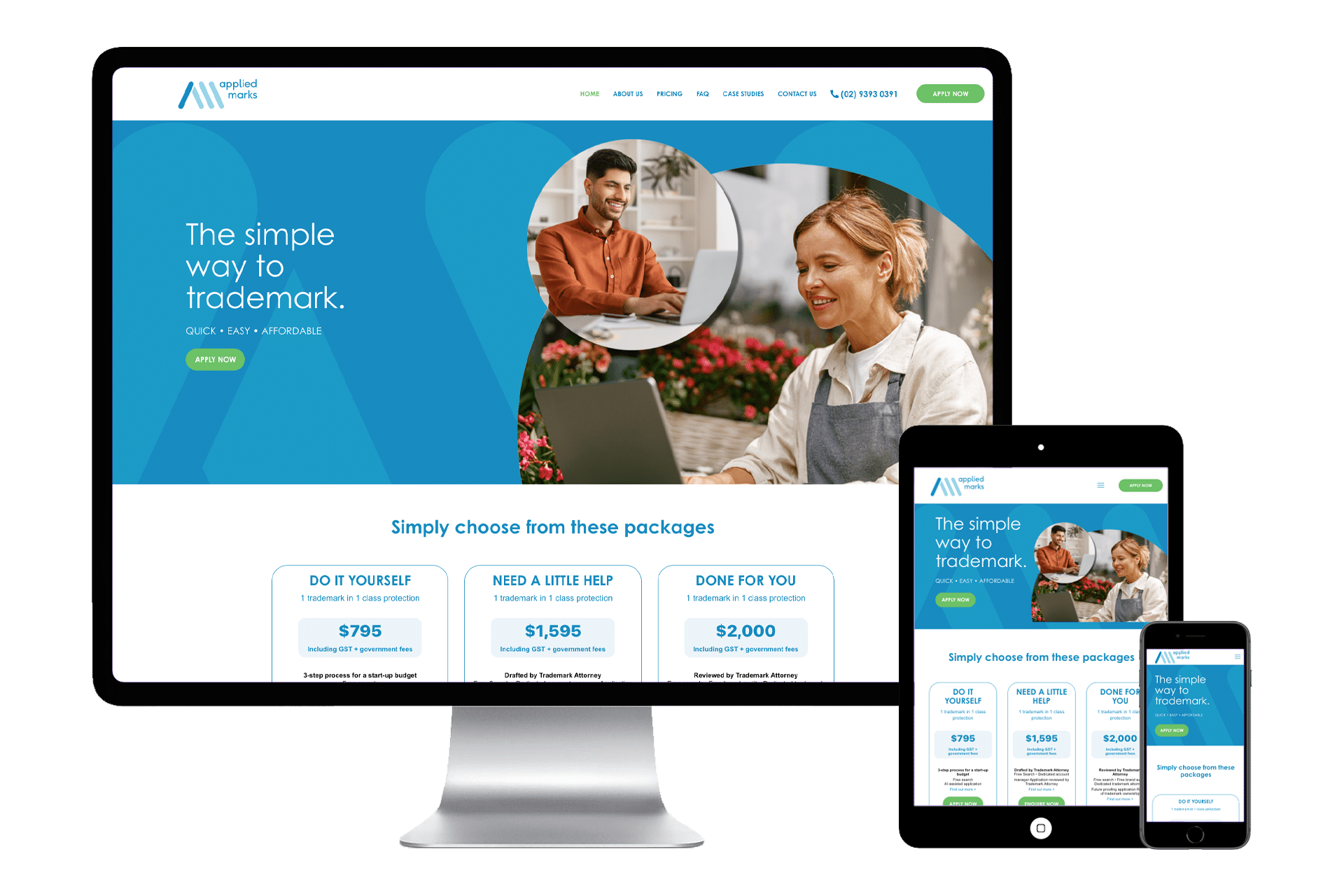
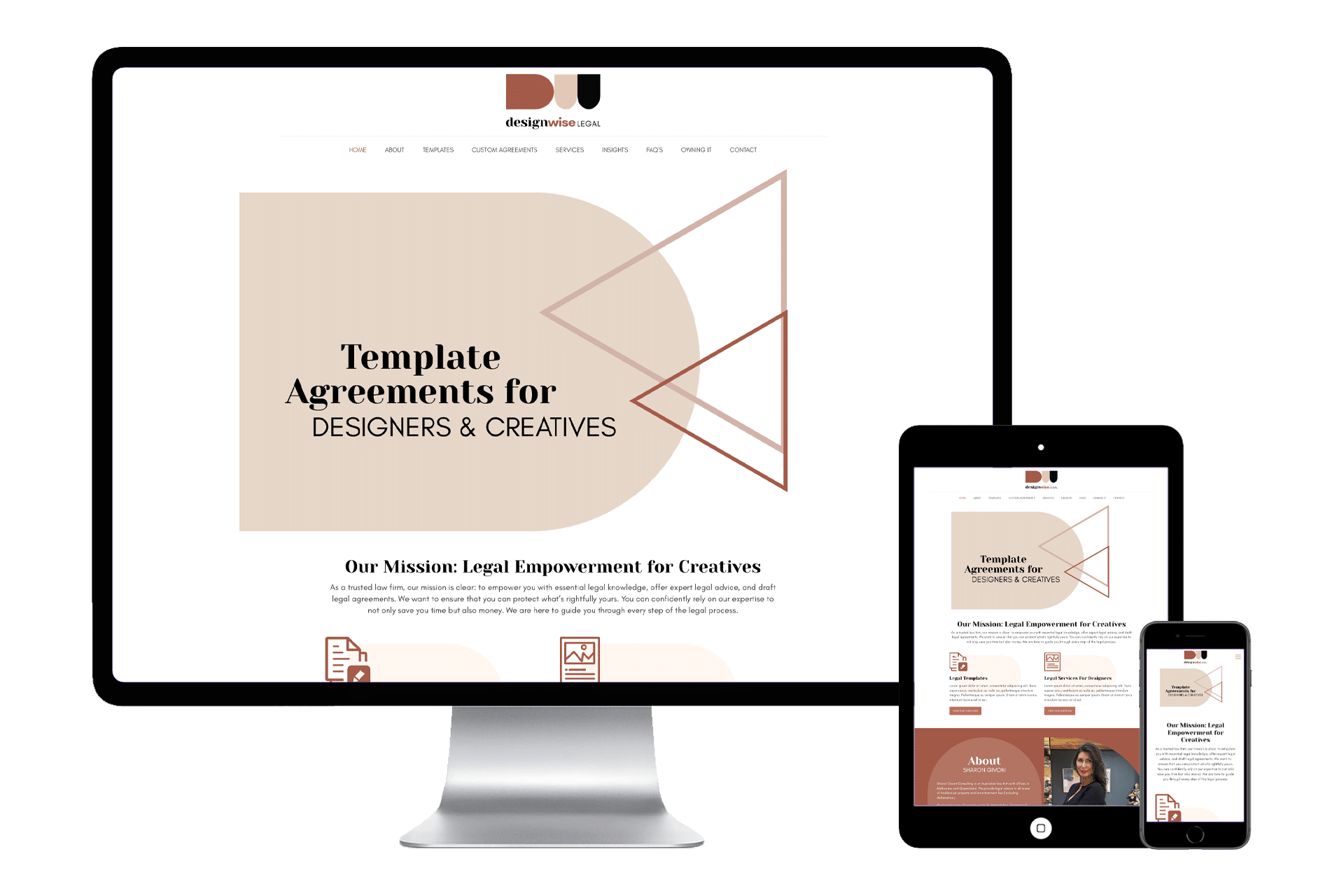
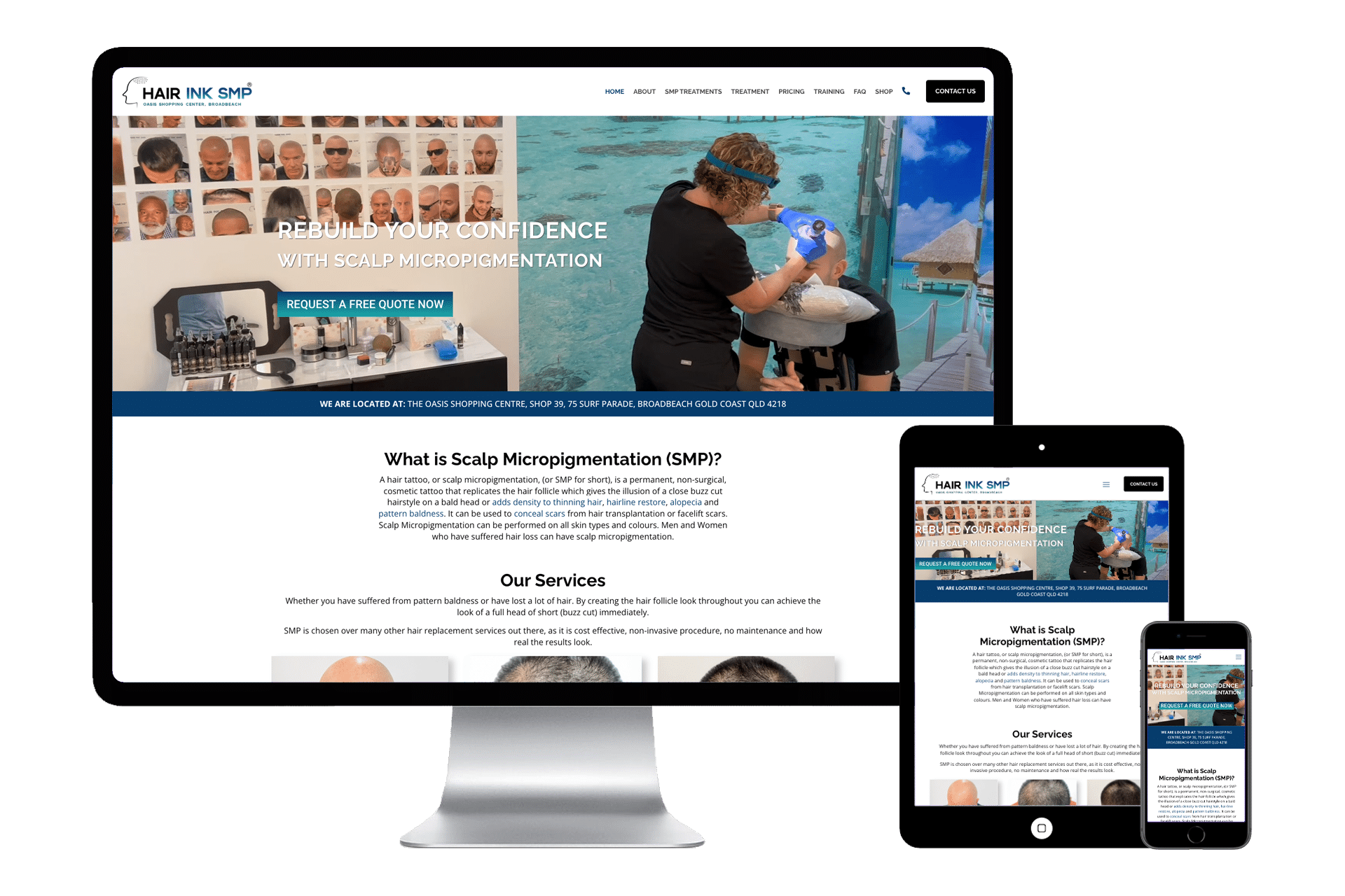
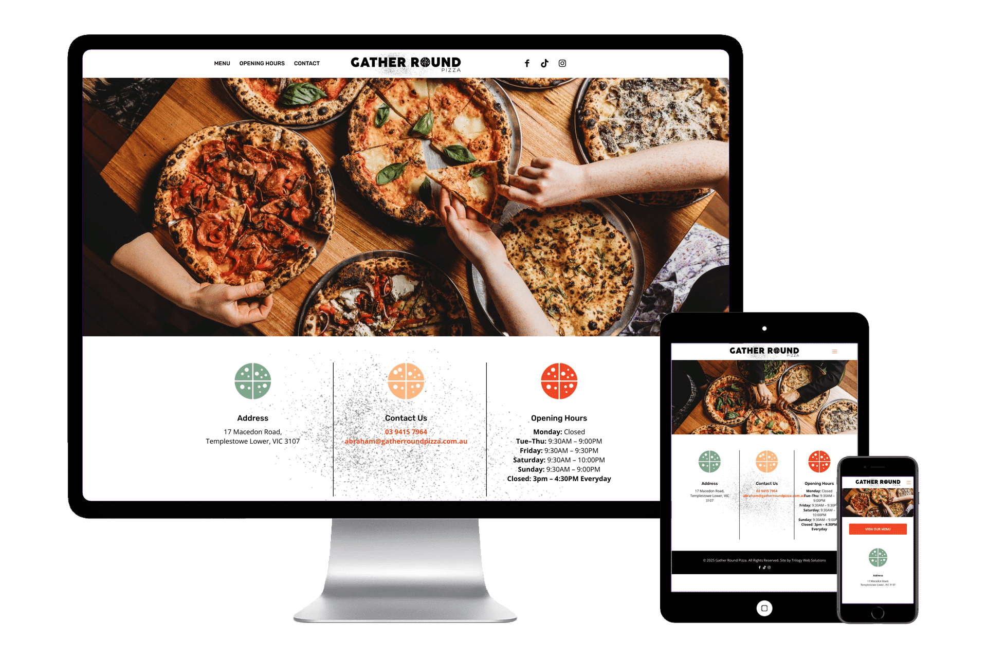
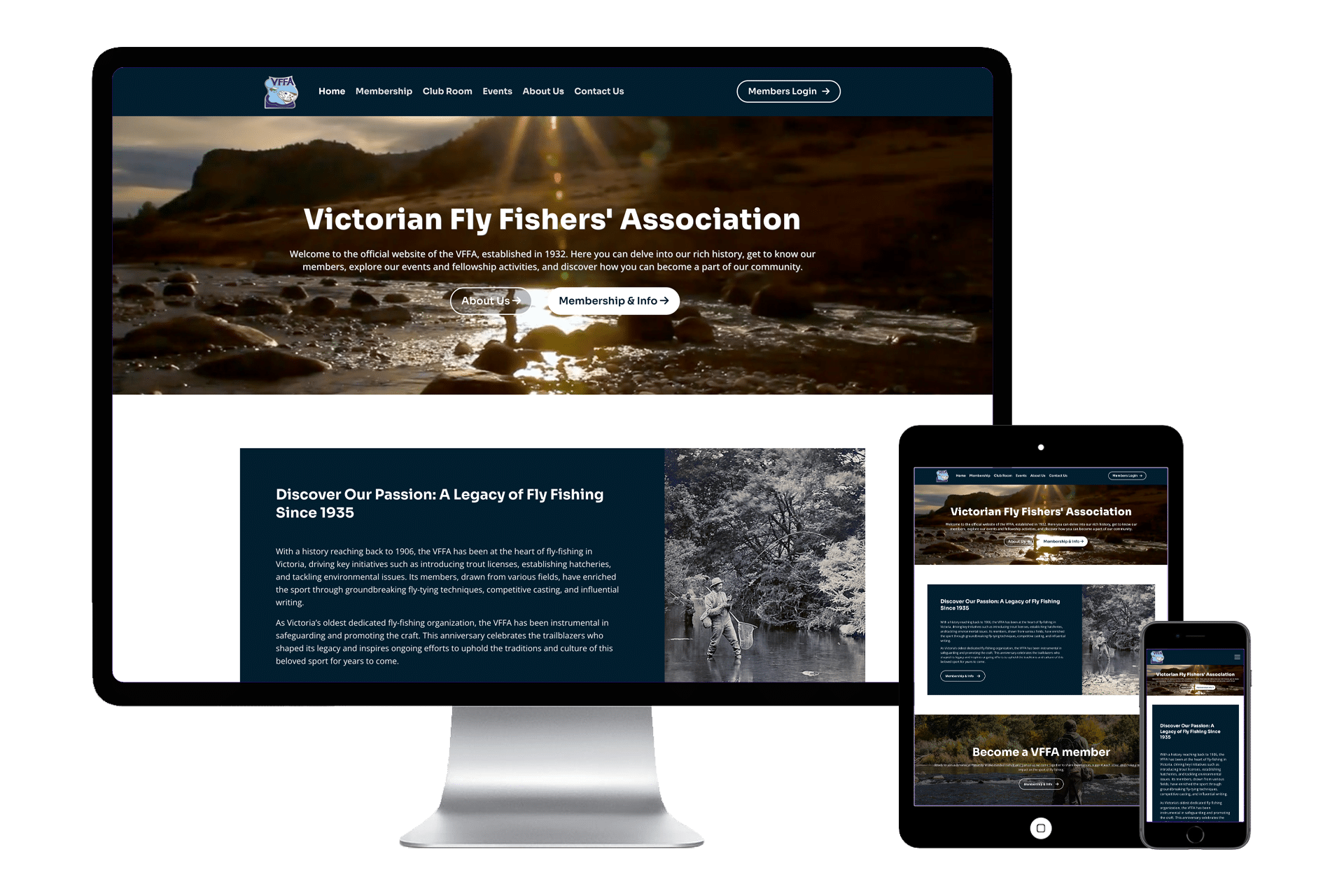
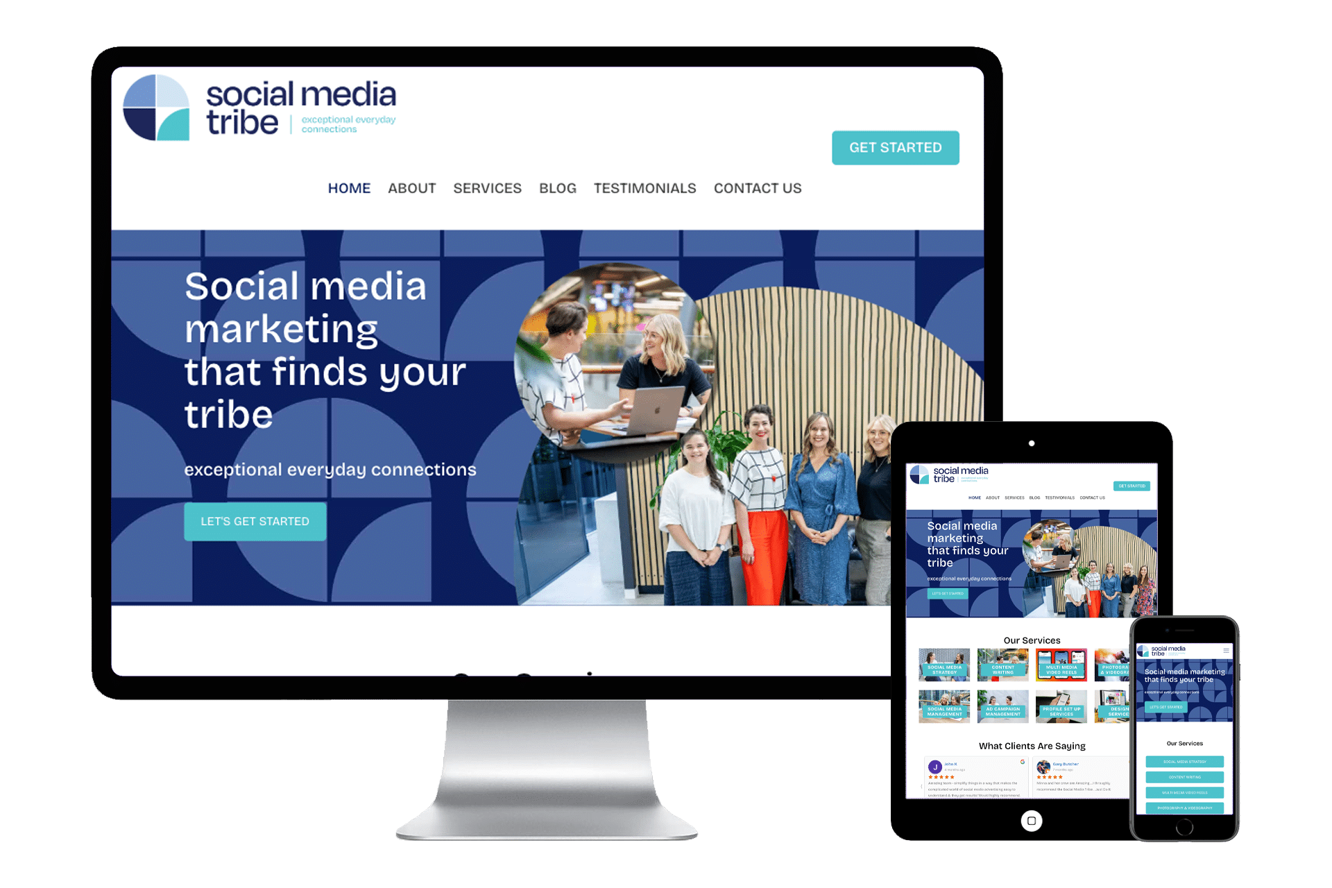
So many websites ramble on and on, showing a bunch of pretty pictures, have so much Wikipedia waffling texts on the front page or they have none. Only a few actually got the point right in my face of that very first page and hooked me into an attitude of “WOW I want to know more” or “Where do I sign?” or “i want to read more about that”
The elevator pitch is surely missing.
Now, you might be thinking, but hey it’s a showcase, the front page is like the front door before people go inside and have a good look around to see what they can see and make a choice if they want to contact us and do business. We must show people, pictures of our food, our place, our products, our services, our buildings, our children, dog, cat or pony! People must be given the chance to browse. Well folks, I’m here to tell you, your website is no longer a library!
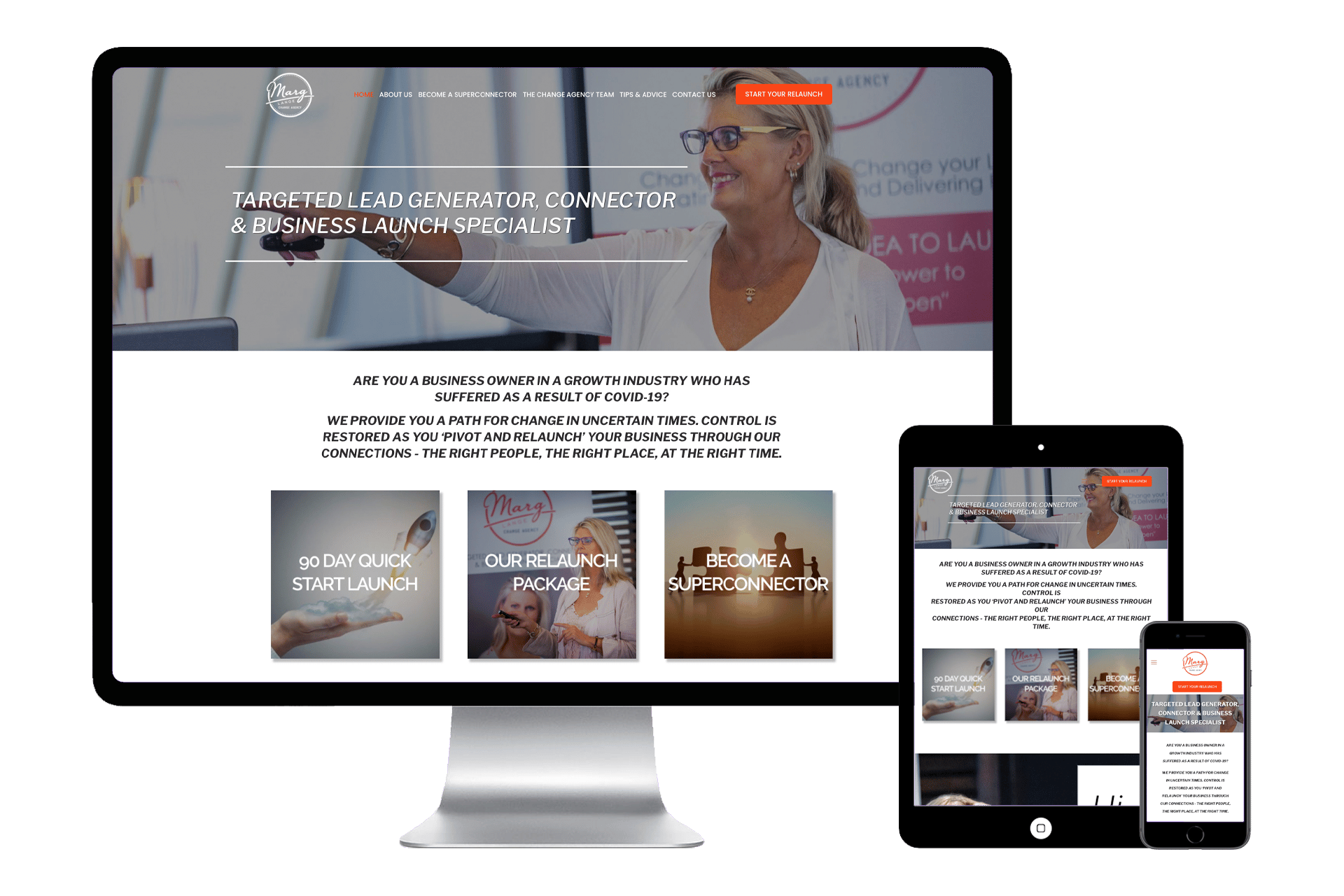
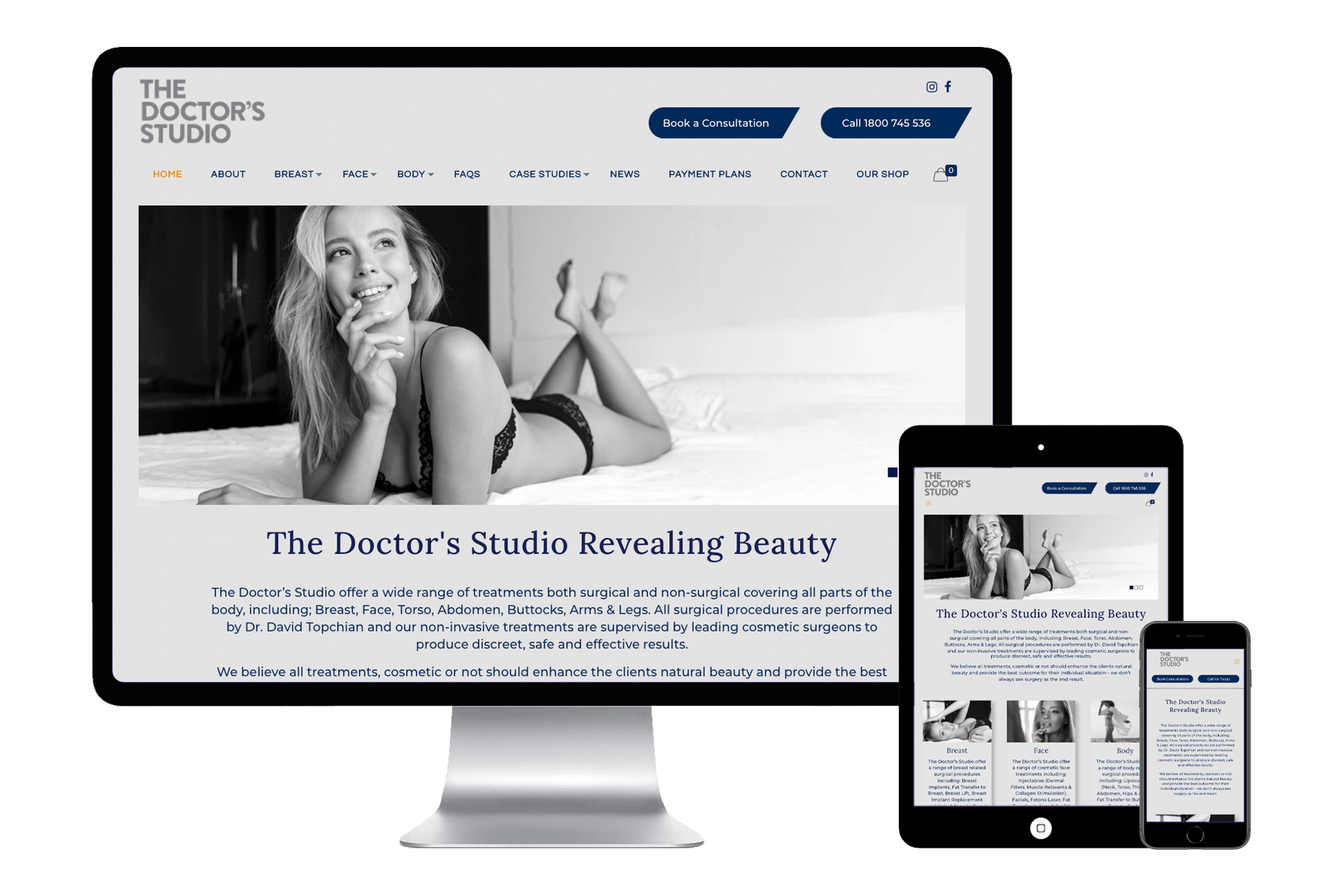
It’s a first web impression marketing machine and that first page they hit, better be an elevator pitch of what you’re all about, what you can do to satisfy their needs, how you will do that and press here to get it done.
You need to think about the main selling points of your business or service. You need to focus on what makes you better than the competition. You need to give questions and show answers. You need testimonials of what you do great and even better if it’s a video. And you need to think that’s all this is going to excite them enough and have a call to action button right within eyes reach to press and email or call you or delve further into what you are selling. Websites that have a home page with a great First Impression tend to have low “Bounce rates” meaning the website has done its job and the visitor has been engaged and excited enough to look further into what you do and what you are selling.
Start to think when you’re in what-do-I-want-my-website-to-look-like mode be stimulated by that quick elevator ride, there will be no long scrolling down on this page so make sure it’s all right smack in their face.
Think of a 21-inch screen, a ten-inch tablet and a six-inch phone. Use that space as your first web impression about your business and ask yourself what do I want potential customers to see in 10 – 20 seconds and make them buy the book and not join the library!
Climb aboard that elevator, hit the “up” button, because that’s where we’re going, up in the business and if you want a website that can accomplish the Elevator Pitch call Trilogy Web Solutions!!!
